Articles / Guidesupdated for DaVinci Resolve 21.1 (November 2026)
DaVinci Resolve Text+ Bounding Box: Fit Text Correctly
Quick answer
To fit DaVinci Resolve Text+ inside a bounding box, select the Text+ title, open Layout, and use a frame or text-box layout with wrapping enabled if that control is available. Adjust the box dimensions to control line breaks. Resolve does not automatically shrink the font to fit every box: reduce the Text tab’s Size yourself, then check for clipping and legibility.
I separate two jobs that often get confused: shaping the box and sizing the letters. The difference matters when a title wraps, gets clipped, or looks stretched after a drag in the viewer.
As of November 2026, the current manual listed by Blackmagic Design is for DaVinci Resolve 21.1. The core advice is simple: use Layout to define where text can go, then adjust font size separately. This guide explains what that distinction does, what it doesn’t do, and how to diagnose the common “fit text” problems without guessing.
What does “fit text” mean in DaVinci Resolve Text+?
“Fit text” can mean either wrapping words inside a fixed box or shrinking the font until every word fits. Those are different operations, and Text+ box controls should not be mistaken for automatic font-size fitting.
A bounding box defines a region for arranging text. The letters still have their own size. If a sentence is too long for the box’s width, wrapping can move part of the sentence onto another line. If there isn’t enough height for all the resulting lines, some text may be hidden or clipped, depending on the layout options. None of those changes necessarily makes the font smaller.
That’s the distinction to keep in mind throughout this guide:
- Box size sets the region available to the text.
- Wrapping moves words onto additional lines when they reach the box edge.
- Clipping hides content that extends beyond a boundary; it doesn’t delete the words from the text field.
- Font size changes the size of the letters.
- Title transform scales or moves the rendered title as a whole, which is not the same as changing the text layout box.
Blackmagic’s Resolve 20 New Features Guide describes the box-wrap behavior this way: “With Wrap to Text Box selected, your text will automatically continue on the next line when it reaches the edge of the text box.” That sentence describes line wrapping, not an automatic reduction in font size. The same guide describes a separate Clip to Text Box option that visually cuts off text extending beyond the box while preserving the excess text. See Blackmagic Design’s Resolve 20 New Features Guide.
A box that wraps text does not automatically make oversized text smaller.
For this guide, “fit” means making the text occupy a chosen region in a deliberate way. Maybe you want a long sentence to wrap. Maybe you want one line to stay on one line. Maybe a compact lower third must leave a logo unobstructed. Each goal calls for a different adjustment.
There’s no single numeric box size that works for every project. The font, wording, frame shape, viewer display, and placement all affect what looks balanced. A value that suits a two-word label may be a poor choice for a longer name or sentence. Treat the box as a layout boundary, then judge the actual rendered result.
How do I find the Text+ bounding-box controls?
Select the Text+ title first, then open the Inspector and find its Layout controls. Depending on the selected title and the layout mode, the box dimensions and wrapping controls may appear under different labels or may not be available in that configuration.
On the Edit page, select the Text+ clip on the timeline. On the Fusion page, select the Text+ node in the node graph. In either case, check that the Inspector is displaying the selected Text+ tool rather than a different clip, node, or title. The selected item matters: changing the Inspector for a background, Merge, or Transform node won’t change the Text+ layout.
The general route is:
- Select the Text+ clip or node.
- Open the Inspector if it isn’t already visible.
- Open the Layout tab.
- Choose a box-based layout, such as Frame or Text Box, if offered.
- Adjust the box dimensions and inspect the wrapping or clipping options.
The names and presentation of controls can differ across Resolve versions and title types. Blackmagic’s documentation for Resolve 20 specifically describes Text Box, Wrap to Text Box, and Clip to Text Box in its section about MultiText. That is useful context, but don’t assume a checkbox shown for MultiText will appear identically for every Text+ setup. Blackmagic lists the current 21.1 manual on its DaVinci Resolve manual page; use the section for the title type you actually selected if the Inspector differs from the steps here.
A point-style layout is built around a point rather than a paragraph region. A frame-style layout lets you define a rectangle for text arrangement. Blackmagic’s Fusion tool documentation describes Frame layout as a rectangular frame used to align text. It is therefore the better starting idea when your task is to control a paragraph-like block or a fixed title region, rather than place a short line around a single point. See the Fusion Text+ Layout documentation.
The rule of thumb is straightforward: if the text should reflow inside a defined area, look for a frame or text-box layout. If you only need to place a short title, point layout may be simpler. If you can’t find a control named exactly as expected, check the selected tool and layout type before assuming the feature is missing.
How do I fit text inside a Text+ box without stretching it?
Change the box dimensions in Layout, not the whole title’s scale. The box determines where text wraps; the Text tab’s Size setting determines how large the letters are.
A common mistake is to drag a corner handle on the viewer or adjust a clip-level transform because the visible text needs more room. That can change the size or proportions of the rendered title rather than the area in which its text is arranged. If your goal is to make the box wider while keeping the letters the same size, use the layout box controls.
Try this sequence:
- Select the Text+ title or node.
- Open Layout and choose a frame or text-box mode.
- Widen the box until the desired words fit on each line.
- Adjust its height only as much as the line layout requires.
- Leave font Size unchanged initially.
- Check the viewer for unexpected wrapping or clipped lines.
If the box grows but the text seems to stretch, stop and undo the last change. Check whether you changed a title transform, a node transform, or a box parameter. Those controls can appear close together in a workflow, but they perform different jobs. Resetting the title’s overall transform may help when the entire title was accidentally scaled, but don’t reset other settings indiscriminately if you have already animated or positioned the title.
If the text stays the same size but wraps differently, that is expected: the box width changed, so the line endings moved. If the text grows or shrinks while the box stays put, you changed a size or transform control rather than only the layout boundary.
This distinction also helps when a tutorial uses the word “scale” casually. Ask what is being scaled: the letters, the title image, or the available text region? If the goal is to control line breaks, adjust the region. If the goal is to make a title more prominent, adjust text Size. If the whole design must move as one unit, use the title’s positioning controls after the text is laid out.
Avoid using a viewer handle as a substitute for understanding which object it affects. A handle may be changing a clip transform, a node transform, or an on-screen control for the text layout. Check the selected tool and the active viewer controls before dragging. When in doubt, change one setting, watch the result, and undo it if the change affects the wrong part of the title.
How do I make Text+ wrap at the edge of the box?
Choose a box-based layout and enable wrapping if the selected title exposes that option. Wrapping changes line breaks; it does not guarantee that all lines fit within the box’s height.
Wrapping is useful when a sentence should occupy several lines inside a fixed region. For example, a two-sentence card may need to stay within a narrow column so that another graphic can sit beside it. A frame or text-box layout gives the text a region to follow. With wrapping enabled, words can continue on the next line at the box edge. Blackmagic documents this behavior for Text Box in the Resolve 20 New Features Guide.
Use wrapping when the text itself may change, when line breaks should adapt to the available width, or when a paragraph-like block needs a controlled measure. Avoid relying on it when you need carefully art-directed line endings. Automatic wrapping can change when the words, font, size, or box width changes. If a line break is part of the design, insert a deliberate line break and test the result with the final wording.
A practical test:
- Type a short phrase that is clearly narrower than the box.
- Add words until the line crosses the box edge.
- Check whether the title forms a new line.
- Add another line and check that the box height has enough room.
- Change the box width slightly and confirm that the intended lines still make sense.
If no line break occurs, check that the text is in a box layout, that wrapping is enabled where that option exists, and that you are editing the intended Text+ tool. A point layout may position text around a point without giving you the paragraph behavior you’re expecting.
Also distinguish wrapping from manual line breaks. Wrapping is responsive to width. A manual line break stays at the point where you inserted it, even if the box becomes wider. Either can be correct. For a title with a fixed two-line composition, manual breaks may preserve the design better. For changing copy or a paragraph block, wrapping can save time.
When the wording changes late in an edit, don’t assume an old box still works. New words may create an extra line, alter the visual balance, or push the last line below the region. Inspect the longest version of the text, not just the shortest one.
Why is my Text+ text cut off at the bottom?
Text can be cut off when the text block is taller than the available region, or when a clipping option hides anything beyond the box. Increase the box height, reduce the font size, reduce the amount of text, or change the layout so the full text remains visible.
Wrapping and clipping are separate choices. Wrapping may create extra lines. Clipping can then hide lines that go beyond the box boundary. Blackmagic’s Resolve 20 guide says Clip to Text Box visually cuts off text extending beyond the box while keeping the excess content intact. So a title can appear incomplete without the text field having lost any words.
Use a quick diagnosis:
- Click in the text field and confirm the full wording is still present.
- Check whether the last line exists but falls outside the visible region.
- Increase the box height and see whether the line reappears.
- Check the layout’s clip setting, if one is present.
- If the full text now appears but the block feels too large, reduce font Size or edit the wording.
Don’t make the box extremely tall just to hide a different problem. A box that extends far beyond the intended design can make later positioning and alignment less predictable. Set a height that accommodates the planned line count, then verify the longest copy that could appear.
Clipping can be useful when you intentionally want a fixed window, such as text passing through a mask-like region or a controlled reveal. It’s a poor default for a title where every word must remain readable. If the words must be fully visible, treat clipping as a warning and solve the underlying overflow rather than accepting the cropped result.
A second issue can look like clipping but have a different cause: the title may be outside the frame, behind another layer, or cropped by a separate effect or transform. Temporarily simplify the stack if necessary. Toggle off a suspected crop or hide a foreground layer to isolate the text. Then restore the design and correct only the control responsible.
Finally, inspect the last line at the actual display size. A line that technically fits may sit too close to a box edge to read comfortably. A visible margin is a design decision, not just a technical allowance.
Does Text+ automatically shrink the font to fit the box?
Don’t treat Text+ wrapping as automatic shrink-to-fit. The documented Wrap to Text Box behavior moves text to another line; it doesn’t say that the font size is reduced until the whole block fits.
This is the most important answer for the word “fit.” If you set a fixed box and type a longer sentence, the result may wrap, overflow, or clip, depending on the layout options. It won’t necessarily scale down the letters until the text fits inside the rectangle. The exact tools available also depend on which title type you selected.
If you need to fit a single line into a fixed width, you have four dependable choices:
| Goal | Adjustment | Trade-off |
|---|---|---|
| Keep the sentence intact and readable | Shorten the wording | Requires an edit to the copy |
| Keep every word and preserve one line | Reduce font Size | Letters become smaller |
| Keep the same font size | Widen the box or use more of the frame | Uses more screen area |
| Keep the box and size but allow more room | Break the title into lines | Makes the block taller |
| Keep a strict visible window | Clip overflow intentionally | Some text may not be visible |
These are design choices, not hidden versions of the same “fit” button. One-line fitting and paragraph wrapping solve different problems. When the title must remain one line, compare shortening, shrinking, or widening. When the title is allowed to become a paragraph, wrapping is usually the natural starting point.
Avoid squeezing tracking or horizontally scaling the title as the first fix. Tight tracking can make letters harder to read, and nonuniform scaling can distort their proportions. Those tools can be intentional design choices, but they shouldn’t be confused with making a clean text box. First decide whether the wording, font size, line count, or box width is the constraint you can change.
For reusable titles, write down the constraint. “Keep the name on one line” is different from “keep every name at the same size,” and both differ from “never exceed this box.” If these constraints conflict, no layout mode can make all of them true for every possible string. Choose which one matters most, and build the title around that choice.
For one-line text, fit means choosing between copy length, type size, and available width.
How do I fit a long title in a fixed-width lower third?
For a fixed-width lower third, decide whether the wording must stay on one line or can wrap. If it must stay on one line, shorten the copy, reduce font Size, or widen the design; wrapping alone won’t preserve a single line.
A lower third often contains a name and a second line such as a role or location. Those lines have different jobs. The name may need to read first, while the supporting line can be smaller. If both are placed in one Text+ block, it may be harder to apply separate sizes or to manage their spacing than if you build the elements separately or use a title type designed for multiple text layers.
Use a worked example, not a universal preset. Suppose a card has a name, a role, and a fixed background panel. The name is longer than expected. First ask what must remain fixed:
- If the panel width must not change, reduce the name’s font size or choose a shorter display name.
- If the name must use a particular size, expand the panel or allow a second line.
- If the role is being squeezed, give it a separate line and size it independently.
- If the final line crosses the safe margin or covers important image content, adjust placement before making the type smaller.
A useful hierarchy is usually more readable than making every line the same size. But this is a design choice, not a guaranteed Text+ rule. Preview the lower third over both bright and dark parts of the footage. Make sure it remains legible without blocking a face or an important action.
Keep the box and background relationship clear. If the background is a separate shape or node, changing the Text+ box may not resize that background automatically. A title’s text layout box is not necessarily a dynamic background panel. Inspect the title’s other elements and adjust them deliberately. Don’t promise yourself that a text-box resize will also change a border, shape, or backing plate unless your particular composition links those controls.
If several people’s names will use the same graphic, test the longest name before deciding the final layout. A title that looks balanced for a short name can look cramped for a longer one. Make the final decision from the most demanding copy, not from the easiest example.
Should I use manual line breaks or automatic wrapping?
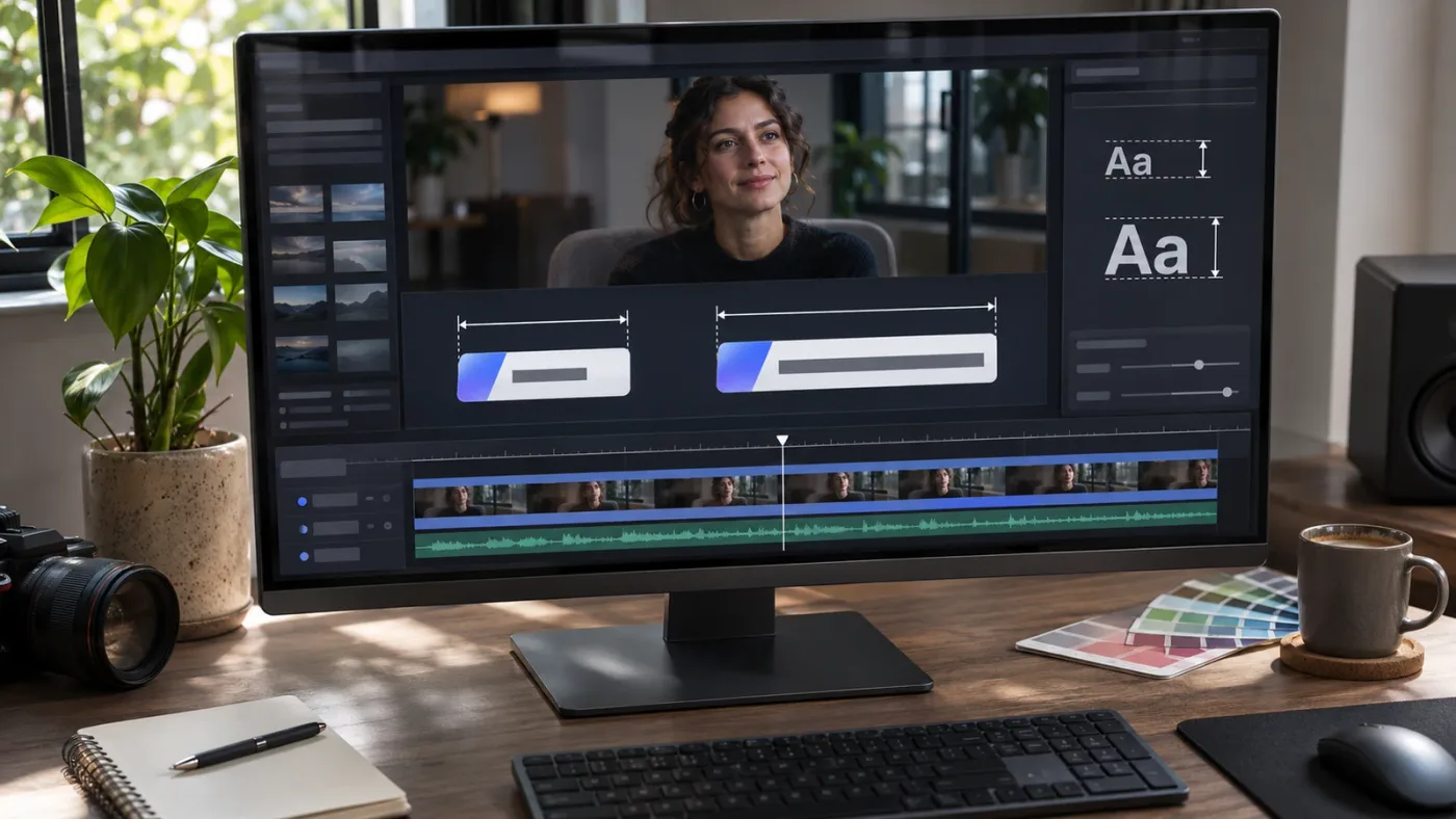
Use automatic wrapping when the text should respond to a changing box width. Use manual line breaks when you want specific line endings to stay part of the composition.
A manual line break gives you control over where a new line begins. That can be valuable in a title, quotation card, or nameplate where line balance matters. The cost is maintenance: if you change the wording or font, you may need to revise the breaks. Automatic wrapping is more flexible for copy that changes often, but the line endings can move when the text or box changes.
Consider these examples:
- A fixed two-line headline: manual breaks can keep the composition consistent.
- A paragraph with variable wording: wrapping can keep text inside the column without editing every break.
- A list of changing names: test each name; a manual break that suits one may split another awkwardly.
- A multi-line caption: wrapping may help, but inspect the actual line breaks and safe margins.
- A title with deliberate rhythm: manual breaks give more art direction, provided you check the final copy.
Don’t insert a break just because a word currently crosses the box edge. First confirm the box width and font size. If you later widen the box, a manual break may leave a short first line and a long second line. Conversely, a wrapped title may reflow unexpectedly when you change a font or adjust the size.
A good compromise is to design with wrapping first, then add deliberate breaks only where the line composition benefits from them. After that, test likely copy variations. If a title is a template, test short, average, and long wording. These are sample cases, not a claim that every name or sentence will fit.
Text+ is also different from a full page-layout application. Its purpose is to create titles and motion graphics within a compositing and editing workflow. Blackmagic describes Fusion as a node-based environment for building visual effects and animations, with Text+ controls for such properties as font, size, alignment, spacing, kerning, and leading. If you need complex typesetting with many paragraphs, precise page-flow rules, or extensive editorial revisions, it may be more efficient to prepare the text elsewhere and bring it into Resolve as a graphic or use a more suitable text workflow. See Blackmagic Design’s Fusion overview.
How do I center text inside the bounding box?
Set the text’s alignment or justification controls in the relevant Inspector tab, then check how the text sits inside the frame. Alignment inside the box and the box’s position in the image are separate decisions.
A box may be centered in the viewer while its text is left-aligned inside it. Or the text may be centered inside a box that is positioned off-center. If you adjust the wrong control, the result can look like the title is drifting even though the alignment setting is working as designed.
Think in two coordinate steps:
- Text within its box: choose left, center, or right alignment and any available vertical alignment.
- The box within the image: position the layout region where the composition needs it.
The Resolve 18 Visual Effects Guide describes the Text+ Frame layout as a rectangle used to align text and says its alignment controls justify text vertically and horizontally within the frame. The exact presentation may change between versions, so check the current Text+ Inspector rather than treating an older illustration as a pixel-perfect map. The guide is still useful for understanding the conceptual distinction between a frame’s position and the text’s alignment within it. See Blackmagic Design’s Visual Effects Guide.
For a paragraph block, left alignment often makes line starts easy to scan. For a short single-line title, centered alignment may look balanced. Right alignment can work for an edge-anchored graphic, but it may make varying line lengths more noticeable. None of these is automatically correct.
When center alignment appears wrong, check:
- Is the text aligned inside the box, or is the entire box centered?
- Does the box extend beyond the visible title area?
- Is the anchor point affecting placement?
- Is the title transformed after the layout stage?
- Is another node or clip-level transform changing the final position?
Change one control at a time. If the box moves but the text’s relationship to the box does not change, you adjusted placement rather than justification. If the text shifts inside the boundary without moving the boundary, you adjusted alignment. That simple observation helps you identify the right control without cycling through random sliders.
Why does the text move when I resize the box?
Resizing a box can change wrapping and alignment, which changes the text’s visible position even when the box itself stays anchored. The result depends on the alignment, anchor, and which edge you adjusted.
Imagine a left-aligned paragraph inside a box. If you make the box wider, the first line can extend farther before wrapping. The number of lines may fall, making the block shorter. If the text is vertically centered, the shorter block may sit lower or higher within the same rectangle. That can look like the title moved even when the box center didn’t change.
Now consider a right-aligned block. Widening the box may move the left edges of the lines while keeping the right edge aligned. That behavior is expected. A centered block may expand equally on both sides, depending on its layout and anchor. These are not necessarily glitches. They’re consequences of changing a text region and asking the text to align within it.
To diagnose a jump:
- Note the current box position and dimensions.
- Note the text’s horizontal and vertical alignment.
- Change only width.
- Check line endings and block height.
- Change only height.
- Check vertical alignment and anchor.
- Restore the intended dimensions and reposition only if needed.
If a title is animated, test at more than one time in the timeline. The box can be static while the text content or animated properties change. A title may look correct on one frame and overflow later. If the text or layout controls are keyframed, inspect the relevant frames and make sure the animation is intentional.
Resolve 21 adds a number of text-related changes, including spell checking for Text+ and MultiText in Fusion, according to Blackmagic’s Resolve 21 New Features Guide. Those new features don’t change the basic distinction between layout, alignment, and font size. Don’t assume a version update made every older title or template behave identically. Check the actual title type, selected controls, and result in the current project.
A box can stay put while its text shifts because alignment and line count changed.
How do I keep the same title design for different wording?
Use the longest likely wording as your design test, and decide which properties are allowed to change. A reusable title can’t preserve every constraint if the text length varies widely.
Templates often need to accommodate different names, roles, locations, or headlines. “Same design” might mean the same box size, the same font size, a fixed one-line name, or the same overall position. Those goals can conflict. A longer name may need a smaller type size, more width, a second line, or different wording.
Make a small test set that represents realistic extremes:
- A short name or phrase.
- A typical name or phrase.
- The longest likely name or phrase.
- A version with punctuation, numerals, or an accent if those characters are expected.
These examples are a design check, not measured results. They help reveal whether the layout depends on one convenient string. If a long version forces the font below a comfortable size, decide whether copy can be shortened or the box can grow. If a two-line version pushes a role out of place, separate the fields or change the vertical layout.
For a title that must remain in one line, keep a clear size floor in mind as a design preference. There is no universal font-size number that guarantees readability across all fonts, frame dimensions, viewing distances, and platforms. Inspect the output at the intended display size. The size shown in the Inspector is not, by itself, proof that a title will be legible on a phone or at a distance.
Resolve 21 includes improved font support and spell checking in Text+ and MultiText, as Blackmagic documents in its New Features Guide. That can help with font selection and proofreading, but it doesn’t automatically make a template responsive to arbitrary wording. Still check the chosen font and wording in the final composition.
For titles reused across several videos, save a copy before making structural changes. Then test the new version with representative text. If your change breaks the title, return to the preserved version rather than rebuilding it from memory. For more help with title choices and reusable graphics, see DaVinci Resolve title templates for YouTube.
Why is the box correct but the title still looks wrong?
A correctly sized box can still produce poor typography if the font, line breaks, spacing, alignment, or contrast don’t suit the wording. A box solves a geometry problem; it doesn’t make every text design look balanced.
Check the content before changing more controls. Long words can create awkward line endings. A short final line may look unbalanced under a wide first line. A font with broad characters can use more width than a narrower font at a similar nominal size. Punctuation and all-capital text can also change the visual rhythm. These are reasons to judge the rendered title, not rely only on the numeric box dimensions.
Use this review order:
- Copy: Can you remove a word without changing the meaning?
- Line breaks: Do the lines divide ideas or phrases naturally?
- Font: Does the chosen face suit the amount and tone of text?
- Size: Is the title legible at the intended display size?
- Alignment: Do the line edges look deliberate?
- Spacing: Are the lines crowded or detached?
- Position: Does the block sit well relative to the image?
- Contrast: Can you read it over the footage or background?
Blackmagic’s Fusion overview lists font, size, alignment, spacing, kerning, and leading among Text+’s controls. That’s a reminder that the box is only one part of the typography workflow. The Fusion overview also describes Text+ as a 2D text tool and notes that its shading controls can add treatments such as outlines, shadows, and glows. Those treatments may improve visibility in some designs, but they don’t fix a bad line break or too-small text.
When you can’t tell which setting is causing the problem, duplicate the title or save a version before experimenting. Then change one property at a time. If you change the font, size, box width, and alignment together, you won’t know which change improved or harmed the result. Small controlled edits are faster to evaluate than a long series of guesses.
Should I use Text+, MultiText, or a regular Text title?
Choose the title type based on the structure you need, then use its documented controls rather than assuming every Inspector is identical. Text+ is a flexible Fusion text tool; MultiText is designed to manage multiple text layers inside one title; a simpler Text title may be enough for a basic graphic.
Blackmagic describes Text+ as a 2D text generator with advanced controls for typography, shading, and animation. Its Fusion overview also distinguishes Text+ from Text 3D, which adds three-dimensional extrusion and related controls. For a conventional title that needs detailed styling or animation, Text+ is often the relevant choice.
Resolve 20’s New Features Guide describes MultiText as a tool built on Text+ with a Text List and multiple text layers. It also describes adding Point, Text Box, or Circle layers and gives Wrap to Text Box and Clip to Text Box controls for Text Box layers. That is useful when a graphic contains several independently managed text elements, but it doesn’t mean every control belongs to the same Text+ Inspector field. See Blackmagic Design’s Resolve 20 guide.
| Title type | Consider it when | Watch for |
|---|---|---|
| Text+ | You need a Fusion text tool with detailed styling or animation controls | Layout behavior depends on the selected mode and the particular controls available |
| MultiText | One title needs several separately managed text layers | Its layer controls and layout options differ from a single Text+ node |
| Text | You need a simpler title and don’t need the extra Text+ workflow | Don’t assume its Inspector matches Text+ |
Don’t switch tools just because a tutorial’s screenshot has a slightly different label. First confirm which title type the tutorial uses and which Resolve version it describes. If your project uses an older template, opening it in a newer version may not reveal every new feature in the same place.
For a walkthrough of Fusion’s workspace and node concepts, see DaVinci Resolve Fusion Page tutorial for beginners. If a title template itself is failing to load or display as expected, use the focused troubleshooting guide for DaVinci Resolve Fusion title templates not working.
How do I check a title before exporting?
Review the longest wording, the final frame size, and the title over its actual background before relying on the layout. A viewer check at one frame can miss overflow or contrast problems elsewhere in the timeline.
Start by moving through the title’s full duration. If the title text changes, inspect the longest version and any keyframed change. Look for words disappearing at the bottom, unexpected line breaks, or a box that shifts relative to the picture. If the background footage changes underneath the title, judge readability over each distinct shot.
Then check the composition at the intended viewing size. A large viewer can make small text look comfortable. A phone display or a smaller embedded player may reveal that the same title is hard to read. This isn’t a claim about a universal size threshold; it’s a practical visual check based on the audience and delivery context.
A short pre-export checklist:
- Is all required copy visible?
- Are the line endings acceptable?
- Is the font readable at the intended display size?
- Is the text inside the intended safe area?
- Does it avoid faces, logos, and important action?
- Does the title remain legible over every relevant background?
- Does it look correct at the beginning, middle, and end of its duration?
If you use a background panel, outline, or shadow, check those elements as well. The text box and the graphic behind it may be separate controls. Resizing one doesn’t necessarily resize the other. Look at the complete title design, not just the white text on a neutral viewer background.
A render is useful for a final quality check, but don’t make it the first place you inspect the layout. Fix visible wrapping, clipping, and alignment problems before exporting. If the title looks wrong in the viewer, exporting won’t solve the underlying design issue.
What should I do if I can’t find a “Fit Text” control?
Look for layout, wrapping, clipping, and font-size controls instead of searching for a single universal “Fit Text” button. The available options depend on whether you selected Text+, MultiText, or another title.
If your tutorial says “Text Box” but your Inspector shows “Frame,” verify the tutorial’s Resolve version and selected title type. Blackmagic’s current manual is linked from its DaVinci Resolve 21.1 manual page, and the Resolve 20 guide documents the newer MultiText box controls. Those documents can help you distinguish a missing control from a different layout or tool.
Check these points in order:
- Selected clip or node: Is the Text+ title selected?
- Title type: Is it Text+, MultiText, or a basic Text title?
- Inspector tab: Are you in Layout rather than a different properties tab?
- Layout mode: Is the title in a point, frame, or text-box arrangement?
- Terminology: Does your version use a different label for the same kind of box?
- Version: Is the tutorial for a different Resolve release?
- Goal: Do you want wrapping, clipping, or actual font-size reduction?
That last question matters. If you want a paragraph to wrap, a box layout is the relevant control. If you want a strict crop, look for clipping. If you want every word to stay on one line at a smaller size, adjust the font size manually. If your goal is an automatically shrinking font, don’t infer that capability from a wrap checkbox. Confirm it in the documentation for the specific title or template.
The 21.1 manual listing is dated September 8, 2026, according to Blackmagic’s welcome page. If your software has a different version number, use the manual for that version and compare the section on the selected title. If the UI still doesn’t match, note the page, selected tool, and visible control names before asking for help. A description such as “I selected a Text+ node, opened Layout, and see Frame but not Text Box” is more useful than saying only that the tutorial doesn’t match.
When the control names differ, verify the selected title and version before changing the design.
Can on-screen guidance help when the Inspector doesn’t match a tutorial?
If a tutorial’s Inspector doesn’t match your screen, guidance that refers to the controls currently visible can help you identify the next step. That’s different from a written guide that assumes your panel, version, and selected title are identical.
TryUncle is the on-screen assistant for DaVinci Resolve on Mac and Windows; ask in plain words and Uncle points at the exact control on your screen. You still choose and perform the changes, and you should verify that the suggested control matches the Text+ title and layout you intend to edit.
Use any kind of guidance as a way to locate a control, not as proof that the design is correct. For this task, the goal remains the same: adjust the layout box to manage text flow, adjust font Size to change letter size, and check the resulting title for wrapping, clipping, and readability. If those controls are already clear, you don’t need another tool to complete the task.
What is the reliable way to fit Text+ text inside a box?
The reliable approach is to choose a box-based layout, set its dimensions, decide whether text should wrap or clip, and then adjust font Size separately. Finally, inspect the title with the longest wording over its real background.
Use the full procedure below when you’re starting from a Text+ title:
- Select the Text+ title. Select the title clip on the timeline or its Text+ node in Fusion. Confirm that the Inspector shows the title you mean to change.
- Open Layout and choose a box layout. Choose a frame or text-box mode rather than a point layout when you need a bounded text region. If the label differs, check the current manual for your version and title type.
- Set the box dimensions and wrapping. Adjust width to control the line length and height to allow the desired number of lines. Enable wrapping if the selected tool exposes that control. Use clipping only when you deliberately want overflow hidden.
- Set font size and alignment. Use the text controls for font Size and the available alignment options. Keep these separate from the box measurements.
- Check clipping and legibility. Review the full wording in the viewer. Confirm that no required line is hidden and that the smallest text remains readable at its intended display size.
- Test the title in context. Scrub through the title’s duration and check its longest wording over the actual picture. If the graphic includes a separate background shape, confirm that it still fits the text.
A good result isn’t simply a title that stays inside a rectangle. It’s a title whose words remain visible, whose breaks make sense, and whose size suits the viewer. If the wording is too long for the design, choose whether to shorten it, reduce the font size, widen the box, or allow more lines.
For an exact one-line title, the first three options are usually the honest choices: edit the copy, reduce the size, or make more width available. For a paragraph-like title, use wrapping and give the resulting lines enough height. If a title is a reusable template, test a longer version before settling on its layout.
DaVinci Resolve 21.1’s current manual is the version reference for this article. The underlying principle remains simple across title workflows: the box controls the text region, and the font-size control changes the letters. Keep those jobs separate, and the “fit” problem becomes much easier to diagnose.
Frequently asked questions
- How do I make text fit inside a bounding box in DaVinci Resolve Text+?
- Select the Text+ title, open Layout, and choose a frame or text-box layout. Set the box width and height, and enable wrapping if the option is available. Then adjust font Size in the Text tab. Text+ can wrap or clip text, but don’t assume it will automatically reduce the font size to fit.
- Does DaVinci Resolve Text+ automatically shrink text to fit a box?
- No. A text box can control wrapping and clipping, but that is different from automatically scaling the font down. Reduce the Text+ Size yourself, shorten the wording, or enlarge the box.
- Why is my DaVinci Resolve Text+ text cut off?
- The text may exceed the box height, wrapping may be disabled, or clipping may be enabled. Increase the box dimensions, check the Layout settings, and inspect the rendered title rather than relying only on its outline in the viewer.
- How do I resize a Text+ bounding box without stretching the letters?
- Change the box dimensions in Text+ Layout rather than scaling the whole title with the Edit page Transform controls. The box changes where text wraps; the Text tab’s Size control changes letter size.
Sources
Put this guide to work with TryUncle.
Ask about the step you’re on. TryUncle sees your screen and points at the control you need, so you can keep learning in your own project.
Get TryUncle for Mac or WindowsKeep reading

Guides · Aug 29, 2026 · 8 min
DaVinci Resolve Title Templates for YouTube: What to Choose
Choose DaVinci Resolve title templates for YouTube by checking format, safe areas, version support, animation, and licensing before you edit.
Guides · Jul 10, 2026 · 32 min
DaVinci Resolve Fusion Page Tutorial for Beginners
Learn the DaVinci Resolve Fusion page from zero: nodes, MediaIn/MediaOut, the Merge node, planar tracking, and keying a green screen, step by step.
Fixes · Jul 17, 2026 · 22 min
DaVinci Resolve Fusion Title Templates Not Working: The Fix
DaVinci Resolve Fusion title templates fail for five distinct reasons, from missing files to locked macros to bad fonts. Here's the fix for each one.