Articles / Comparisonsupdated for DaVinci Resolve 21.1 (November 2026)
DaVinci Resolve Color Slice vs Color Warper: Which Should You Use?
Quick answer
Color Slice is usually the quicker choice for broad, blended adjustments to familiar color ranges, such as deepening reds or refining skin tones. Color Warper is better when you need to reshape a specific hue while controlling a second color dimension, such as hue and saturation or chroma and luma. Use a qualifier or window when color alone cannot isolate the subject.
I reach for one of these tools when a shot is close, but a color still feels wrong. The hard part is not finding a control. It’s choosing one that changes the color you mean without dragging the rest of the image along.
As of November 2026, the distinction in DaVinci Resolve 21.1 is practical: Color Slice gives you a small set of blended, familiar color ranges with density and saturation controls; Color Warper gives you a grid for deliberately reshaping color relationships. Neither is a universal “better” tool, and neither replaces a clean exposure and color-management foundation.
Which tool should I choose first?
Choose Color Slice for a quick, broad adjustment to a familiar color family; choose Color Warper when you need a more specific hue change or want to adjust two color dimensions together. If the subject shares its color with distracting parts of the frame, neither tool alone guarantees a clean isolation.
| Your grading problem | Start with | Why it fits | When to switch |
|---|---|---|---|
| A red jacket needs richer, less bright color | Color Slice | Its red vector offers blended hue, density, and saturation adjustments | Switch to a qualifier or window if other reds must stay unchanged |
| A blue sky needs a subtle hue and saturation shift | Color Warper | The Hue-Saturation grid can reshape both dimensions in one move | Try a window or qualifier if the shift spills into blue objects elsewhere |
| Skin needs a gentle overall refinement | Color Slice | The seven vectors include a dedicated skin-tone range | Use a qualifier, window, or mask if the background is affected |
| A green object needs to move toward cyan without losing control of saturation | Color Warper | The grid lets you move a selected color relationship rather than only changing hue | Use a key or window if several green objects should not move together |
| Saturated highlights are getting too bright | Color Slice | Its saturation model is designed to avoid the unwanted brightness rise associated with a simple saturation increase | Test the result on the actual shot and check highlights on scopes |
| A range must be selected by luminance as well as color | Color Warper in Chroma-Luma mode | That mode exposes a different two-dimensional relationship | Use a qualifier or another selection method if the needed separation is spatial |
| You need the same correction across a varied group of shots | Neither by default | A tool that works on one shot may not match the lighting, camera response, or palette of another | Match shots first, then choose the least disruptive tool for each correction |
The table is a starting rule, not a preset recipe. Color Slice’s fixed vectors can be fast to understand, but a fixed range may overlap colors you did not mean to touch. Color Warper offers more direct control over color relationships, but more control also means more ways to make an adjustment that looks convincing on one frame and distracting in motion.
Color Slice is the faster starting point for blended changes to familiar color families.
I’d make a neutral balance and contrast decision first, then test one secondary correction on its own node. That makes the comparison fair: if you change exposure, contrast, saturation, and a hue range all at once, it becomes difficult to tell which operation caused a problem.
If your shot does not respond as expected, pause before switching tools. Check that you are grading the intended clip, that the node is enabled, and that the viewer is showing the same image state you are judging. A dramatically different result can come from a different transform or an adjustment elsewhere in the node graph, not just from the palette.
What does Color Slice do in DaVinci Resolve?
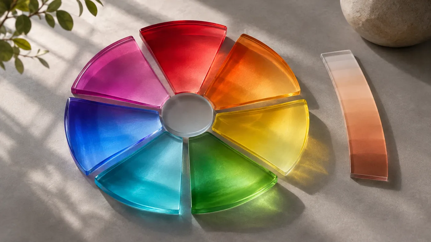
Color Slice is a vector-based grading tool that makes blended adjustments to fixed color ranges. In the Resolve 21 manual, the palette has seven vectors: red, skin, yellow, green, cyan, blue, and magenta.
Each vector has a Center control that changes which colors in that range receive the most weight. Its other vector controls adjust the selected range rather than selecting a new range. That distinction is important: Center is the qualifying control, while Hue, Density, and Saturation are adjustment controls.
The palette also has global controls. These affect the overall image rather than just one vector. That makes Color Slice suitable for two different kinds of work: a broad image-wide density or saturation change, and a more limited adjustment to one of its color families.
Blackmagic describes Color Slice as a fixed-vector tool for making targeted changes that blend into the rest of the image. The tool’s density and saturation behavior is designed to give a subtractive-style result, rather than simply increasing saturation and making the most vivid colors brighter. That description explains the design; it does not mean every shot will automatically look more filmic or that a high saturation setting is safe.
Think of the vectors as broad neighborhoods, not exact object masks. The skin vector is not a person detector. A patch of warm sand, a terracotta wall, or late-afternoon light can overlap colors that the skin vector also sees. The same goes for the red vector: it can affect a red shirt, brake light, and painted sign at the same time if their color values fall within its range.
Color Slice’s advantage is the simplicity of the decision. You can ask, “Does this range need a small density change?” and inspect the relevant vector. You do not have to build a custom mesh point for every adjustment. Its limitation follows from that convenience: when the color range you want does not line up neatly with a fixed vector, the Center control can only move the weighting within that vector’s available range. It cannot turn the palette into an arbitrary matte.
A useful mental model is a set of overlapping color zones. The color zones blend, so they do not behave like seven hard cutouts. Blackmagic’s manual explains that a perfectly clean matte is not necessarily the goal for Color Slice; the tool is intended to make blended color adjustments. That is useful when an organic transition looks better than a sharply keyed boundary. It is less useful when the task is to change only one object that shares color with other parts of the frame.
Color Slice also exposes numeric parameter fields. In Resolve’s manual, values can be edited directly, adjusted with the arrow keys, or changed by dragging the field. That can help when you need to return to a known setting or compare a subtle change without relying only on a large mouse gesture. It does not give the value universal meaning across different shots: the same numerical change can look different with different footage and node pipelines.
For the controls and their effect on the image, use the DaVinci Resolve 21.1 Reference Manual, chapter 135, rather than assuming a control name means the same thing as a similarly named control elsewhere in Resolve.
What does Color Warper do in DaVinci Resolve?
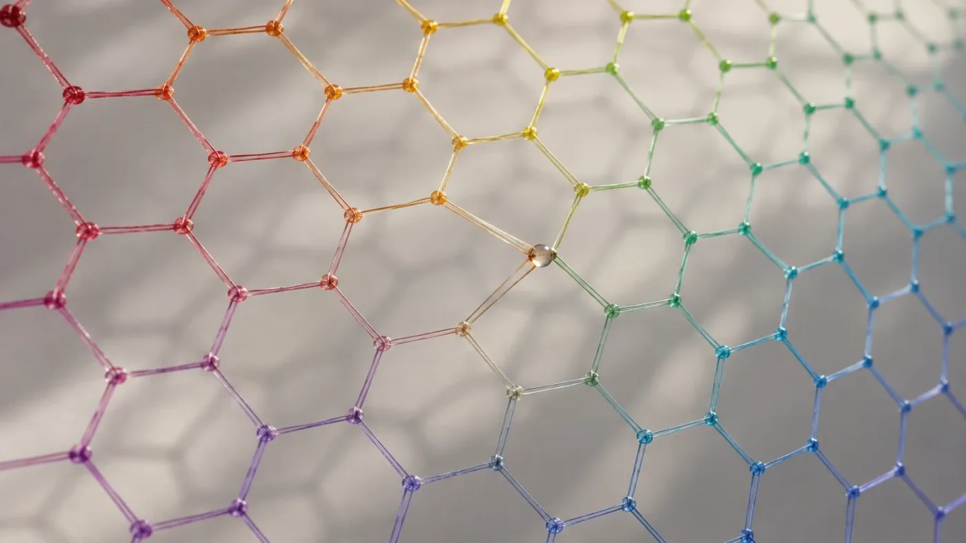
Color Warper is a grid-based tool for remapping one set of colors into another with a smooth falloff. In its Hue-Saturation and Chroma-Luma modes, it lets you manipulate two color attributes together, instead of making only a one-dimensional hue adjustment.
The palette provides two broad workflows. You can select and drag grid points, or sample a color from the viewer and drag that selection toward a new position. Blackmagic’s Color page overview describes the user-facing idea: select a hue or hue range on the web or in the viewer, then drag it to a different hue and saturation point.
The grid is not a spatial map of the frame. A point represents a color relationship, not a location in the picture. If two objects have similar color values, a warping move may affect both even when they sit far apart. That is why the tool can feel wonderfully direct on a distinctive jacket and less precise on an image where the same hue appears across skin, foliage, and reflected light.
Resolve 21’s manual describes modes including Hue-Saturation and Chroma-Luma, alongside Chroma Warp. In the two-grid modes, the axes or grid arrangement represent different pairs of color properties. The practical choice is about the change you want: moving hue while managing saturation is not the same task as changing colorfulness alongside lightness. Read the mode label and inspect the grid before you drag, especially if you have learned an older version or a different tool.
A warped point influences nearby colors according to the surrounding grid and locked points. Neighboring colors can be held in place, so the relationship between what moves and what stays is part of the grade. Blackmagic’s historical Color Warper feature guide describes this as a smooth falloff from the adjusted points to surrounding locked points. The 21 manual expands on grid controls, resolution, Auto Lock, and sampling.
That is why Color Warper can be useful for more specific color shaping than a simple global hue move. You can move one local region of the color grid while keeping neighboring regions comparatively stable. But a grid does not magically know what counts as the subject. It understands color relationships; it does not recognize “the car,” “the face,” or “the sky” as objects unless you combine the grade with a spatial or key-based selection.
The Color Warper palette can also be expanded into a floating window, according to the Resolve 21 manual. A larger view can make it easier to work with a dense grid, but it does not change the correction itself. If the palette is cramped, expanding it is a usability choice, not a color-science fix.
For a beginner, Color Warper’s apparent complexity can be misleading in both directions. The interface looks more technical than a few sliders, but sampling from the viewer can be intuitive. Conversely, an easy drag can move far more of the image than intended. Start with a small move and inspect the result at the shot’s beginning, middle, and end.
The official DaVinci Resolve Color page describes Color Warper as a way to adjust color by hue and saturation and to warp color based on brightness. For current control details, the Resolve 21.1 manual is the more appropriate reference than an older tutorial.
Why does Color Slice feel different from Color Warper?
Color Slice feels like a color-family adjustment; Color Warper feels like a color-relationship adjustment. The first gives you named, fixed vectors with controls for that slice, while the second gives you a grid where a selected region can be remapped in relation to neighboring colors.
This difference matters more than which palette has the more impressive interface. A quick boost to a familiar color family may be easier to express in Color Slice. A deliberate move from one hue toward another, while adjusting saturation at the same time, often maps more naturally to Color Warper.
There is overlap. You can change hue in Color Slice, and you can use Color Warper to alter saturation relationships. But the controls are organized differently, and the tools do not behave identically. “Both can change green” does not mean they create the same transition, select the same pixels, or preserve the same neighboring colors.
A helpful way to compare them is to identify the operation, not just the subject. “I want a richer sky” is not specific enough. Do you want more saturation, darker saturated blue, a shift away from cyan, or an adjustment limited to the sky area? The answer can point to Color Slice, Color Warper, a window, a qualifier, or a combination.
Cullen Kelly, a colorist and educator, describes a related motivation for subtractive color work: “I’ve always had difficulty quickly getting a ‘color wash’ look I’m happy with.” That quote comes from his discussion of building a subtractive balance tool, not from a direct evaluation of Resolve’s Color Slice palette. The distinction matters. It helps explain why a subtractive-feeling operation can be useful, but it is not proof that Color Slice is better than Color Warper.
Color Warper is the better fit when the desired change is a relationship between color dimensions, not just a broad color-family tweak.
You may also see “ColorSlice,” “Color Slice,” and “Color Warper” used in tutorials and documentation. The reference manual names the palette chapters ColorSlice and Color Warper. Tutorials can differ in terminology, interface size, palette layout, and Resolve version. If a button is not where a video shows it, check the manual for your installed version before concluding the feature is missing.
In Resolve 21, both palettes sit among the Color page’s secondary tools. They are not replacements for primary balance, contrast, or color management. If the whole image has a green cast, a global balance correction is usually a more sensible first question than whether a green slice or a warper point can compensate for it. Secondary tools are most useful after you understand the baseline image and the result you want.
How do I decide between Color Slice and Color Warper for skin?
Start with Color Slice when you want a gentle, broad skin-tone refinement; choose Color Warper when you need to shape a particular hue relationship; use a qualifier, window, or mask when skin must be separated from a similarly colored background. The dedicated skin vector is convenient, but it is not an object selection.
Worked example: a warm interview close-up
This is a worked example, not a test result. Imagine a close-up interview under warm practical lights. The face looks a little too saturated, but the overall image feels balanced. A Color Slice skin adjustment is a reasonable first experiment because the intended change is a broad skin-range refinement, not a highly specific hue remap.
Start with the skin vector’s highlight view. Inspect what is selected. If the face is mostly highlighted but the warm wall behind the subject is highlighted too, that tells you the selection is based on color range, not on object identity. Adjust the Center control only if the selected range is poorly centered on the skin color you want. Then make a small saturation or density change and turn off the highlight so you can judge the actual image.
Now inspect the face and background together. Did the face become more natural? Did the wall change in a way you dislike? Did the skin darken more than you intended? If the correction improves the face but harms the background, do not keep pushing the same control and hope the overlap disappears. Add a spatial restriction or use another selection method.
A Color Warper can be the next experiment when the problem is specifically that the skin hue needs to move slightly while its saturation relationship also needs careful control. Sample a representative skin area, use the mode that matches the intended change, and make a restrained drag. The viewer sample chooses a color point; it does not draw a face-shaped boundary. Watch the hair, lips, warm clothing, and background as well as the cheeks.
If the person moves, that does not necessarily mean a color-based correction will stay confined to the face. The color may remain similar across frames, but lighting, angle, and expression can change it. When the correction needs to follow a subject spatially, use a suitable tracked selection and inspect the track, rather than assuming the color tool itself tracks an object.
A useful A/B check is to disable the correction node and re-enable it while viewing the shot. Ask whether the face looks more believable, not merely more vivid. Check a representative mid-shot and close-up if the grade covers both. A correction that flatters one frame can make another look orange or gray.
If you need a primer on the order of basic corrections before secondaries, the site’s guide to how to color grade in DaVinci Resolve covers the larger workflow. For an example of sequencing decisions, see DaVinci Resolve color grading workflow order.
The key lesson is separation of jobs. Color Slice can make a broad skin-color adjustment efficiently. Color Warper can reshape the hue and saturation relationship. A qualifier or window can constrain where the change applies. You can use all three kinds of controls in a grade, but each one solves a different part of the problem.
How do I choose for skies, water, and foliage?
Use Color Slice for a broad adjustment to a familiar sky, water, or foliage color family; use Color Warper for a more deliberate hue and saturation reshaping; add a window or qualifier when only one area should change. Color alone does not distinguish a blue sky from a blue shirt or teal water from a teal reflection.
Worked example: a cyan sky and blue water
This is a worked example. Imagine a wide landscape with a cyan sky and blue water. You want both to feel richer, but you do not want the water to become purple or the distant shadows to turn unnaturally blue. Begin by deciding whether the goal is saturation, density, or hue. “Make it pop” is not a grading instruction.
If the desired effect is a broad density or saturation adjustment across cyan and blue, Color Slice gives you distinct vectors to inspect. Check the cyan and blue highlights separately. A vector’s label is a starting point, not a guarantee that every pixel in the sky or water will land neatly in that slice. Make a restrained change and review the transition between the color families.
If the sky needs to shift from cyan toward a cleaner blue and the water needs a slightly different saturation response, Color Warper may be easier to reason about. The grid lets you shape the color movement in relation to neighboring colors. But if you sample a color in the sky and move it, other pixels with similar values can move as well. A blue reflection on a boat or a patch of blue clothing may share that region of the grid.
For a sky-only adjustment, a gradient window may make more sense than trying to force a color palette to act like a horizon mask. For water that has changing reflections, a single broad selection may include unwanted highlights or color patches. In those cases, combine tools only when each has a clear job: a window limits location, a qualifier narrows color, and Color Slice or Color Warper shapes the selected color.
Foliage presents a related problem. Leaves vary from yellow-green to deep green, and different parts of the same shot may have very different exposure. Color Slice’s green vector can offer a quick broad correction. Color Warper can help move a selected green relationship toward a different hue while preserving nearby regions. Neither one can repair clipped leaves, restore missing detail, or compensate for a poor exposure decision.
Worked example: green foliage that looks too yellow
Suppose the foliage is healthy but has a yellow cast. First compare the shot against a reference or neighboring clip, if one exists. If the issue is present across the whole image, correct the global balance before targeting foliage. If the issue is limited to vegetation, inspect the green and yellow Color Slice highlights. The unwanted cast may fall across both vectors, so it can take more than one adjustment to make a natural change.
A Color Warper offers another path: sample a representative leaf color, then nudge the relevant region toward a less yellow green. Look for collateral changes in skin, wood, clothing, and shadows. If the shot contains those colors in similar ranges, use a window or key to confine the correction rather than increasing the grid move.
Do not judge the foliage only by whether it looks greener. Grass and leaves can become fluorescent when hue and saturation move too far. Compare the result with the original, view the full frame, and check neighboring shots. The goal is a consistent image, not the strongest possible color.
A color selection follows color values, not the object name you have in mind.
How do the tools handle saturation and density differently?
Color Slice makes density and saturation central controls, while Color Warper changes color relationships through its selected mode and grid. If the problem is “more vivid but not brighter,” Color Slice is a sensible first test; if the problem is “move this hue and manage its saturation,” Color Warper may be easier to control.
“Density” is not a universal promise that a particular color will darken in the exact way you expect on every shot. In Color Slice, the manual describes density as adjusting luminance of more saturated colors in a subtractive-style way. It also describes the saturation control as using a subtractive model intended to avoid unnaturally bright highly saturated colors. Those are descriptions of the tool’s behavior and design, not a guarantee of a specific visual outcome.
The practical distinction shows up when you compare a simple saturation increase with a density adjustment. A basic saturation increase can make a strong color feel brighter or harsher. Color Slice’s density control is designed to produce a deeper treatment of more saturated regions. Whether that looks right depends on exposure, color space, neighboring hues, and how much of the image the vector affects.
Color Warper’s Hue-Saturation mode offers a more spatially organized relationship in color space: points in the grid represent color regions, and moving one changes a range around it. Chroma-Luma gives a different pairing of attributes. Before making a move, name the two dimensions you intend to affect. If you cannot describe that pair, you may be reaching for the grid without a clear target.
Worked example: a red jacket looks bright and plastic
This is a worked example, not a measured comparison. Imagine a red jacket that feels too bright and digital. The aim is richer red fabric without making the red brighter still.
Start with the red Color Slice vector. Inspect the highlight view to see whether the jacket is the primary selected region or whether red objects elsewhere are included. Try a modest density adjustment, then compare it with a small saturation reduction or increase. One control at a time. If density deepens the fabric while leaving the image’s overall balance intact, the tool matches the stated task.
If the jacket is shifting toward orange or magenta and the hue must be reshaped, test Color Warper. Sample a representative portion of the jacket, choose a mode that matches the intended pair of color attributes, and move the point a short distance. Check the rest of the red family. A brake light, lipstick, and warm practical source might all be affected by the same color move.
You may decide that neither is the best fix. If a single red object must change while other reds remain untouched, use a qualifier or spatial window, then choose the tool that shapes the result. Selection and color adjustment are separate decisions. That separation is one of the easiest ways to avoid the “why did the background change?” problem.
Worked example: highly saturated stage lighting
A saturated stage light can be difficult because the brightest parts may already approach clipping. Increasing saturation or shifting hue can produce a harsh patch, and deepening color can reduce detail in the lit subject. Start with a conservative move and check both the image and scopes. If a highlight loses texture, the color tool is not recovering information; it is only changing the rendered signal.
For this kind of shot, a Color Slice density move might give you the darker color feel you want, but it could also alter similar colors across the frame. A Color Warper adjustment could move the hue relationship, but it may not solve clipped highlights. If the issue is highlight detail or exposure, address that upstream instead of trying to repair it with a secondary hue tool.
Is Color Warper more precise than Color Slice?
Color Warper offers more flexible control over color relationships, but that does not automatically make it more precise for every shot. Color Slice can be more direct when the intended correction maps cleanly to one of its fixed vectors, while Color Warper may require more careful inspection of nearby colors and points.
Precision has at least three meanings in grading:
- Selection precision: Are you affecting the pixels you intend?
- Adjustment precision: Can you make the type of color change you intend?
- Shot-to-shot precision: Can you repeat the result consistently across related clips?
Color Warper often provides more flexibility for the second question. Its grid and sampling workflow let you move color regions in a selected color space, and control points can shape how surrounding colors respond. But the grid cannot tell whether the selected hue belongs to the hero object or a background object. It has no object-level understanding by itself.
Color Slice can be more convenient when the intended color range maps to a vector and a blended adjustment is acceptable. Its built-in skin vector is a useful example. Yet the broad vector can include unwanted colors, so a fast adjustment is not necessarily a selective one.
For selection precision, both tools can need help. Resolve’s Qualifier palette, windows, and tracking tools address different kinds of selection problems. A qualifier can narrow a range by color characteristics. A window can constrain an adjustment to a region of the frame. Tracking can help keep a spatial selection aligned as the shot changes. The right combination depends on motion, overlap, and the intended look.
For shot-to-shot consistency, neither palette replaces matching. A Color Slice setting on one camera angle may not transfer cleanly to another camera or lighting setup. A Color Warper point may also need adjustment when the color distribution changes. Compare the shots, match the base, then decide whether the same secondary correction still makes sense.
An important caution: more grid points or more elaborate selections do not guarantee a more natural result. A visually smooth mesh move can still create an odd skin tone or a discontinuity in a gradient. The best correction is usually the smallest one that accomplishes the goal without drawing attention to the correction itself.
Why is Color Slice changing colors I did not select?
Color Slice can affect colors you did not intend because each vector is a blended color range, not an object mask. Similar colors can fall into the same range, and a broad adjustment may therefore change background areas or other objects in the image.
Start by holding the vector’s highlight control or using the viewer’s highlight mode. The Resolve 21 manual says the highlight view shows areas affected by the selected control. Inspect the whole frame, not just the subject you meant to adjust. A warm wall or orange light may overlap with the skin range; several red objects can overlap with the red vector.
Next, adjust the Center control while watching the highlight. Center changes the weighting of the vector’s color range. It does not create a custom shape around the subject, and it cannot move a color range anywhere without limit. If the range cannot be refined enough using Center, adding more adjustment is unlikely to solve the selection problem.
Then decide whether the remaining spill matters. For a gentle, blended grade, some overlap may be acceptable. If it is not, constrain the correction spatially or with another selection method. For example, a window can limit a sky correction to the upper part of the frame. A qualifier can help narrow a color range. A tracked selection can be useful when an area moves.
If the change is global rather than limited to one vector, check whether you adjusted the global Color Slice controls by mistake. Global controls affect the whole image. Also confirm that the node contains only the correction you are trying to evaluate. If it holds several unrelated operations, disable or separate those operations before troubleshooting.
Finally, watch the clip in motion. A selection that looks acceptable on one frame may include changing reflections, movement, or newly visible areas later in the shot. Resolve’s own Color Slice example describes using a window or another qualifier to limit the effect for trickier shots. That is a good principle: a blended color tool can be the grade, while another selection tool supplies the boundary.
Why is Color Warper changing more than one object?
Color Warper can affect more than one object because it remaps color values, not object identities. Two different objects with similar hues and saturation can occupy the same area of the grid, even if they are far apart in the frame.
A color sample in the viewer selects the nearest relevant color point; it does not draw a mask around the sampled object. When you drag that point, look for every object that shares similar color values. For a distinctive red shirt against a neutral background, that might be straightforward. For a red shirt against brick, warm skin, and red signage, it may not be.
To diagnose spill, make a small move, then inspect the viewer for every changed region. The Resolve 21 manual describes using Option-click on a control point to preview affected pixels against black. Use the manual’s current key description for your platform and version, then compare that affected-pixel preview with the visible image. A point preview is useful for understanding the color range, but it still does not substitute for judging the final grade.
Auto Lock and grid resolution can change how you work with the grid. Auto Lock can lock a border of points around a selected point, helping isolate the moved region in color space. Grid resolution changes the number of control points available in a mode. These controls affect the grid workflow; they do not guarantee that one object is selected independently of every other similar color.
If only one object should change, add a qualifier or window to narrow the operation. When the subject moves, track the spatial selection and review the track through the clip. Keep the color warp modest, especially near gradients such as skies, skin transitions, and soft shadows. A large move can create visible separation where the original image had a smooth blend.
When the mesh looks like it has become difficult to interpret, reset or undo the last move rather than stacking more point adjustments blindly. Start from the original grid state, identify one target color, and move one point. If a second point is needed to hold neighboring colors in place, add it with a specific purpose. Each extra point is another decision to review later.
How do I use Color Slice and Color Warper without making a messy grade?
Use one tool for one clearly stated correction, keep that correction easy to disable, and evaluate it across the full shot. A small, labeled node makes it easier to compare Color Slice with Color Warper without confusing either adjustment with exposure, contrast, or color management.
A practical comparison workflow:
- Choose a representative frame. Pick a frame where the color problem is visible, not an unusually flattering or unusually difficult frame.
- State the target. Write down the desired change in plain terms: “reduce the brightness feel of the red jacket,” or “move cyan sky color slightly toward blue without increasing saturation.”
- Add a separate serial node. Label it with the tool and purpose, such as
Color Slice - red densityorWarper - cyan hue. - Try one tool first. Make a restrained adjustment and inspect the affected colors.
- Toggle the node. Compare the corrected image with the original and note whether the target improved.
- If uncertain, make an alternative node or version. Do not combine two competing corrections before you know what each does.
- Review motion and neighboring shots. Scrub through the clip and compare the grade with adjacent shots in the same scene.
- Keep the correction only if it survives the full check. If it creates spill or harms continuity, undo it or add the appropriate selection constraint.
This is a workflow suggestion, not a claim that a particular node arrangement is required. Resolve gives you different node structures, and a larger grade may use parallel or layered approaches. For a tool comparison, a separate serial node is simply easy to read and test. The important part is being able to identify which operation caused the visible change.
If both tools seem useful, combine them only when you can explain the job of each. For instance, one correction might use Color Slice to manage broad density in a color family, while a later node uses Color Warper for a distinct hue relationship. But if both nodes are making overlapping changes to the same colors, the combined result may be harder to judge and maintain.
Use a still or a reference frame to compare the before-and-after state, but do not rely on a single still for a moving shot. Reflections, exposure changes, camera movement, and subject motion can reveal problems that a parked frame hides. For a multi-shot scene, compare the chosen correction against other angles and lighting setups rather than copying the same numeric values automatically.
A grade can also become hard to debug when multiple tools are active on one node. If Color Slice and Color Warper appear to fight each other, bypass one operation or split them onto separate nodes. Then inspect each in isolation. An organized node graph is not just a tidy graph; it is a way to preserve cause and effect.
For readers following a broader grading sequence, the internal guide to DaVinci Resolve color grading workflow order gives context for where secondary color adjustments fit. Resolve also provides a full Color page and scopes reference to help you inspect what the viewer and scopes are telling you.
What should I check if a tutorial shows different controls?
First check the DaVinci Resolve version, the selected palette mode, and the manual chapter for your installation. A tutorial recorded in another version may show different labels, layout, or mode options, even if the underlying grading idea still applies.
Resolve’s official 21.1 manual is dated September 8, 2026 on Blackmagic Design’s manual listing. The Resolve 21.1 reference manual separates ColorSlice and Color Warper into chapters 135 and 136. The official Resolve Color page also provides a high-level overview, but its product explanation may not show every detailed palette control.
When following a video, pause at the tool name and confirm it is actually Color Slice or Color Warper. A video may be discussing Hue vs Hue curves, HSL qualification, or another palette while using a similar color-wheel image. The result can look related while the controls behave differently.
Check the Color Warper mode before using an older tutorial’s steps. The manual describes multiple modes, and grid shape and axes differ. A tutorial showing a hue-saturation spider web will not map one-for-one to a Chroma-Luma grid. If your grid differs, find the mode control and verify what is selected before dragging points.
Also check screen layout. Resolve lets the Color Warper palette expand into a floating window, and the Color page layout can change which controls are visible. A small display or a compact palette may hide or rearrange controls compared with a tutorial filmed on a wide monitor. The palette may also show a different arrangement based on the selected mode.
Do not assume an unavailable option means you need to buy another edition. The sources used here describe Color Slice and Color Warper as Color page palettes; if a control is missing, first verify version, selection, panel layout, and active tool. When an instruction depends on a Studio-only feature, Blackmagic’s product pages and manuals should say so. Avoid transferring claims from an unrelated Studio-only tool to these palettes.
A useful check is to open Resolve’s Help menu and use the reference manual that corresponds to your installed version. Search for “ColorSlice” or “Color Warper,” then compare the mode and control labels with the tutorial. That is more reliable than following a remembered click path from an old interface.
If the screen still does not match the instructions, describe the visible state precisely: which page is open, which clip and node are selected, which palette is active, and what mode appears. A question like “where is Color Warper?” is less actionable than “I’m on the Color page, the Color Warper palette is open, and the grid is in Chroma-Luma mode; where is the Auto Lock control?” Specific screen context usually exposes whether the issue is a version difference, hidden panel, or a mistaken selection.
When a tutorial does not match your Resolve screen, TryUncle can offer on-screen guidance while you work on Mac or Windows. TryUncle is the on-screen assistant for DaVinci Resolve on Mac and Windows - ask in plain words and Uncle points at the exact control on your screen.
Does Color Slice or Color Warper replace a qualifier?
No. Color Slice and Color Warper adjust color relationships; a qualifier or spatial selection helps determine which pixels should be affected. They can work together because selection and adjustment are separate jobs.
A qualifier is useful when you need to select based on color characteristics. A window is useful when the correction needs to be limited to a region of the frame. A tracker can help keep a window aligned as that region moves. Color Slice and Color Warper can then shape the color change. That division gives you a clearer question at each stage: what should be selected, and what should happen to it?
For example, if a blue product on a shelf needs a hue shift but the background has similar blue, a color warp may alter both. A qualifier can narrow the selected blue range; a window can further limit the change to the shelf area. If the camera moves, track the window and review its alignment. The actual node and key configuration depends on the image, but the reasoning stays the same.
If the whole color family should change smoothly, a separate qualifier may not be needed. The blend across color ranges can be the desired result. That can make Color Slice or Warper simpler than constructing a tight matte. But when the background should remain untouched, do not mistake smooth blending for object isolation.
Selection quality and grade quality should be assessed separately. A highlight view can help you see what is being selected, while the normal viewer shows whether the grade looks right. A clean selection can still produce a bad color change; a soft selection can still produce a pleasing result if its boundaries are not distracting.
Be careful with masks and qualifiers on moving footage. A technically good selection on the first frame may drift, flicker, or miss a changing region. Review the shot over time, not just one frame. Color tools do not eliminate the need to monitor motion and image continuity.
For a step-by-step introduction to the larger process, see the internal guide to basic color grading in DaVinci Resolve. Start with what the image needs, not with the most complex tool available.
Which mistakes make Color Slice or Color Warper look bad?
The most common mistake is asking a color tool to solve a problem that is actually about exposure, white balance, selection, or shot matching. Another is making a large adjustment on one frame and not reviewing what happens elsewhere in the clip.
Mistake: moving a color before fixing the base image
If a shot has a global cast or inconsistent exposure, a secondary color shift can hide the symptom without fixing the cause. Balance and contrast first. Then revisit the specific hue problem. A later base correction can change how the secondary looks, so it is better to make color-family decisions after the overall image is stable.
Mistake: treating the skin vector as a skin mask
The skin vector selects by color range. It can affect warm backgrounds, sand, wood, clothing, or sunlight. Inspect the highlight and add a spatial or color restriction if the spill is distracting.
Mistake: dragging too far in Color Warper
A big move can distort neighboring hues and make gradients look artificial. Start with a small move, inspect the affected colors, and add neighboring locked points only to protect an area you have identified.
Mistake: grading a still frame instead of the shot
A single frame cannot reveal flickering selection, changing reflections, or a moving subject leaving a window. Scrub through the clip and review the first, middle, and last portions of the shot, as well as any key action.
Mistake: pushing saturation to fix weak color
Weak color may come from exposure, white balance, source lighting, camera transform, or delivery color management. More saturation can amplify noise or make skin and highlights harsh. Identify the cause before increasing color intensity.
Mistake: copying a setting between unlike clips
A blue sky in one camera angle may not have the same hue or exposure in another. A numeric value or mesh move that suits one shot may not suit the next. Match each shot and use copied grades as a starting point, not as proof of a match.
Mistake: ignoring the viewer and scopes
A monitor can mislead, especially if its profile, brightness, or surrounding environment differs from the intended viewing setup. The Resolve manual discusses viewer monitoring and video scopes; use scopes as another reference, not as a substitute for looking at the picture. A vectorscope can help you inspect color direction and spread, while the image tells you whether the correction supports the scene.
Mistake: adding several corrections before checking the first
If Color Slice, Warper, curves, and a qualifier all change the same range on one node, a bad result can be hard to diagnose. Separate operations when comparing them. Disable one at a time. Keep the grade readable.
A good secondary correction should improve the target without making the viewer notice the tool.
When should I use Color Slice and Color Warper together?
Use both only when each has a distinct job and you can evaluate each correction separately. For example, Color Slice might handle a broad density refinement while Color Warper handles a specific hue relationship, but neither tool needs to be present just because it is available.
A sensible test is to create one node for the first correction and another for the second. Label each node by intent, not only by tool name. “Green foliage density” is more informative later than “Color Slice 1.” Make the first correction, compare it against the original, and then add the second only if a separate issue remains.
The order can affect the result because a later operation receives an image already changed by earlier nodes. If the second tool’s selection depends on the altered color values, it may behave differently after the first correction. That is not a reason to avoid using both; it is a reason to decide which one acts first and test the result with the full node chain enabled.
If both adjustments seem to pull the same color in opposite directions, stop and simplify. You may be using the second tool to undo the first. Reset the relevant control or bypass one node. Then describe the final desired color in terms of hue, saturation, density, or brightness and rebuild the correction with one tool where possible.
A combination can be useful when the first adjustment is broad and the second is a controlled refinement. For instance, an overall Color Slice pass may make a family of saturated colors sit better, and a Color Warper node may then move one hue region slightly. But this only makes sense if the broader correction remains beneficial on its own and the refined correction adds a separate improvement.
Do not combine them as a workaround for a poorly selected subject. If the wrong background colors are changing, solve selection first. Stacking color adjustments can make the spill harder to see, not less present.
What is the final verdict: Color Slice or Color Warper?
Choose Color Slice when you want an efficient, blended adjustment to one of its familiar color ranges, especially when density and saturation behavior are central to the look. Choose Color Warper when you need to remap a color region with more deliberate control over hue and another color dimension. Choose a qualifier, window, or tracked selection when the real requirement is “change this object and leave the rest alone.”
My default is to make the base grade first, test Color Slice for a broad range correction, and move to Color Warper when the color relationship itself needs shaping. If either tool affects too much of the frame, I stop adjusting color and solve the selection problem instead.
There is no winning palette in every scene. A quick red adjustment can be easier in Color Slice; a carefully shaped hue move can be easier in Color Warper; an object-specific change may need an entirely different selection. The tool choice should follow the image, not a rule that one palette is newer or more advanced.
Keep the correction small, keep it separate, and watch the shot in motion. That is the safest way to see what the tool actually changed.
Frequently asked questions
- What is the difference between Color Slice and Color Warper in DaVinci Resolve?
- Color Slice makes blended adjustments through seven fixed color ranges, including a dedicated skin-tone slice. Color Warper lets you reshape a color range on a grid and control two color dimensions together, such as hue and saturation.
- Is Color Slice or Color Warper better for skin tones?
- Color Slice is a useful starting point for broad skin-tone refinement because it has a dedicated skin slice. Color Warper can be more selective when skin overlaps other colors, but neither tool isolates a person by itself; use a qualifier, window, or tracked mask when the image needs spatial separation.
- Can I use Color Slice and Color Warper in the same DaVinci Resolve node?
- Both palettes can be used in a grade, but Color Warper modes are alternatives within the Color Warper palette, not an instruction to combine every control in one adjustment. For a clear, reversible workflow, place distinct corrections on separate serial nodes and compare each node's contribution.
- Does DaVinci Resolve Color Slice replace the Color Warper?
- No. Color Slice and Color Warper solve overlapping but different problems. Color Slice offers convenient fixed vectors and subtractive-style density and saturation controls; Color Warper offers a more flexible grid for reshaping hue, saturation, chroma, or luma relationships.
Sources
- DaVinci Resolve 21.1 Reference Manual, ColorSlice and Color Warper chapters
- Blackmagic Design: DaVinci Resolve Color
- Blackmagic Design: DaVinci Resolve 19 New Features Guide
- Blackmagic Design: The Colorist Guide to DaVinci Resolve 20
- Blackmagic Design: DaVinci Resolve 21.1 Manual announcement
- Mixing Light: Cullen Kelly on building a subtractive color-balance tool
- DaVinci Resolve 21.1 Reference Manual, Color Page and scopes
Put this guide to work with TryUncle.
Ask about the step you’re on. TryUncle sees your screen and points at the control you need, so you can keep learning in your own project.
Get TryUncle for Mac or WindowsKeep reading

Guides · Jul 7, 2026 · 35 min
How to Color Grade in DaVinci Resolve: The Basics
Learn how to color grade in DaVinci Resolve: build a node chain, balance shadows and highlights with Lift, Gamma, and Gain, and read the scopes.
Guides · Oct 23, 2026 · 38 min
DaVinci Resolve Color Grading Workflow Order: The Right Sequence
A practical DaVinci Resolve color grading workflow order, from color management and shot balance to matching, look development, checks, and delivery.
Guides · Nov 11, 2026 · 34 min
What Does the Bitmap Node Do in DaVinci Resolve?
Learn what Fusion’s Bitmap node does, when to use it, how to choose a channel, and when you can skip it in DaVinci Resolve 21.