Articles / Guidesupdated for DaVinci Resolve 21.0.2 (July 2026)
How to Read DaVinci Resolve Scopes: Waveform and Vectorscope
Quick answer
DaVinci Resolve's waveform plots luminance from 0 to 1023: keep shadows off the floor and highlights off the ceiling. The RGB Parade splits that into red, green, and blue, so a neutral object should show equal-height traces. The vectorscope maps hue and saturation on a circle, and skin should sit near its skin tone line.
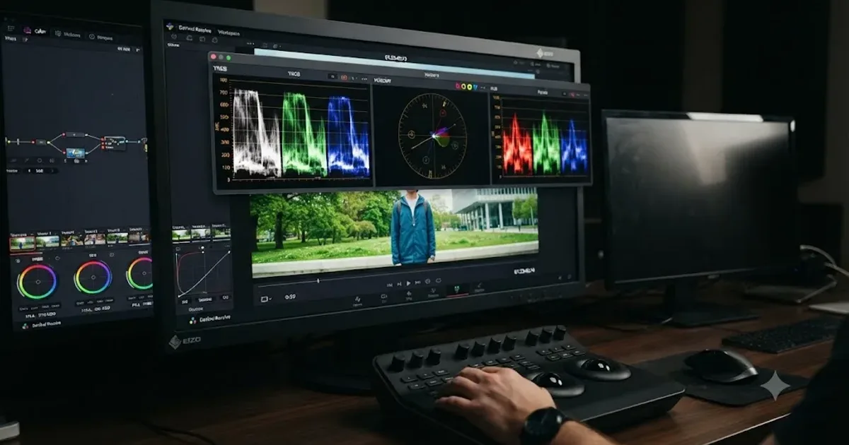
Your monitor is lying to you right now. Not on purpose. It's just adapting to the room, the backlight, and whatever you were looking at five minutes ago, the same way your eyes do. The scopes in DaVinci Resolve don't adapt to anything. They read the signal exactly as it is, and once you can read them back, you stop guessing.
This guide covers all five scopes Resolve gives you: the Waveform, the RGB Parade, the Vectorscope, the Histogram, and CIE Chromaticity. You'll learn what each one measures, what a balanced shot looks like on it, and how to catch the mistakes that don't show up until a client's screen makes them obvious.
What are DaVinci Resolve's scopes, and why not just trust your eyes?
Because your eyes are the least reliable instrument in the room. Ambient light shifts through the day. Monitors drift out of calibration. And your visual system adapts to whatever's on screen, so a shot that looks perfectly exposed after twenty minutes of staring at it can be crushed or blown out by any objective measure.
Jarle Leirpoll, a filmmaker and the author of The Cool Stuff in Premiere Pro, put it plainly in a piece for Frame.io Insider:
"You trust your scopes. Video scopes never lie."
Scopes measure the signal itself, not how that signal happens to look on the screen in front of you right now. That's the entire reason they exist. A waveform doesn't care if you're in a bright room or a dark one. A vectorscope doesn't care if your monitor runs warm. They report numbers, and numbers don't have moods.
That doesn't mean your eyes are useless. Creative judgment, whether a grade feels warm enough or a shadow feels moody enough, is still yours to make. But the technical questions, is this shot clipped, is this white balance off, is this skin tone oversaturated, those have objective answers, and the scopes are where you find them. Our color grading basics guide covers where scopes fit into a full grading workflow if you haven't built your first node chain yet; this guide goes deep on reading the scopes themselves.
How do you open the scopes panel in DaVinci Resolve?
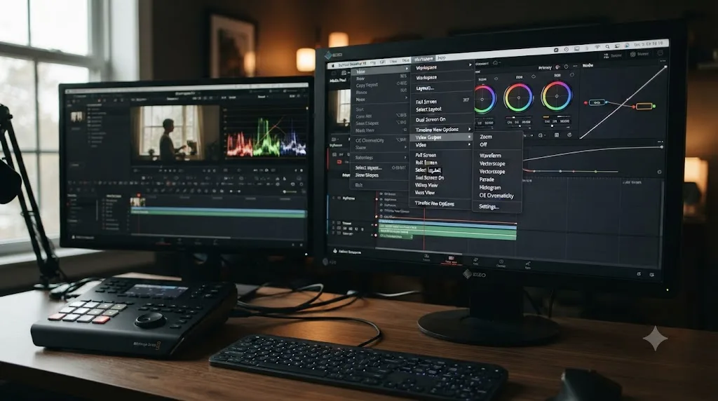
Press Command-Shift-W on a Mac or Ctrl-Shift-W on Windows, and a floating scopes window appears. That's the fastest path, and per Blackmagic's own manual, the same window is reachable from Workspace > Video Scopes > On, and it's available on the Media, Color, and Deliver pages, not just Color.
If you're working with two monitors, Workspace > Dual Screen > On pushes the full interface, viewer included, onto the second display, and you can dedicate a chunk of that screen to scopes permanently instead of toggling a floating window. Colorists working professional bays often run exactly this setup: a reference monitor showing the graded image, and a second display carrying nothing but scopes, so nothing ever obstructs the reading.
Inside the floating scopes window, a small layout icon in the top corner switches between single-scope and multi-scope views. Single-scope view gives you one large reading, useful when you're chasing a specific problem and want maximum resolution on it. Multi-scope view splits the window into quadrants so you can watch two, three, or four scopes simultaneously, which is how most working sessions actually run: Waveform and Vectorscope side by side, with Parade a click away when a white balance question comes up.
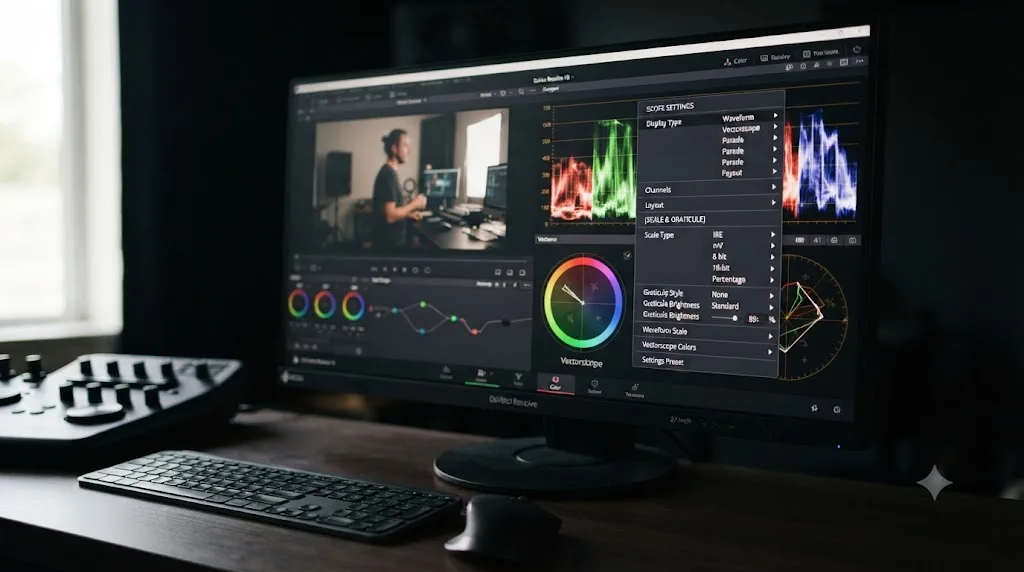
Right-click inside any individual scope to open its own settings menu. This is where scale, graticule style, and display mode live, all covered later in this guide, and it's specific to that scope. The waveform's right-click menu and the vectorscope's right-click menu are not the same menu, so don't go hunting for vectorscope settings inside the waveform's panel.
If you're brand new to Resolve's pages and haven't cut a rough timeline yet, our beginner's guide walks through getting a project started before you reach the point where scopes matter.
What are the five scope types, and when do you use each one?
Resolve gives you five distinct scopes, and each one answers a different question about the same signal.
| Scope | What it measures | The question it answers |
|---|---|---|
| Waveform | Luminance (or per-channel brightness) across the frame, left to right | Is my exposure and contrast reasonable? |
| RGB Parade | Red, green, and blue luminance shown as three separate waveforms side by side | Is my white balance and color cast under control? |
| Vectorscope | Hue and saturation on a circular graph | Is my color balance and saturation reasonable? |
| Histogram | Distribution of brightness values across the whole image, dark to light | How much of my image sits in shadows versus highlights? |
| CIE Chromaticity | Where your colors fall relative to a target color space's gamut boundary | Are my colors inside the space I'm delivering to? |
That table is your entire mental map for this guide. Per Blackmagic's Color page, all five ship in both the free version and Studio, and none require an add-on or a paid unlock to appear on screen.
You don't need all five open constantly. Waveform and Vectorscope cover the majority of decisions on an ordinary shot: waveform for exposure, vectorscope for color balance. Bring in Parade the moment you suspect a specific channel imbalance, like a shadow that's greener than it should be. Reach for Histogram when you want a fast read on how much of the frame sits in shadow versus highlight without hunting across a waveform's left-to-right layout. And open CIE Chromaticity specifically when gamut compliance matters, HDR delivery, wide-gamut masters, or footage shot on unusual camera color spaces.
How do you read the waveform for exposure?
The waveform takes every pixel in your frame and plots its brightness on a vertical scale, with the pixel's horizontal position on screen preserved on the scope's horizontal axis. A bright cloud in the upper-right of your frame shows up as a bright trace in the upper-right of the waveform. That correspondence is what makes the waveform readable at a glance: you can look at a spike or a dip and know exactly what part of the image it belongs to.
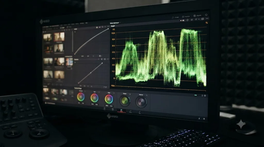
Resolve's default scale runs from 0 to 1023, a 10-bit representation, per the Blackmagic manual's scope measurement documentation. Zero sits at the bottom of the scope and represents pure black. 1023 sits at the top and represents the brightest value the signal can carry before it clips. Everything in your image lands somewhere on that vertical range.
A flat line pressed against the top or bottom of the waveform means the detail there is gone, not that the shot is especially bright or dark. That distinction matters more than it sounds like it should. A shot can be legitimately dark, night footage, a dim interior, and still have a healthy waveform, with its brightest highlight sitting well below 1023 and texture visible in every shadow. A shot is only clipped when the trace goes flat against the ceiling or floor, because a flat line means every pixel in that region reads the exact same maximum or minimum value, with nothing to separate one from another.
Right-click the waveform to switch its display mode. Per an advanced scopes breakdown from Video Editor London, Resolve offers RGB, YRGB, and YCbCr waveform modes, plus separate Y (luma) and C (chrominance) isolation, a Colorize toggle that renders the trace in false red, green, and blue instead of monochrome, and an Extents checkbox that draws an outline highlighting every overshoot and undershoot in the signal so you never miss a clip by eye alone. A Low Pass Filter option smooths grain and high-frequency noise out of the display, useful on a noisy log shot where you want to read the underlying exposure without the grain obscuring the trace's shape.
One relationship worth knowing: each full stop of exposure roughly doubles or halves the light hitting the sensor, and on Resolve's waveform that maps to the trace climbing or falling by a predictable chunk of the 0-1023 range, though the exact mapping shifts depending on your color science and gamma curve, per cinapex's breakdown of the waveform's signal logic. You don't need to memorize the math. Just understand that a two-stop exposure push moves your trace by roughly twice as much as a one-stop push, which explains why a small Gain move sometimes barely nudges the waveform while a similarly small Lift move at the bottom of the scale can look dramatic.
What does a correctly exposed shot look like on the waveform?
Numbers help more than adjectives here, so let's use them.
| Waveform reading | What it means | What to do |
|---|---|---|
| Shadows sit at 0, flat line | Crushed blacks, detail lost | Raise Lift until the trace lifts off the floor |
| Shadows sit between roughly 30 and 100 | Healthy shadow detail | Nothing, this is normal |
| Highlights sit at 1023, flat line | Clipped highlights, detail lost | Lower Gain or use Highlights recovery |
| Highlights sit between roughly 850 and 1000 | Bright but intact | Nothing, this is normal |
| Skin tone trace sits near the middle-to-upper-middle of the range | Typical diffuse skin exposure | Sanity check only, not a rule |
| Entire trace compressed into a narrow band | Flat, low-contrast image, common on unconverted log footage | Normalize first before judging exposure |
That skin tone row deserves a caveat: it's a starting point for sanity-checking a shot, not a law you enforce on every frame. Lighting conditions, the specific complexion in front of the camera, and the mood you're going for all move that number legitimately. A backlit silhouette with skin sitting near the floor of the waveform isn't a mistake. It's a choice, and the waveform will show you exactly what choice you made.
Here's a worked comparison. Say you're grading a daytime exterior interview. The waveform shows the subject's shirt, a white button-down, sitting at roughly 900, with a small sliver climbing to 1023 where a sunlit patch of fabric catches direct light. That sliver flatlining at 1023 is a real clip, and no amount of squinting at your monitor would have told you that with confidence, because a bright white shirt looks "bright" whether it's clipped by ten values or two hundred. Pull Gain down two or three points, or reach for the Highlights slider specifically, and watch the flat section separate back into texture. That's the difference between a shirt that reads as fabric and one that reads as a blown-out white shape.
How do you read the RGB Parade for white balance?
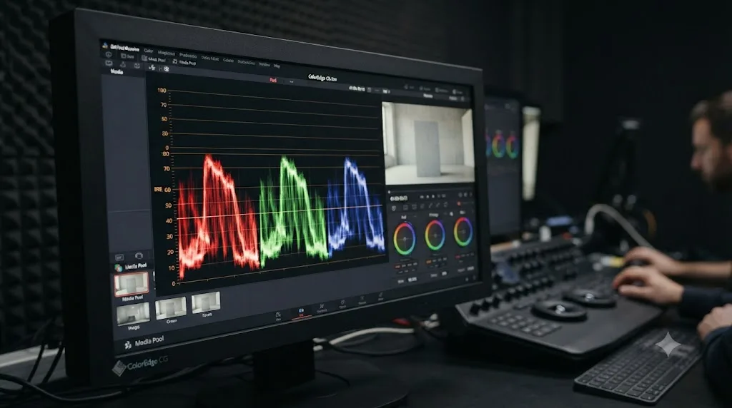
The Parade takes the same signal the waveform reads and splits it into three separate traces, one for red, one for green, one for blue, displayed side by side instead of overlapped. Where the waveform tells you about overall brightness, the Parade tells you whether that brightness is evenly distributed across the color channels, which is precisely what white balance is.
A neutral object is the fastest, most objective white balance check that exists in the entire application. Find something in your frame that's supposed to be white, gray, or otherwise colorless, a shirt, a wall, a piece of pavement, a gray card if you shot one, and look at where that object's traces land on the Parade. In a perfectly balanced image, the red, green, and blue traces for that object sit at exactly the same height. When they don't, the gap tells you the story.
| Parade reading on a neutral object | What it means |
|---|---|
| Red trace higher than blue | The shot leans warm |
| Blue trace higher than red | The shot leans cool |
| Green trace higher than red and blue | A green cast, common under fluorescent or cheap LED lighting |
| Magenta imbalance (red and blue both above green) | A magenta cast, often from certain tungsten or mixed-source lighting |
| All three traces level with each other | Balanced, no color cast on that object |
Worked example: you're grading footage shot in an office lit with a mix of window daylight and older fluorescent overheads. On the Parade, a gray filing cabinet in the background shows its green trace sitting noticeably above red and blue. That's the fluorescent tubes leaking a green cast into the shot, a classic and extremely common problem, confirmed instantly by the Parade in a way your eyes, adapted to the greenish room, would likely miss entirely. Nudge the Tint slider toward magenta, watching the three traces on that cabinet converge, and the cast disappears.
The Parade earns its keep in one more specific situation: a cast that only lives in part of the tonal range. Sometimes the highlights are perfectly neutral but the shadows carry a cast, or vice versa. On the waveform alone you'd never catch this, since it only shows overall luminance. On the Parade, you'll see the red, green, and blue traces agree at the top of the range and diverge at the bottom, telling you exactly which tonal zone needs the correction, so you know to reach for Lift specifically rather than a global Temp or Tint move that would also disturb the highlights you already got right.
How do you read the vectorscope for hue and saturation?
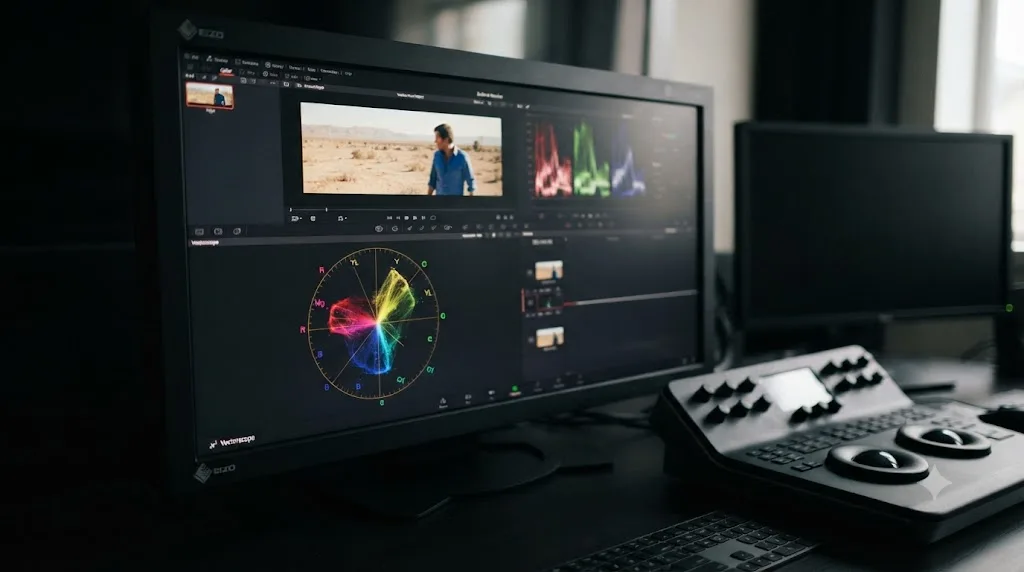
The vectorscope throws out spatial position entirely. It doesn't matter where in your frame a color sits; every pixel in the image contributes a single dot somewhere on a circular graph based on two properties alone: hue and saturation.
Distance from the center of the vectorscope is saturation. The angle around the circle is hue. Nothing else about the trace's shape means anything. A color sitting near the center is close to gray, low in saturation regardless of what hue it technically is. A color sitting near the outer edge is heavily saturated. Rotate around the circle and you move through hue: red at roughly the top, then clockwise through magenta, blue, cyan, green, and yellow before returning to red.
Per the DaVinci Resolve manual's vectorscope section, the standard graticule marks six target boxes, one each for red, magenta, blue, cyan, green, and yellow, positioned at their theoretically correct hue angles, with tick marks at both 75% and 100% saturation levels for each. Those boxes aren't decoration. They're reference points: a fully saturated primary red in your image should produce a trace that lands close to the red target box, and if it consistently lands somewhere else, either your color balance is off or your camera's color science is rendering that hue differently than the standard expects.
You get four graticule styles to choose from, again per the manual: Off strips every overlay for a clean, uncluttered view; Standard shows the crosshairs, target boxes, and outer reference circle described above; Simplified reduces that down to minimal crosshairs for a lighter-weight hue reference; and Hue Vectors draws full reference lines running from each target angle to the center, which fade out in the low-saturation region near the middle where most natural images actually sit, making them useful for comparing multiple shots' color balance at a glance without the lines cluttering the busy center of the scope.
A practical habit: don't chase "more saturated" as a default goal on the vectorscope. An ordinary, well-exposed natural scene, daylight, skin, foliage, sits well inside the target boxes at the graticule's edge, not pinned against them. A trace that's constantly kissing the outer circle across an entire timeline usually means the grade is oversaturated, not that the footage is unusually colorful.
How do you use the skin tone line to check skin?
Skin, across every human complexion, sits on almost exactly the same hue angle on the vectorscope. That's a genuine, physical property of how melanin and hemoglobin interact with light, not an approximation or a cultural convention, and it's why Resolve's vectorscope includes a dedicated reference for it.
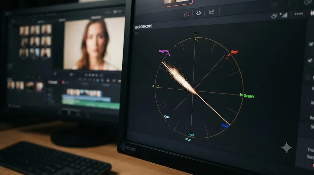
Open the vectorscope's settings and enable "Show Skin Tone Indicator." A diagonal line appears between the red and yellow targets, at roughly the ten o'clock position on the circle. Skin tone falls on almost the same hue angle across every human complexion, because complexion changes saturation and luminance, not hue. In practice, that means darker skin and lighter skin land at different distances from the center, and at different heights on a waveform, but both should point along the same diagonal line on the vectorscope if the color balance is correct.
Checking a specific face against the line is a two-step move. First, isolate the skin with a qualifier or a power window so the vectorscope isn't averaging skin together with hair, clothing, and background. Then zoom into the vectorscope, most versions offer a 2x zoom toggle for exactly this, and watch where the isolated skin sample lands relative to the line. If the trace sits off the line's angle, that's a color balance problem in the skin specifically, not a different complexion producing a different reading.
Saturation is the second half of the check. Per a practical scopes guide from Colour Grade Agency, skin tones generally fall somewhere between 20% and 50% saturation as a rough rule of thumb, closer to the center than the outer edge of the scope. Push skin saturation much past that and it starts reading as sunburned or artificially warm, even on footage where the color balance elsewhere in the frame looks correct.
Treat both of these as guides, not laws. If you're grading a music video lit with heavy colored neon practicals, skin under a magenta light source will pick up that magenta and shift off the reference line, and that's the correct, intentional result of the lighting, not an error to correct away. The vectorscope tells you what's happening to the signal. Whether that's the look you want is still a creative call.
How do you read the histogram?
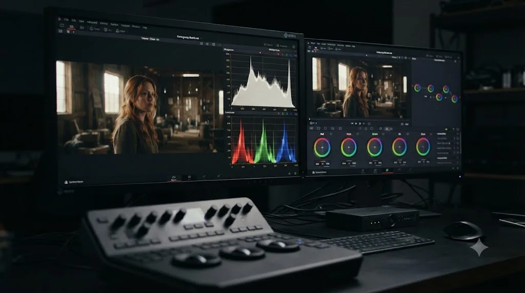
The histogram throws out spatial position the same way the vectorscope does, but keeps the waveform's brightness axis instead of hue and saturation. Every pixel in the frame contributes to a bar chart running from dark on the left to bright on the right, with the height of each bar showing how many pixels in the image sit at that brightness level. Resolve's version, like most modern implementations, also breaks the histogram out by red, green, and blue channel simultaneously, so you can see whether one channel's distribution differs meaningfully from the others.
Where the waveform excels at telling you where in the frame a problem lives, the histogram excels at telling you how much of the frame a problem affects. A waveform might show a small clipped patch in the corner of the image, and you'd have to judge by eye how significant that patch is relative to the whole shot. A histogram answers that instantly: a tall spike jammed against the right edge means a meaningful chunk of pixels are clipped, while a thin sliver means it's a small, probably ignorable highlight.
Use the histogram in two specific situations where it beats the waveform outright. First, judging overall contrast and tonal range at a glance, a histogram bunched entirely in the middle third tells you the shot is flat and low-contrast before you've even looked at the image, which is exactly what unconverted log footage looks like. Second, comparing two shots for a consistent exposure across a scene, since a quick side-by-side glance at histogram shape is often faster than reading two full waveforms.
The histogram won't tell you where in the frame a problem sits, which is its one real limitation relative to the waveform. If your histogram shows a clip, you still need the waveform, or your own eyes on the viewer, to find where that clip actually is.
How do you read CIE Chromaticity?
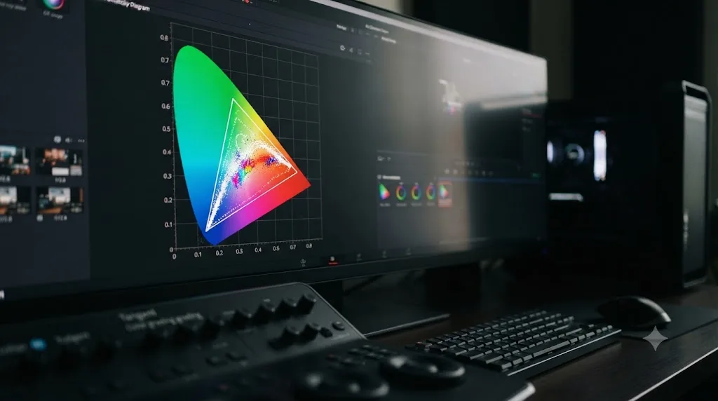
CIE Chromaticity is the scope most beginners skip, and the one that matters most the moment a project touches HDR or a wide-gamut deliverable. Instead of a circle like the vectorscope, it plots your image's colors against a triangle, and the triangle represents the boundary of a specific color space, the tristimulus values that define what colors that space can actually contain.
Per the DaVinci Resolve manual's CIE Chromaticity documentation, Resolve offers both CIE 1931 xy and CIE 1976 uv variants of this scope, and the triangle it draws is tied to your project's delivery color space setting. Grade a Rec.709 project and you'll see the (relatively small) Rec.709 triangle. Switch delivery to a wide-gamut space like Rec.2020 and the triangle expands to match, showing you a much larger palette of colors your delivery format can actually hold.
The read is simple in concept: colors from your image that fall inside the triangle are within your target gamut. Colors that push toward or past a triangle edge are approaching or exceeding what that delivery format can represent, which usually means they'll get clipped, desaturated, or otherwise mangled by whatever's decoding the file downstream, a broadcast chain, a streaming platform's encoder, a consumer TV's gamut mapping.
The manual is upfront about a real limitation here, and it's worth repeating rather than glossing over: the chromaticity graph gives you a rough sense of whether the current image sits inside your delivery gamut, but it's not exact and not foolproof. Part of an image's data can fall comfortably within the wide triangle while a specific highlight or shadow region overshoots the required gamut somewhere the graph doesn't make obvious at a glance. Treat a chromaticity reading as an early warning system, not a final compliance check, especially on anything headed to a broadcast QC pass with hard delivery specs.
Most single-camera Rec.709 web projects never need this scope opened. Reach for it specifically when you're grading HDR, working across mixed wide-gamut camera sources, or delivering to a spec that names an exact color space boundary you have to hit.
What's the difference between legal range and full range on the scopes?
Legal range and full range are delivery decisions, not exposure decisions. They describe how the numbers on your scope map to the two ends of the visible signal, and getting them confused is one of the most common ways a technically correct grade gets rejected by a broadcast QC department, or comes back looking crushed and murky after a platform re-encodes it.
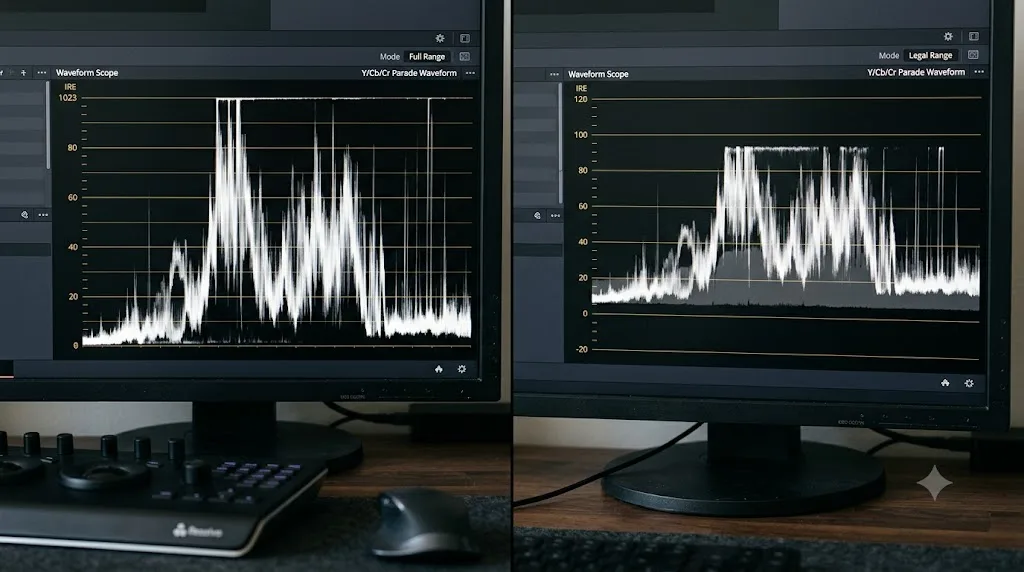
Full range uses the entire 0-1023 span on Resolve's 10-bit scale: 0 is pure black, 1023 is pure white, no reserved headroom on either end. Legal range, sometimes called video range or broadcast-safe range, reserves a narrower window, 64 to 940 on that same 10-bit scale, leaving room below black and above white for signal overshoot that older broadcast equipment needed to tolerate without clipping catastrophically.
Resolve lets you toggle which one your scopes display against, per the manual's scope documentation: a Data Levels versus Video Levels switch changes how the scope's own scale renders, without changing your actual output. That distinction matters. Switching the toggle doesn't regrade anything; it just changes what the ruler on the scope is measuring against, the same way switching a tape measure from inches to centimeters doesn't change the length of the object you're measuring.
Here's where it gets genuinely important to check rather than assume. If your scope is set to display full range but the signal underneath was actually encoded in legal range, your readings will look artificially compressed: blacks that are truly at 0 IRE will read around 6% up from the floor, and whites truly at 100 IRE will read a few percent short of the ceiling. Make exposure decisions off those misleading numbers and you'll end up delivering a file that's either crushed or blown out relative to what the receiving system expects, exactly backwards from what you intended.
The practical rule: match your scope's Data/Video Levels toggle to whatever your actual delivery target expects, and confirm rather than assume. Broadcast masters, network delivery, most cable and satellite specs, still commonly require legal range. Web platforms are looser; our YouTube export settings guide covers the exact numbers YouTube's own encoding guide recommends, and full range files upload and play back on YouTube without any legal-range enforcement on their end. Know which world your delivery is headed to before you trust a scope reading as a pass or fail signal.
How do you customize the scopes to match how you work?
Every scope in Resolve has its own right-click settings menu, and the defaults aren't necessarily what suits your project or your eyes. Knowing what's adjustable saves you from squinting at a display that's technically correct but poorly suited to the job in front of you.
Scale display is the first lever. Per the manual, both the waveform and Parade can show their vertical scale as 10-bit (the 0-1023 default), 12-bit, a straight percentage from 0 to 100, millivolts, or, in Studio specifically, HDR nit values in cd/m² for PQ or HLG signals. That last option is the one genuine scope-related Studio exclusive: everything else in this guide works identically whether you're on the free version or Studio. Percentage scale reads more intuitively for anyone coming from a broadcast IRE background, since 0 to 100 maps closely to the familiar IRE convention even though Resolve's underlying math runs in 10-bit code values.
Graticule style is the second lever, covered above for the vectorscope specifically: Off, Standard, Simplified, or Hue Vectors, chosen from the Vectorscope Scale Style submenu. Pick Simplified when you want a fast, low-clutter hue read during a quick pass, and Standard or Hue Vectors when you're doing careful, deliberate color balance work and want the full reference geometry visible.
A Colorize toggle, available on the waveform and Parade, renders traces in false red, green, and blue instead of a flat monochrome or white line, which makes it easier to tell channels apart at a glance, particularly useful in multi-scope layouts where screen space is tight. And a Low Pass Filter, available across Waveform, Parade, and Vectorscope, smooths grain and high-frequency noise out of the displayed trace without touching your actual image, which matters most on noisy, underexposed, or heavily compressed source footage where noise can make a scope reading hard to interpret at a glance.
If you find yourself reaching for the same scope configuration project after project, it's worth building that layout once and treating it as your default rather than rebuilding it every session. Colorist Walter Volpatto described exactly this kind of habitual setup in an interview with Time in Pixels, describing his own working configuration:
"I run a classic RGB parade and Vectorscope, and I have multiple configurations depending if I'm working in HDR, SDR, or if I also need to monitor the audio itself."
That's the shape of a mature scope habit: not five scopes crammed open at once out of caution, but a small, deliberate set matched to the specific job in front of you, swapped out when the job changes.
If a specific control here still isn't clicking after reading about it, TryUncle is an AI tutor built for exactly this gap: it looks at your actual Resolve window and points at the specific menu or slider instead of sending you hunting through a twenty-minute video for a ten-second answer.
What does balancing a shot with only the scopes actually look like?
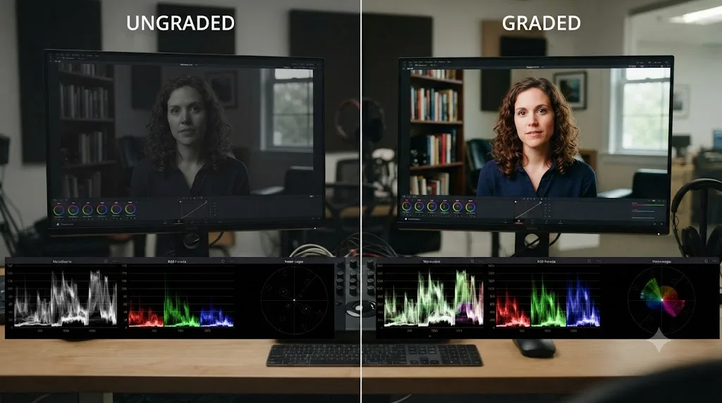
Theory sticks better with a worked example, so here's a full one, start to finish, using nothing but scope readings to make every decision.
The shot: a Rec.709 exterior interview, shot on an overcast day with a bounce card providing fill. On the timeline it looks a touch flat and slightly cool, but you're going to confirm every impression against a scope before touching a wheel.
- Check exposure on the waveform first. The trace shows shadows sitting around 60, well clear of the floor, and highlights, mostly the subject's light gray jacket, peaking around 700, well short of the 1023 ceiling. Nothing is clipped, but the whole trace sits lower than it needs to for a shot this well-lit. Raise Gain a few points until the jacket's highlight climbs toward 850, and the whole image gains presence without any part of the trace approaching the ceiling.
- Check white balance on the Parade. A white foam bounce card sits just out of frame on one side, but a section of the subject's gray sweater serves as a reliable neutral reference. Its red, green, and blue traces on the Parade aren't level: blue sits roughly 40 points above red, confirming the cool cast you noticed by eye. Nudge Temp warmer until those three traces converge on the sweater.
- Recheck the waveform after the white balance move. Temp adjustments shift luminance slightly along with color, so it's worth a second glance. The shadows and highlights haven't moved meaningfully; the correction stayed within the safe range established in step one.
- Check saturation and skin on the vectorscope. With the skin tone indicator enabled and a qualifier isolating the face, the skin trace sits close to the diagonal line, angle-wise, but its distance from center reads closer to 55%, above the rough 20-50% guideline covered earlier. Pull back Saturation a few points globally, then confirm on the vectorscope that the skin trace settles back into the 30-40% range without flattening the rest of the shot's color.
- Final pass across all three scopes together. Waveform: shadows and highlights both comfortably inside the range, no clipping. Parade: the sweater's three channels align. Vectorscope: skin sits near its line at a reasonable saturation, and the rest of the frame's colors sit well inside their target boxes, not pinned against the outer circle.
Five scope checks, four small corrections, zero decisions made by eye alone. That's not a slower way to grade once it becomes habit; it's usually faster, because you stop second-guessing moves and re-checking them against a monitor that might be lying to you in either direction.
What mistakes do beginners make when reading scopes?
A short list, because the same handful of errors account for most scope-reading confusion.
| Mistake | Why it's wrong | The fix |
|---|---|---|
| Reading the waveform's top as "brightness" instead of "the brightest pixels" | The top of the waveform doesn't show the top of your frame, it shows whichever pixels are brightest wherever they sit | Remember the waveform's vertical axis is luminance, its horizontal axis is frame position |
| Chasing maximum saturation on the vectorscope | A trace pinned against the outer circle usually signals an oversaturated grade, not a vivid one | Keep natural scenes comfortably inside the target boxes |
| Treating a small vectorscope trace as "wrong" | Undersaturated footage, especially unconverted log, naturally produces a small, centered trace | Normalize the footage first, then judge saturation |
| Ignoring the Data/Video Levels toggle | Reading full-range numbers against legal-range footage, or vice versa, misreads your actual exposure | Match the toggle to your delivery target before trusting a reading |
| Assuming skin should sit exactly on the skin tone line | The line is a hue reference, not a mandate; lighting and creative intent legitimately move skin off it | Use the line as a diagnostic starting point, not a hard target |
| Never opening the Parade at all | Overall balance can look fine on the waveform while a channel-specific cast hides in one tonal zone | Check the Parade whenever a shot feels "off" but the waveform looks clean |
| Judging clipping by eye on an uncalibrated monitor | A monitor can make a genuinely clipped highlight look like it still has detail, or the reverse | Confirm every suspected clip against the waveform's flat-line signature |
The pattern underneath nearly all of these: scopes reward a specific, deliberate question, not a general glance. "Is this shot okay?" isn't a question a scope can answer. "Is my highlight clipped?" or "Is this neutral object neutral?" are, and answering the specific version is what makes the scope worth having open.
How do the scopes look different on log or RAW footage before normalization?
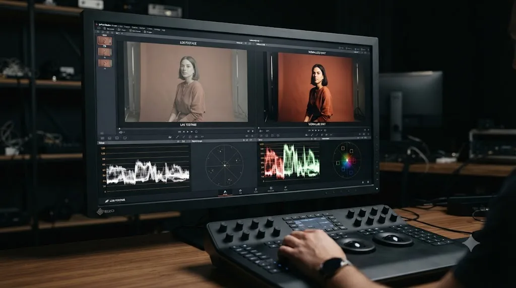
Log-profile footage, S-Log3, Canon Log, ARRI LogC, and similar, looks flat and desaturated on the timeline by design, and its scopes reflect exactly that. On the waveform, expect the entire trace to sit compressed into a narrow band well short of both the floor and the ceiling, since log encoding deliberately squeezes a camera's full dynamic range into a smaller signal footprint to preserve highlight and shadow information for later. On the vectorscope, expect a small, tightly clustered trace near the center, since log's flat rendering carries far less apparent saturation than a normalized image.
None of that is a problem to fix directly on the scopes. It's a normalization step you have to run first, using a conversion LUT, the Color Space Transform effect, or DaVinci Resolve's color management system, before any scope reading means what it would mean on ordinary Rec.709 footage. Our color grading basics guide walks through the normalization step itself in detail, including the trade-offs between a manufacturer's LUT and the Color Space Transform effect.
Once footage is normalized, its scopes behave exactly like any other Rec.709 source, and every technique in this guide applies without modification. The mistake beginners make here isn't misreading the scopes; it's judging log footage's scopes before normalization and concluding something's wrong with the shot, when what's actually happening is the log curve doing its job.
A related habit worth building if you install creative look LUTs regularly: check your scopes both before and after applying a look LUT, not just after. A look designed for one camera's log curve, dropped onto footage that's already been normalized differently, can push highlights toward clipping or crush shadows in ways that aren't obvious until you check the waveform specifically. Our guide to installing LUTs in DaVinci Resolve covers where in the node chain a look LUT belongs, which is directly relevant to keeping its effect on the scopes predictable.
Do the scopes work the same in the free version as in Studio?
Yes, with one narrow exception. Per Blackmagic's product pages for the free version and Studio, every scope covered in this guide, Waveform, RGB Parade, Vectorscope, Histogram, and CIE Chromaticity, ships identically in both. The graticule styles, the scale options, the Data/Video Levels toggle, the skin tone indicator, none of it is gated behind the $295 Studio license.
The one Studio-specific piece is the HDR nit-value display option on the Waveform and Parade scales, showing brightness in cd/m² against PQ or HLG transfer functions, per the manual's scope measurement documentation. That matters specifically for HDR mastering workflows where you need to confirm a highlight sits at a precise nit value for Dolby Vision or HDR10+ compliance. Every SDR reading in this guide, and the vast majority of what a working colorist checks day to day, works exactly the same whether you paid for the license or not.
That's a meaningfully different situation from some other Studio-gated features. Temporal noise reduction, Magic Mask, and Dolby Vision mastering are Studio exclusives with no free-version equivalent at all. Scopes aren't in that category. If you're weighing whether to upgrade to Studio, scope access shouldn't factor into that decision one way or the other, since you already have full access to everything covered here.
What do you do when the scopes and your eyes disagree?
Trust the scopes, but figure out why they disagree before you move on, because the disagreement itself is useful information.
Most often, the gap traces back to your viewing environment. A shot that looks slightly warm on your monitor but reads neutral on the Parade probably means your monitor, or the room around it, has a warm bias you've adapted to without noticing. A shot that looks correctly exposed but shows a clipped highlight on the waveform usually means your screen's brightness or contrast setting is compressing the top of the range in a way that hides the clip visually while the underlying signal stays clipped in the file.
Less often, the disagreement points to something worth investigating rather than dismissing. If a scope reading seems clearly wrong relative to an image that looks obviously fine, check first whether you're reading the right scope for the right question, a common mix-up covered in the mistakes table above, and second whether your Data/Video Levels toggle matches your actual signal, since a levels mismatch produces exactly this kind of scope-versus-eyes confusion.
The waveform tells you where your exposure actually sits, not where you think it sits. That's not a knock against your eyes or your instincts; creative judgment about mood, contrast, and color is still entirely yours to make, and no scope substitutes for it. But the technical floor underneath that judgment, whether a highlight is actually clipped, whether a white shirt is actually neutral, whether skin is actually within a reasonable saturation range, is where scopes settle the argument every time your eyes and your monitor try to have one.
Where do you go from here?
Open the scopes now, on whatever project is currently on your timeline, and run the five-step check from the worked example above on one shot: waveform for exposure, Parade for white balance, vectorscope for saturation and skin, and a Data/Video Levels check if you know your delivery target. Do it once, deliberately, and the pattern starts sticking faster than any amount of reading about it would.
From here, the rest of a full grading workflow builds on exactly this foundation. Our color grading basics guide covers the node system these scope readings feed into, our LUT installation guide covers getting creative looks into Resolve without breaking what you just balanced, and our YouTube export settings guide covers the delivery numbers that determine whether you should be reading these scopes in legal range or full range in the first place. Every one of those steps gets easier once the scopes stop looking like noise and start looking like the truth about your image.
Frequently asked questions
- What does it mean when the DaVinci Resolve waveform is flat at the top?
- It means your highlights are clipped, not just bright. A flat line pressed against 1023 shows that every pixel in that area hit the ceiling of the signal, and any detail that used to live above it is gone from the file for good. Pull the Gain wheel down or use the Highlights slider to roll that section back under the ceiling before you finish the grade.
- How do I turn on the skin tone line in DaVinci Resolve's vectorscope?
- Open the vectorscope, click its settings icon or right-click inside it, and enable Show Skin Tone Indicator from the menu. A diagonal line appears between the red and yellow targets. Skin of any complexion should fall close to that line's angle; how far a trace sits from the center reflects saturation, not race or skin color.
- What's the actual difference between the waveform and the RGB Parade in DaVinci Resolve?
- The waveform plots one combined luminance trace for the whole image, which is fast for judging overall exposure. The Parade splits that same signal into three separate traces, one each for red, green, and blue, so you can compare the channels against each other. Use the waveform for exposure and the Parade for white balance and color casts.
- Should I grade to legal range or full range in DaVinci Resolve?
- Grade to whatever your delivery target expects, and check it on the scopes rather than guessing. Broadcast masters usually need legal range (64-940 on the 10-bit scale). Web platforms like YouTube accept full range (0-1023) without complaint, since their encoders don't enforce broadcast legal limits the way a TV network does.
- Why does my vectorscope trace look tiny even on a colorful shot?
- Check the Vectorscope Scale setting first; some configurations plot at a smaller default gain than others, so a technically saturated image can still look understated at a glance. If the scale is correct, a small trace usually means the shot really is undersaturated, which is common straight off a log or RAW camera profile before normalization.
- Can I read all of DaVinci Resolve's scopes on the free version?
- Yes. The Waveform, Parade, Vectorscope, Histogram, and CIE Chromaticity scopes are identical in the free version and Studio. The one scope-related feature Blackmagic reserves for Studio is displaying the Waveform and Parade in HDR nit values (cd/m²) for PQ or HLG signals; every SDR reading works the same in both versions.
- What is CIE Chromaticity used for in DaVinci Resolve?
- It plots your image's colors against a triangle representing the color space you're delivering to, like Rec.709 or Rec.2020, so you can see at a glance whether any colors fall outside that gamut. It's a rough check, not a precise one: part of an image can sit safely inside the triangle while a specific highlight or shadow overshoots the gamut elsewhere, so treat it as a warning sign rather than a final verdict.
Sources
- DaVinci Resolve - Color (Blackmagic Design)
- DaVinci Resolve - Tech Specs (Blackmagic Design)
- DaVinci Resolve Studio product page (Blackmagic Design)
- DaVinci Resolve Manual: Video Scope Measurement Using Scales (VFXPedia mirror)
- DaVinci Resolve Manual: Vectorscope (VFXPedia mirror)
- DaVinci Resolve Manual: CIE Chromaticity Scope (VFXPedia mirror)
- How to Use and Read the Four Primary Video Scopes, by Jarle Leirpoll (Frame.io Insider)
- Grading by Numbers: When to Use Color Scopes (and When Not To), by Charles Haine (Frame.io Insider)
- 5 Tips for Getting Perfect Skin Tones in DaVinci Resolve (Frame.io Insider)
- A Practical Guide to Reading Scopes in DaVinci Resolve (Colour Grade Agency)
- You're Reading Your Waveform Wrong: The Signal Logic Behind IRE, Stops, and Exposure in DaVinci Resolve 21 (cinapex)
- Advanced DaVinci Resolve Scopes: Hidden Settings, HDR Scopes and Broadcast-Safe Colour Grading (Video Editor London)
- OmniScope Featured Artist: Walter Volpatto (Time in Pixels)
Put this guide to work with TryUncle.
Ask about the step you’re on. TryUncle sees your screen and points at the control you need, so you can keep learning in your own project.
Get TryUncle for Mac or WindowsKeep reading

Guides · Jul 7, 2026 · 35 min
How to Color Grade in DaVinci Resolve: The Basics
Learn how to color grade in DaVinci Resolve: build a node chain, balance shadows and highlights with Lift, Gamma, and Gain, and read the scopes.
Guides · Jul 10, 2026 · 26 min
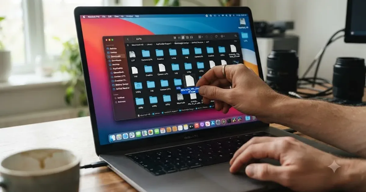
How to Install LUTs in DaVinci Resolve: Folders and Fixes
Install LUTs in DaVinci Resolve: find the real LUT folder, apply them to a node instead of a clip, and fix the LUT-not-showing-up refresh bug for good.
Guides · Jul 7, 2026 · 32 min
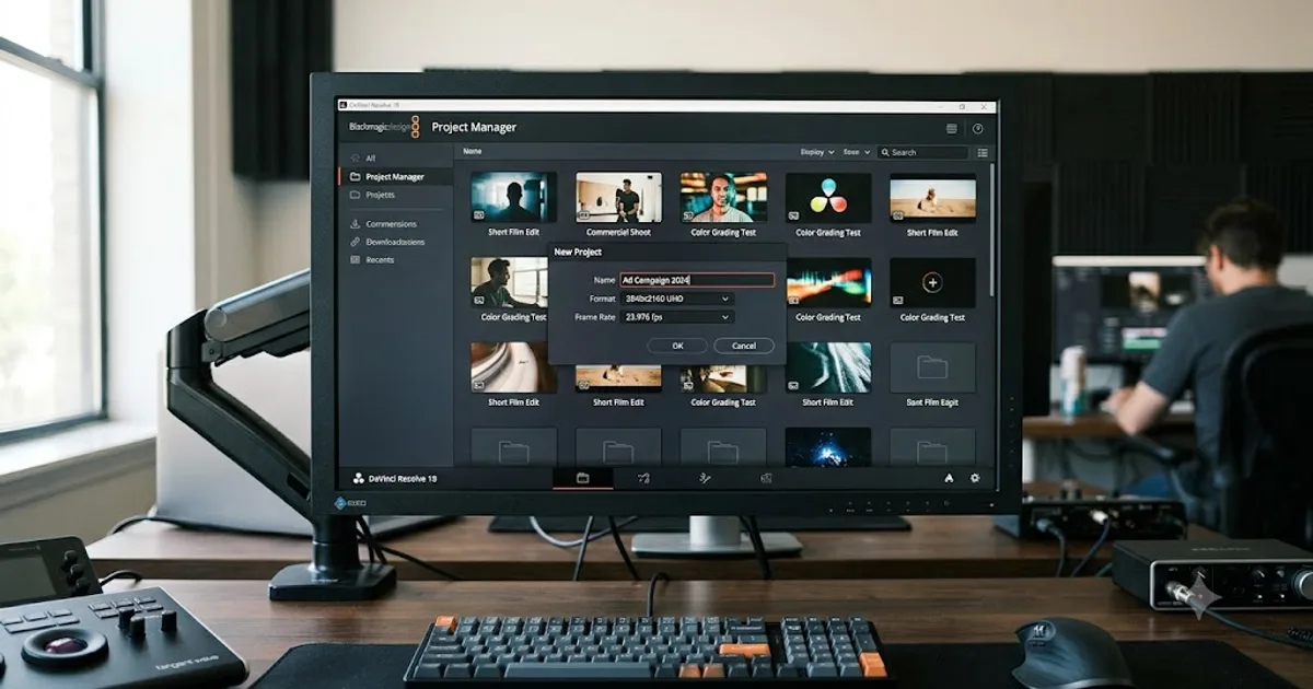
DaVinci Resolve for Beginners: The Complete Starter Guide
Learn DaVinci Resolve from zero: what it costs, what it needs to run, the seven pages you'll actually use, and the steps to cut your first project.