Articles / Guidesupdated for DaVinci Resolve 21.1.2 (October 27, 2026)
Where Are Auto Balance Sliders in DaVinci Resolve Photo Page?
Quick answer
In DaVinci Resolve 21 Photo, select an image, open the Inspector, choose the Photo tab, and expand Adjustments. Auto Balance and the Temp, Tint, tone, and color controls it adjusts are in the same section, so you can refine the result there.
I’d start in the Inspector, not in the Color page or the RAW tab. In DaVinci Resolve 21, the Photo page’s Auto Balance button and its related adjustments live together, but the controls are easy to miss when the Inspector is closed or showing another tab. This guide focuses on the DaVinci Resolve 21.1.2 interface as of November 8, 2026.
Where are Auto Balance sliders in the DaVinci Resolve Photo page?
In DaVinci Resolve 21 Photo, select a still, open the Inspector, choose the Photo tab, and expand Adjustments. Auto Balance and the controls for refining its result are in that section, not in the RAW tab.
Follow this route:
- Open the Photo page.
- Select the photo you want to work on in the Photo Album or Media Pool.
- Open Inspector if it is hidden.
- Choose the Photo tab at the top of the Inspector.
- Expand or scroll to Adjustments.
- Find Auto Balance and the adjustment controls grouped with it.
The shortest answer to “where are the Auto Balance sliders?” is Inspector > Photo > Adjustments. Selecting a photo matters. The Inspector changes its available controls according to the selected item, and a RAW image exposes a separate RAW tab as well. If you see camera-specific decode, white-balance, or exposure settings, check that you have switched to Photo before looking for Auto Balance.
The official DaVinci Resolve 21 New Features Guide describes the Inspector as the place to edit RAW and Photo parameters, effects, and file metadata. It also notes that selecting an image reveals its controls when the Inspector is open. That selection-dependent behavior explains why a panel can show different tabs when you click a different item.
Auto Balance and its related Photo adjustments are found together in Inspector > Photo > Adjustments.
If you need the broader layout, How to Use the DaVinci Resolve 21 Photo Page covers the Photo page’s albums, selection, and editing areas. This page stays focused on the specific controls Auto Balance adjusts and on how to make sense of them afterward.
What if the Inspector is closed?
Click the Inspector control on the Photo page toolbar. The DaVinci Resolve guide lists Inspector among the Photo page toolbar controls; it shows or hides the panel used to edit photo parameters and effect settings. Once it opens, select your image again if needed, then choose the Photo tab.
The panel can be narrow enough that its sections are below the visible area. Scroll inside the Inspector rather than searching the whole application window. If the Inspector is open but you only see File, Effects, or RAW, look for the tab row at its top. The labels can be easy to overlook when the panel is compressed.
A useful check is whether the selected item is really a still image. The Photo page’s Media Pool is dedicated to still-image media, while the project can also contain other media elsewhere. If you are on another page or have selected a timeline item, the available Inspector tabs may differ. Return to Photo, select an image in the album or Media Pool, and inspect the tabs again.
The order of checks matters. Start with the selected item and page, then the Inspector and its tab, then the Adjustments section. Don’t start by changing project preferences or reinstalling Resolve. Those steps won’t help if the Inspector is simply showing a different selection.
If you use a small display or have resized the application, the Inspector may have little room for its controls. Maximize the application window or widen the Inspector panel if your layout allows it. Then scroll within the panel. These are layout checks, not changes to the image itself: if the viewer remains the same while the panel changes, you have only changed what is visible on screen.
Why are there several places to adjust a photo?
DaVinci Resolve separates camera RAW parameters from general Photo adjustments. The RAW tab applies controls to supported camera RAW data; the Photo tab contains the general image adjustments, including Auto Balance. The two sets of controls serve related but distinct purposes.
That distinction is particularly important when the same concept appears in more than one place. A RAW file can expose RAW white balance and exposure parameters, while the Photo tab offers its own controls for Temp, Tint, and tonal adjustments. The Photo tab is the place to find Auto Balance.
A RAW image can have camera-specific controls and Photo adjustments at the same time, but Auto Balance belongs to Photo > Adjustments.
Think of the tabs as different stages of working with an image, not as duplicate shortcuts. RAW controls interpret supported camera data. The Photo adjustments are the general image controls used in the Photo page. When a control name seems familiar in both places, check the tab label before changing it. Otherwise, you may alter a camera decode setting when you meant to refine the Photo-page balance.
For a processed file such as a JPEG, the RAW tab may not be available because the image is no longer exposed to Resolve as camera RAW data. That doesn’t remove the Photo adjustments. Select the JPEG, choose the Photo tab, and look under Adjustments.
What does Auto Balance adjust?
Auto Balance is a one-button operation in the Photo page that adjusts the parameters in the Adjustments section. Blackmagic’s Resolve 21 guide describes it as automatically adjusting those parameters based on machine learning.
That description tells you where the result goes: into the controls in Photo > Adjustments. It does not mean the interface opens a separate results panel, creates a new image file, or presents a report. After applying the operation, inspect the photo and the controls in that same section.
The adjustment group includes controls for color temperature and tint, tonal range, contrast, and color intensity. The control labels documented for the Resolve 21 Photo page include Temp, Tint, Lift, Gamma, Gain, Contrast, Pivot, Midtone Details, Shadows, Highlights, Saturation, and Hue. The precise visible arrangement may depend on panel space and interface layout, so use the Inspector’s section labels rather than expecting every slider to fit on screen at once.
| Control | What it changes, in practical terms | A reason to inspect it after Auto Balance |
|---|---|---|
| Temp | Moves color toward warm/orange or cool/blue | A neutral reference looks too yellow, blue, or cyan |
| Tint | Moves the balance toward magenta or green | Whites or gray areas show a green or magenta cast |
| Lift | Adjusts the black point and shadow density | The darkest areas look too heavy or too lifted |
| Gamma | Adjusts the middle tones | Faces or other midtone subjects look too dark or bright |
| Gain | Adjusts the brighter part of the tonal range | Highlights feel too dim or too strong |
| Contrast | Changes the separation between darker and lighter tones | The image looks flat or too harsh |
| Pivot | Changes the tonal pivot around which contrast works | A contrast change affects too much of the image |
| Midtone Details | Changes the perceived detail in midtone regions | Texture looks too sharp or too soft |
| Shadows | Selectively affects shadow detail | Dark areas lose detail or appear unnaturally lifted |
| Highlights | Selectively affects highlights | Bright areas look clipped or dull |
| Saturation | Changes color intensity | Overall color looks too strong or too weak |
| Hue | Rotates colors around the hue distribution | A color relationship looks wrong |
The table is a reading aid, not a prescription. Auto Balance does not guarantee that every image needs all these controls adjusted, or that a particular value is correct for every photograph. It gives you an initial balance to evaluate. The image’s subject, lighting, intended style, and display conditions still matter.
Don’t assume the button will move every control by a noticeable amount on every image. If the source already looks balanced, the result may be subtle. The useful check is the image and its controls, not whether you can see a dramatic slider movement. A small change may be appropriate; no dramatic transformation is required for the operation to have been useful.
What is the difference between Temp and Tint?
Temp handles the blue-to-orange axis associated with color temperature. Tint handles the green-to-magenta axis. If a photo looks too cool or warm, Temp is the first control to examine; if a neutral surface has a green or magenta cast, Tint may be more relevant.
This distinction is useful because a color cast may not be fixed by moving only one control. A fluorescent-lit room, for example, can have both a temperature issue and a green tint. That’s a hypothetical worked example, not a claim about a specific test image. Start with the Auto Balance result, look at a neutral reference if one exists, then make a small Temp or Tint refinement and compare.
Avoid treating a white object as a perfect neutral reference in every photograph. It may be reflecting colored light, clipped, or intentionally warm. A white wedding dress under sunset light, a gray wall in a room with mixed bulbs, and a product photographed beside a colored surface can all lead to different creative choices. The control’s direction is consistent; the “correct” visual result depends on what the photo is meant to communicate.
A simple decision check can keep the two controls straight:
| What looks wrong? | First control to inspect | What else to check |
|---|---|---|
| The whole image feels too blue or too orange | Temp | Whether warm or cool lighting is intentional |
| Neutrals lean green or magenta | Tint | Whether the reference object is actually neutral |
| One object has a cast but the rest looks right | Neither may be enough on its own | Consider whether a targeted grade is needed |
| Skin improves but a white object looks less neutral | Reconsider the reference | Check the subject and scene together |
Use the table as a starting point, not a rule that overrides the photograph. A shirt can be white in daylight and colored by a nearby sign in the same frame. Correcting the shirt in isolation may make the face or background less convincing. If a global adjustment trades one problem for another, stop and reassess whether the lighting is mixed or whether a local correction would suit the image better.
What do Lift, Gamma, and Gain do?
Lift, Gamma, and Gain let you inspect different tonal areas rather than making a single undifferentiated brightness change. Blackmagic’s guide describes Lift in relation to the image’s black point. The Photo page also provides Gamma and Gain within its adjustment set, giving you separate ways to work through the tonal range.
Use the image as a whole when deciding whether to change them. A darker shadow is not automatically a problem. Night scenes, silhouettes, and backlit subjects may need deep blacks; lifting them simply because they look dark can weaken the picture. Likewise, bright highlights may be part of the intended look rather than a defect.
A careful check can follow this order:
- Look at the darkest areas and ask whether they retain the detail you need.
- Look at the main subject’s midtones, not only the background.
- Check whether bright areas still have useful detail.
- Make one small adjustment at a time.
- Toggle or reset that adjustment if the change makes the image less convincing.
A scope can help you check tonal distribution, but it doesn’t decide whether the image looks right. The Photo page’s Inspector includes scopes, and the Resolve documentation says the default Photo page scope is the histogram. For a separate explanation of what a waveform and vectorscope show, see How to Read DaVinci Resolve Scopes: Waveform and Vectorscope.
When you look at Lift, Gamma, and Gain, avoid treating the names as three versions of a general exposure knob. They affect different parts of the tonal range, so each can create a different tradeoff. If you change all three at once, it becomes hard to tell which move helped or caused a new problem.
A worked decision might look like this: the face is too dark, but the window behind the person already looks bright. A broad increase to the whole image could make the window more dominant. Check the midtones first and make a modest adjustment, then review the background and the darkest areas. This is an example of how to reason about the controls, not a recommended numerical setting or a tested result.
How do you use Auto Balance without accepting the result blindly?
Click Auto Balance once, then treat its output as a starting point. Inspect color and tonal controls in Photo > Adjustments, compare the image with your intent, and refine only the controls that need attention.
A practical sequence keeps the button from becoming a verdict:
- Choose the right photo. Confirm the selected thumbnail and viewer image match the photograph you intend to adjust.
- Open the correct controls. Go to Inspector, Photo, and Adjustments.
- Apply Auto Balance. Click it once and give the viewer a moment to update.
- Check a neutral area, if available. Look for an object that should plausibly read as neutral, while remembering that reflected light can tint it.
- Inspect the subject. Skin, product color, fabric, foliage, and other meaningful colors can reveal an unwanted shift more clearly than a white wall.
- Review tonal areas. Check shadows, midtones, and highlights separately.
- Refine with small moves. Adjust Temp, Tint, contrast, or tonal controls only when the visible result calls for it.
- Compare before and after. Use the available toggle or reset options carefully so you can tell whether the change improved the image.
- Move on when the image works. Don’t adjust every control just because it exists.
The most common mistake is to decide that the result is wrong because one area changed more than expected. Auto Balance adjusts a set of parameters; it isn’t a promise to preserve a specific creative color cast. A warm interior can be intentionally warm. A blue-hour landscape should not necessarily become neutral. A pale background might be lit by a colored source. Decide what the photograph is supposed to look like before you chase neutrality.
Auto Balance is a starting adjustment, not a requirement to make every photo neutral.
Before and after comparisons need a stable viewing setup. Keep the same photo selected and avoid changing the viewer zoom, display brightness, or another effect while judging the adjustment. If you switch to a different image, the Inspector may follow that selection, which can make a comparison confusing. Confirm the selected thumbnail again before deciding that the adjustment did nothing.
Also distinguish between what the control did and what you hoped it would do. Auto Balance can provide a starting correction, but it cannot know that a warm cast is part of a sunset or that a product’s exact brand color matters more than neutralizing the background. That judgment belongs to you.
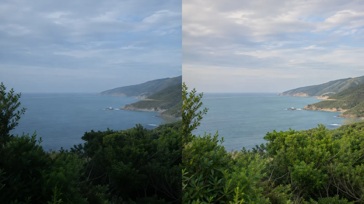
A worked example: a photo with a cool cast
Imagine a portrait made indoors under cool lighting. After Auto Balance, the face looks more natural, but a neutral shirt still appears blue. First, check whether the shirt is actually neutral and whether the light falling on it differs from the light on the face. If the blue cast remains distracting, make a modest Temp adjustment and compare the whole frame.
Then check Tint. If neutral areas still lean green or magenta, adjust Tint in the needed direction. Don’t push Temp and Tint just to make the shirt white if that makes skin look unnatural. The goal is not to remove every color variation. It’s to bring the intended subject into a believable relationship with the rest of the image.
This is a worked example, not a reported test result. It illustrates a decision process that applies to many stills: check the subject and a plausible neutral reference, use the relevant axis, and reassess the whole picture rather than optimizing one patch.
There’s another useful branch. Suppose the face looks natural but the background still appears blue. Ask whether the background is lit by a different source or reflects a colored surface. If it is, a global Temp move may make the face too warm while barely solving the background. In that case, keep the global correction restrained and consider whether the photo needs a targeted adjustment on the Color page.
If you don’t have a reliable neutral object, don’t invent one. Compare skin, known materials, and other images from the same lighting setup, but treat them as clues rather than proof. The picture may be intentionally warm or cool, and a neutral-looking wall is not always the goal.
A worked example: bright sky and dark foreground
Suppose an outdoor photo has a bright sky and a dark foreground. Auto Balance may adjust the image, but you still need to decide whether the foreground should reveal more detail or stay dark for mood. Inspect Highlights and Shadows separately. If the sky looks dull, reduce or undo the change that caused it; if the foreground is too dense, make a restrained shadow adjustment.
Don’t assume a highlight control can restore detail that wasn’t recorded in the source. A clipped area may contain little or no recoverable texture. Likewise, lifting every shadow can make an image look flat or reveal noise. Make an adjustment only when it improves the photo’s subject and intent.
A second decision is whether the sky and foreground need the same treatment. If a global adjustment improves the foreground but weakens the sky, that may be a sign that a broad control cannot solve both goals at once. You can keep the global result moderate and decide whether a more selective grade is worth the extra work. There is no need to force every tonal problem into one slider.
Treat exposure and mood separately. The foreground can be dark because the photograph is underexposed, or because the scene’s lighting and composition make a dark foreground useful. The viewer alone cannot tell you which interpretation is correct. Check the subject, context, and any reference you are matching before trying to make every dark area brighter.
How do you refine Auto Balance with each Photo slider?
Refine the result by connecting the visible problem to the appropriate control. Temp and Tint address different color axes; Lift, Gamma, Gain, Shadows, and Highlights affect tonal areas; Contrast, Pivot, Midtone Details, Saturation, and Hue address other image characteristics.
Don’t work through the controls as if you must set each one. A slider can remain untouched. The point of finding the section is to have the controls available when the image gives you a reason to use them.
Temp and Tint: correct a cast, not a mood
Use Temp when the image needs a warmer or cooler balance. In Blackmagic’s Resolve 21 guide, Temp is described along a warm/orange to cool/blue axis. Use Tint for a green-to-magenta adjustment. These controls are not interchangeable.
When adjusting, keep the viewer on the whole composition. A move that improves a neutral wall can harm the subject’s skin. A cooler white background may be correct for a scene lit by daylight; a warmer one may be right for a candlelit portrait. If the source contains mixed lighting, one global adjustment may improve one area while worsening another. That doesn’t mean you missed a hidden slider. It may mean the photo needs a more targeted approach elsewhere in Resolve’s grading tools.
Lift, Gamma, and Gain: work through the tones
Use Lift to examine the black point and shadows, Gamma for the middle tones, and Gain for the brighter portions of the image. Move one control at a time, then check both subject and background. A tonal correction that looks impressive on a small preview can become excessive when you inspect the full frame.
A useful practice is to decide what should remain anchored. If you want deep blacks, avoid lifting the whole shadow range just to see detail. If a face is too dark but the background is already bright, a global exposure-style change may not be the best answer. The Photo page’s adjustments provide broad controls; when you need selective control, DaVinci Resolve’s broader color-grading workflow may be more suitable. The official Photo page overview describes switching to the Color page for access to the full color-grading toolset.
Contrast and Pivot: avoid a one-slider rescue
Contrast changes the separation between dark and light portions of an image. Pivot changes where that contrast adjustment centers. If you increase contrast and the picture becomes harsh, don’t immediately counteract it by pulling several unrelated sliders. Check whether the contrast move is needed at all, then adjust Pivot if the tonal balance is being pushed around the wrong part of the image.
A flat photograph can be intentional: fog, a soft portrait, or a low-contrast product image may call for gentle separation. A dramatic landscape may benefit from stronger contrast. Auto Balance can’t know your delivery style or creative reference, so the decision remains yours.
Shadows and Highlights: protect detail and atmosphere
Shadows and Highlights let you work more selectively than a broad contrast move. If shadow areas look crushed, a small shadow adjustment may help. If bright areas appear too dominant, inspect Highlights. However, visible detail and pleasant-looking detail are not the same thing. A shadow can be dark by design, and a bright sky can be a deliberate compositional element.
Check for side effects. Raising shadows can make noise more visible. Reducing highlights can make a bright source look gray. If a change improves one portion but makes the overall photograph less convincing, back it off.
Saturation and Hue: know when color is the problem
Saturation changes color intensity across the image. Hue changes the placement of colors around the hue distribution. If a photograph looks too vivid or too muted overall, inspect Saturation first. If a color relationship looks wrong, examine Hue, but be cautious: a global hue adjustment can move many colors, not just the one you noticed.
For a photo with one troublesome color, a global Hue move may be too broad. A more selective grading method may be needed. Don’t use Saturation to repair a white-balance problem; color intensity and color balance are different issues.
Midtone Details: keep texture under control
Midtone Details affects the perception of detail in midtone regions. Increasing it can make textures feel more pronounced; reducing it can soften them. That doesn’t mean it creates new photographic detail. Use it sparingly, especially on faces, foliage, fine fabric, and high-frequency backgrounds. A strong adjustment can make texture look brittle or unnaturally smooth.
If you see what looks like extra detail after changing the control, judge the full image rather than zooming into one small patch. Fine texture can look appealing at high magnification and distracting at normal viewing size. Conversely, a subtle softening may be useful for a portrait but wrong for a detailed product shot. Make the call at the size and context that matter for the final image.
Why can’t you see Auto Balance sliders in DaVinci Resolve?
The most likely causes are a closed Inspector, the wrong Inspector tab, a collapsed or off-screen Adjustments section, or a selected item that is not the still photo you mean to edit. Check those before changing project settings or reinstalling Resolve.
Use this troubleshooting table:
| What you see | Likely reason | What to check |
|---|---|---|
| No Inspector panel | Inspector is hidden | Click Inspector on the Photo page toolbar |
| Inspector is open, but there is no Auto Balance | A different tab is selected | Choose Photo, not RAW, Effects, or File |
| RAW controls are visible | The RAW tab is active | Switch to Photo for Auto Balance |
| Photo controls are partly visible | The panel is too short or scrolled | Scroll within the Inspector and expand Adjustments |
| Controls change when you click another item | Selection changed | Select the intended still in the album or Media Pool |
| Adjustments are unavailable | The selected item may not be a supported still or you may be on another page | Return to Photo and select a photo |
| You’re following a tutorial with different labels | It may show another Resolve version or page | Confirm the version and the selected Inspector tab |
The Resolve 21 New Features Guide says the Inspector activates different tabs based on the selected media. For example, a RAW photo activates the RAW tab, while a normal post-debayered image such as a JPEG does not expose RAW controls. That’s a meaningful distinction, not a sign that the entire adjustment panel is missing.
If the Photo tab is present but you can’t find Adjustments, check whether the section is collapsed and whether the panel has been scrolled. The Inspector has its own scroll area. Moving the mouse wheel over the viewer or another panel won’t necessarily move the Inspector. Put the pointer over the Inspector area before scrolling.
If the item selection seems unclear, click the intended thumbnail and wait for the viewer to update. Then check that the same photo remains selected while you inspect the tabs. A selected RAW file can show different available sections from a JPEG, even when both appear in the same album.
If a tutorial screenshot doesn’t match your layout, compare the page and tab names first. Panel width, window size, and version differences can change how much of a section is visible. The stable navigation clues are the selected still, Inspector, Photo, and Adjustments. Don’t assume a control is gone just because it is below the visible area or the tutorial shows a wider panel.
Is Auto Balance in the Looks toolbar?
Resolve 21’s Photo page includes a Looks toolbar with its own controls, but don’t confuse a look preset with the Auto Balance adjustments. The Auto Balance sliders you’re trying to inspect are in the Inspector’s Photo tab under Adjustments. If you are looking at a toolbar above the viewer or at the Looks area, move to the Inspector.
A preset look can change the image’s appearance, but it isn’t the same thing as finding and refining the individual Auto Balance parameters. If a look seems to alter the result, check what is enabled and whether you’re evaluating the image with the expected effect state. Avoid stacking a preset on top of a balance correction until you know which change is responsible for the appearance you’re seeing.
A useful way to isolate the cause is to change one thing at a time. First, evaluate the Photo adjustments without adding a new look. Then, if you want to try a look, apply it separately and compare. If the picture changes, you’ll know which step caused the change. That makes it easier to keep a useful balance while deciding whether the preset helps the style.
Did the Photo page change between Resolve 21 and 21.1?
DaVinci Resolve 21 introduced the Photo page. Blackmagic’s September 8, 2026 announcement of Resolve 21.1 describes expanded camera-format support and the ability to adjust Photo page image settings in the Inspector using DaVinci color panels, including the Micro Color Panel.
The basic on-screen route described here remains the route in the Resolve 21 guide: select the photo, open Inspector, choose Photo, and find Adjustments. Resolve 21.1.2 was listed on Blackmagic Design’s support page as an update released October 27, 2026. Its summary focuses on timeline editing-point selection and other improvements, not a stated relocation of the Photo page’s Auto Balance controls. If your layout differs, rely on the current Inspector tab and section labels rather than assuming the exact panel arrangement in an older tutorial.
The 21.1 panel support matters if you use a supported color panel to adjust image settings, but it doesn’t remove the on-screen Inspector route. A physical panel can give you another way to manipulate controls; the Inspector remains the useful place to identify which Photo adjustment you are working with.
Blackmagic Design CEO Grant Petty described the new page this way: “The new Photo page in DaVinci Resolve 21 brings Hollywood’s most advanced color tools to still photography for the first time,” in the official Resolve 21 announcement. That statement explains the page’s broader purpose, but it doesn’t mean every Photo control behaves like a dedicated still-photo application. For the Auto Balance question, the specific control location in Blackmagic’s guide is the more practical reference.
If you’re comparing controls from video grading, remember that the Photo page is designed for still images and has its own Inspector organization. The Color page offers a larger grading environment; the Photo page gives you a still-photo workflow with convenient access to familiar Resolve tools. Blackmagic’s Photo page overview describes both the Photo adjustments and the option to switch to the Color page for its grading tools.
Does Auto Balance work differently on RAW and JPEG photos?
Auto Balance remains in the Photo tab’s Adjustments section, while RAW files also expose separate camera RAW controls. A JPEG doesn’t have the same RAW tab controls because it is already a processed image rather than the original sensor data.
For supported RAW media, the RAW tab provides parameters such as decode quality, white balance, color space, gamma, temperature, tint, and exposure. Blackmagic’s Resolve 21 guide says RAW controls operate on pre-debayered RAW data and are unavailable when the file is not RAW. It also notes that RAW adjustments are generally tuned to the camera.
The practical distinction:
- Use RAW controls when you want to adjust the camera’s RAW interpretation, including RAW-specific white balance and exposure.
- Use Photo adjustments when you want the Photo page’s general image controls and Auto Balance.
- Check both tabs deliberately when working with a RAW image, because similarly named controls can live in distinct processing stages.
Don’t assume that Auto Balance is a RAW-only operation just because a RAW file is selected. The button sits in the general Photo adjustments section. Also don’t assume the RAW tab must be present for Auto Balance to work: the tab is unavailable for non-RAW images, but the Photo tab is still the place to look for the adjustments.
This difference also explains why the same photo may appear to offer two white-balance routes. A RAW control changes camera-data interpretation; a Photo adjustment works in the Photo controls. If you are following instructions that say “set white balance,” check which stage the instructions mean before changing a value. The right choice depends on whether you are interpreting RAW data or refining the image in the Photo page.
Don’t compare RAW and JPEG slider numbers as if they were interchangeable. The image data and controls are different. A value in the RAW tab is not a shortcut to the same visual result as a value in Photo adjustments. Judge the image and identify which control group you intend to use.
What if the RAW controls look different from a tutorial?
Camera format and support matter. DaVinci Resolve 21.1 expanded support for certain still-photo camera formats, as Blackmagic explains in its 21.1 announcement. If your camera file is not recognized as RAW media in Resolve, the RAW tab may not behave as a tutorial shows. That’s different from the Photo adjustments being absent.
Check the file format, the media you selected, and the Resolve version shown in the application. If the image is a JPEG or another already processed format, you should expect the RAW section to be unavailable. For supported RAW, inspect the RAW tab for camera-oriented parameters and the Photo tab for Auto Balance and general adjustments.
If a RAW file opens but its camera controls are missing or incomplete, don’t assume Auto Balance has moved. First confirm whether Resolve recognizes the selected file as RAW. Then inspect the Photo tab separately. A supported image format and the general Photo adjustment section answer different questions.
The image may also have been converted before it reached Resolve. A file extension or filename alone may not tell you what processing has already happened. If you received the file from another application or a shared folder, ask how it was exported or inspect its media information. Use the RAW tab only when Resolve exposes the file as supported RAW media.
How do you reset Auto Balance without losing unrelated work?
Use the reset command that matches what you want to undo. The Inspector option menu distinguishes Reset Photo, Reset Camera Raw, Remove All Photo Effects, and Remove and Reset All; the last option has a broader effect than merely undoing a balance adjustment.
Before resetting, identify where the change lives:
- If the changes are in the Photo tab, consider Reset Photo.
- If you changed RAW controls, look for Reset Camera Raw.
- If you applied effects and want to remove them, Remove All Photo Effects is a separate command.
- If you choose Remove and Reset All, expect it to remove applied effects and reset the image, not just undo Auto Balance.
The Resolve 21 guide lists keyboard shortcuts for some Inspector commands when the Inspector is in focus: Command-R for Reset Photo, Shift-R for Remove All Photo Effects, and Command-Shift-R for Remove and Reset All. These are Mac-style shortcuts from Blackmagic’s guide. On Windows, check Resolve’s keyboard mapping or menu labels instead of assuming those key combinations are identical.
A reset is not always the best way to refine. If Auto Balance changed several parameters and only one looks wrong, adjusting that control may preserve useful parts of the result. If you are unsure, make a copy or save a version before a broad reset. Resolve’s versioning and project workflow can help protect a grade, but the exact method depends on your setup and how you manage the album.
Read the command name before you confirm it. “Reset Photo” and “Reset Camera Raw” target different groups. “Remove All Photo Effects” addresses effects. “Remove and Reset All” combines a broader reset with effect removal. If you only want to back away from one unwanted balance change, the broadest command is usually not the first one to try.
If a menu item is not available or a shortcut doesn’t appear to work, focus on the menu first rather than repeating the key combination. The shortcut may differ across operating systems or keyboard layouts, and the Inspector may not have focus. Confirm the command text and its scope, then decide whether it matches the change you want to undo.
Choose the smallest reset that reverses the change you actually want to remove.
Can you undo only one slider?
If you know which control caused the unwanted change, reset or return that control rather than clearing the whole photo. The exact reset affordance can vary with the control and panel layout. Look for the control’s own reset behavior, and confirm the viewer returns to the expected state before continuing.
If you cannot identify the responsible control, compare the current image against the original or use the broader Photo reset with care. Avoid repeated blind resets: they can remove other adjustments you meant to keep, and a reset of the entire Photo section is not the same as resetting RAW settings or removing effects.
A sensible working sequence is:
- Note the adjustment you are about to change.
- Make a modest correction.
- Compare the resulting image.
- Undo or reset that one change if it didn’t help.
- Use the broader Inspector reset only when you intentionally want to discard the broader set of changes.
This is why changing one control at a time helps. If you move Temp, Tint, Contrast, and Saturation together, you may not know which change created the unwanted look. If you adjust one control, inspect the image, and then continue, you have a clearer way back.
If you have already made several changes and cannot remember which one caused the problem, avoid guessing at a series of sliders. Use a suitable undo or reset route, or return to a known earlier state if you have one. The right recovery choice depends on what else you changed after Auto Balance. A broad reset can discard useful edits made later, so read the scope before choosing it.
Does Auto Balance overwrite a preset or effect?
Auto Balance, Photo adjustments, looks, and effects are different parts of the workflow. If the image changes unexpectedly, inspect which look or effect is active and whether it contributes to what you see. The Inspector’s Effects tab is available when an effect is applied; the guide says the tab is grayed out when no effect is applied.
Don’t conclude that Auto Balance itself is the cause just because the image looks different after clicking it. Check whether a look is enabled, whether an effect is active, and whether you are comparing the same selected photo and viewer state. The right test is a controlled comparison: toggle or reset one thing at a time.
If you started with a look before using Auto Balance, note that order when evaluating the result. The image you see may reflect more than one adjustment. Rather than repeatedly clicking Auto Balance, isolate the visible changes: check the Photo controls, check whether an effect is active, and compare the same image under the same viewer state.
A preset is not a reliable neutral reference. It may be designed to shift color or contrast. If you want to judge the Auto Balance result, temporarily remove or disable other variables only when you know how to restore them. Otherwise, keep the current state and make a deliberate comparison without changing several parts of the image at once.
When should you use the Color page instead of Photo adjustments?
Use the Photo page adjustments for a quick global balance and straightforward still-image refinement. Move to the Color page when you need Resolve’s fuller node-based grading tools, such as more targeted or layered corrections.
Blackmagic describes DaVinci Resolve 21’s Photo page as integrating still-photo work with the Color page, including node-based grading. Its Photo page product overview also describes starting with familiar white balance, exposure, and primary adjustments before switching to the Color page for the full color-grading toolset.
That doesn’t make one page universally better. The Photo page is the direct place to find Auto Balance and make basic refinements in the same Inspector. The Color page can suit work that benefits from a node graph, qualifiers, windows, or more involved combinations of corrections. If you want an introduction to Resolve’s broader grading concepts, see How to Color Grade in DaVinci Resolve: The Basics.
A simple decision rule:
| Your task | Start here |
|---|---|
| Find Auto Balance and make a broad still-image correction | Photo page, Inspector > Photo > Adjustments |
| Change RAW decode, camera white balance, or RAW exposure | Photo page, Inspector > RAW |
| Build a more involved grade using nodes or selective tools | Color page |
| Organize a collection of stills and inspect them together | Photo page albums and Lightbox |
| Check tonal distribution while refining | Inspector scopes, including the histogram |
The pages are parts of one application, not competing products. You can use Photo to organize and balance a still, then use the Color page for more detailed grading. Resolve’s official Photo page overview presents that handoff as part of the still-photo workflow.
Here’s a practical boundary: if the problem can be described as “the whole image looks a little too cool,” start with the Photo adjustments. If it is “the face needs a change but the background must stay as it is,” you may need a more selective tool. Moving pages doesn’t mean the Auto Balance controls are missing. It means the task has grown beyond a simple overall adjustment.
You can also stop in Photo. Not every image needs nodes, masks, or a long grading session. A straightforward balance and a restrained correction may be all the image needs. Use the more involved page when the picture gives you a reason.
How do you check whether Auto Balance improved the photo?
Compare the image against its purpose, not against a rule that every neutral object must become perfectly neutral. Inspect the subject, important colors, and tonal detail, then decide whether the balance is more useful for the intended output.
Try this short review:
- Subject first: Does the person, product, or main object still look believable?
- Color cast: Does a known neutral object look plausible, or is the scene’s lighting intentionally colored?
- Shadows: Are important dark details visible without flattening the image?
- Highlights: Do bright areas keep the detail the photograph needs?
- Color intensity: Do strong colors feel natural for the scene?
- Context: Does the correction still fit the mood and other photographs from the same shoot?
If you’re processing a batch or album, don’t assume one Auto Balance result should be copied blindly to every frame. Images from the same session may differ in direction, exposure, mixed lighting, or subject position. Compare each photo and decide whether a shared correction is useful. Resolve’s official announcement describes Photo albums as a way to manage collections, view images in Lightbox, and grade while seeing the album context, but that doesn’t make every frame identical.
The screen itself is part of the judgment. A very bright display can make shadows seem more visible than they will be elsewhere; a dim display can make the whole image feel darker. The purpose here isn’t to prescribe a display calibration process. It’s to avoid mistaking a viewing condition for a slider problem. If you’re uncertain, compare with a known reference or review the image on another suitable display before making a large correction.
When the photo is part of a set, compare it beside nearby images rather than judging it in isolation. Consistency may mean similar skin tone, contrast, or overall mood, not identical control values. A sequence can look coherent even when each frame needed a different amount of correction.
A helpful review order is to start at normal viewing size, then zoom in only if you need to inspect detail. At normal size, ask whether the subject and overall mood work. At closer magnification, check whether texture or shadow recovery introduces a problem. If a change looks good only when zoomed far in but distracts at normal size, back it off.
Should you balance every photo in an album?
No. Apply Auto Balance where it helps, and leave a photo alone when its existing color and tonal relationships already work. A consistent set is not necessarily a set where every image has identical numerical adjustments.
For a wedding series, for example, one photo may be in open shade, another under tungsten light, and another at sunset. Making all three equally neutral could erase the feel of the setting. For a product catalog, consistency may matter more, but the background and lighting still need to be evaluated. These are illustrative decisions, not measured outcomes.
The useful question isn’t “Did I click Auto Balance on everything?” It’s “Does this image belong with the rest of the set, and does its subject read correctly?” Use a neutral reference where appropriate, compare neighboring photos, and keep the correction that serves the work.
For a set of similar frames, make the decision in two passes. First, look across the album and identify which photos share lighting and subject conditions. Then assess each frame individually. Two images from the same shoot can still differ because a person moved into shade, a cloud changed the light, or the camera angle changed what the frame contains.
If you want a consistent visual style, consistency can come from a shared intent rather than copying every setting. You might aim for a similar warmth or contrast across a set while allowing each image to retain differences in exposure or atmosphere. The Photo page’s album view can help you judge an image in relation to others, but the images still need individual attention.
If a batch contains images from different cameras or processing stages, don’t assume a correction that suits one file will suit the rest. A RAW photo and an already processed image may expose different controls. Check the media type and review the results rather than treating all thumbnails as interchangeable.
What should you do if Auto Balance does nothing or looks wrong?
First confirm the correct photo is selected and that you clicked the Auto Balance control in Photo > Adjustments. Then inspect the viewer, the same adjustment controls, and any active looks or effects before trying a reset.
Work through these checks in order:
- Confirm selection. Verify the viewer and selected thumbnail refer to the same photo.
- Confirm the page. Make sure you are on Photo, not the Color page or another page.
- Confirm the tab. Open Inspector and select Photo.
- Confirm the section. Scroll to Adjustments and locate Auto Balance there.
- Wait for the result to appear. For a large image or a busy system, give the viewer time to update before clicking repeatedly.
- Check for an active look or effect. A preset or effect may affect what you see.
- Inspect controls. Look for changes to Temp, Tint, tone, or color adjustments in the section.
- Compare carefully. Toggle or reset the relevant change rather than applying Auto Balance repeatedly without knowing what changed.
The official Resolve 21 guide describes the Photo page’s preview-resolution choices under Playback > Photo Album Preview Resolution. It says Auto reduces images above 4K resolution to a 4K preview, while Full, Half, and Quarter provide other preview choices. The guide also notes that preview resolution does not determine the final export resolution. If the viewer appears soft or updates slowly, check preview settings before treating that as a color-balance failure.
If the viewer hasn’t changed after clicking Auto Balance, don’t assume that a hidden slider is the issue. Verify selection and wait for the display to update. If the app is unresponsive or the behavior persists, note the Resolve version, operating system, image format, and whether the image is RAW or processed before consulting Blackmagic support or its forum. Those details help distinguish an interface-navigation question from a media or performance issue.
Use the symptom to pick the next check:
| Symptom | Next useful check |
|---|---|
| No visible change in the image | Check selection and inspect the controls before clicking again |
| Image shifts, but in the wrong direction for your intent | Refine the relevant controls or use a reset that matches your goal |
| The image looks different only when a look is active | Isolate the look from the Photo adjustments |
| The viewer is soft or slow to update | Check preview resolution and allow time for the viewer |
| Only one file behaves differently | Check its format and whether it is RAW or processed |
| The Inspector controls belong to another selection | Select the intended photo and confirm the viewer updates |
This table is about diagnosis, not a promise that each symptom has only one cause. A slow or soft preview, for example, is not proof that the color operation failed. Likewise, an unchanged-looking image is not proof that a control is broken; the image may already have been close to the balance Resolve chose, or the result may be subtle at the current zoom.
Avoid clicking Auto Balance repeatedly as a test. If you don’t know what the button does to the current parameters, repeated clicks make it harder to understand the state you’re evaluating. Apply it once, inspect the controls, and make one deliberate change if needed. If the result remains unexpected, preserve the current state and gather the file format, version, and selection details before troubleshooting further.
If a particular file appears to be the exception, try another supported still in the same project as a comparison. This is a diagnostic check, not a guarantee that the second file will behave identically. If controls appear for one image but not another, selection or media-type differences are worth checking before changing system settings.
Can an on-screen assistant help you find the controls?
If the problem is navigating a changing interface, an on-screen assistant can give task-specific guidance while DaVinci Resolve is open. The main fix remains simple: select the still, open Inspector, choose Photo, and expand Adjustments.
TryUncle is an on-screen assistant for Mac and Windows. You can ask for guidance while Resolve is open, and Uncle uses the current screen and conversation to point you toward relevant controls. You stay in control and perform the actions. It can be useful when the panel layout or a tutorial’s version doesn’t match what you see, but you can also follow the steps above without it.
What should you do next?
Select one photo, open Inspector > Photo > Adjustments, and use Auto Balance only as a starting point. Refine the controls that serve the image, choose a reset only when its scope matches what you want to undo, and leave the rest alone.
Frequently asked questions
- Where are Auto Balance sliders in the DaVinci Resolve Photo page?
- Select a photo, open the Inspector, choose Photo, and expand Adjustments. Auto Balance and the related Temp, Tint, tonal, and color controls appear there.
- Why can’t I see the Auto Balance sliders in DaVinci Resolve?
- The Inspector may be closed, the selected item may not be a photo, or you may be looking at the RAW tab instead of Photo. Select a still image, open Inspector, then choose Photo and expand Adjustments.
- Does Auto Balance change RAW settings or Photo adjustments?
- Auto Balance is in the Photo tab’s Adjustments section. RAW files also have separate camera RAW controls in the RAW tab, so don’t confuse those controls with Auto Balance.
- How do I undo Auto Balance in DaVinci Resolve 21?
- Use the reset control for the relevant adjustment section or Inspector menu options. The Inspector menu includes Reset Photo, Reset Camera Raw, and Remove and Reset All; choose carefully because the last option also removes applied effects.
Sources
Put this guide to work with TryUncle.
Ask about the step you’re on. TryUncle sees your screen and points at the control you need, so you can keep learning in your own project.
Get TryUncle for Mac or WindowsKeep reading
Guides · Sep 29, 2026 · 24 min
How to Use DaVinci Resolve 21 Photo Page
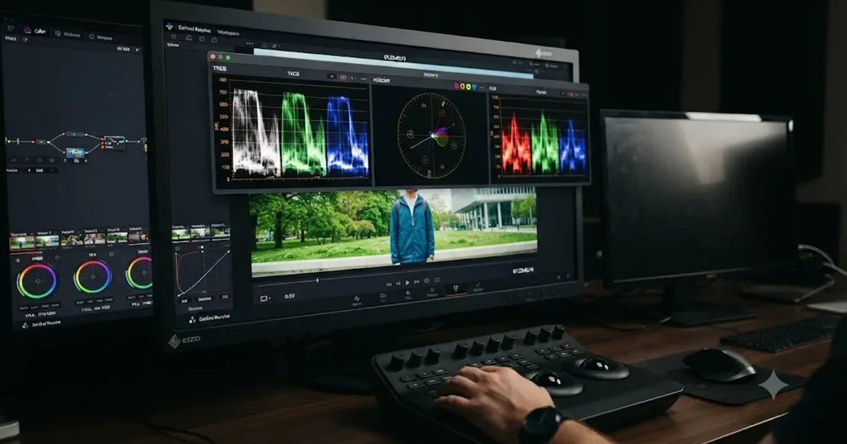
Learn how to use DaVinci Resolve 21 Photo page to import, organize, grade, compare, and export still photos in Resolve 21.1.
Guides · Jul 10, 2026 · 30 min
How to Read DaVinci Resolve Scopes: Waveform and Vectorscope
Learn to read DaVinci Resolve's waveform, RGB Parade, and vectorscope: what balanced exposure, white balance, and skin tone actually look like on each.

Guides · Jul 7, 2026 · 35 min
How to Color Grade in DaVinci Resolve: The Basics
Learn how to color grade in DaVinci Resolve: build a node chain, balance shadows and highlights with Lift, Gamma, and Gain, and read the scopes.