Articles / Guidesupdated for DaVinci Resolve 21.0.3 (July 2026)
DaVinci Resolve Color Grading Workflow for Colorblind Editors
Quick answer
A DaVinci Resolve color grading workflow for colorblind editors grades by the numbers, not by eye. Use the Waveform, RGB Parade, Vectorscope, and skin tone indicator instead of hue perception, label every node with text rather than trusting node color, verify Qualifier mattes in high-contrast black and white, and get a second opinion before locking final saturation.
We don't have personal experience with color vision deficiency, so this guide leans on published research, Blackmagic's own documentation, and on-record accounts from colorblind editors and colorists, checked against every tool actually inside DaVinci Resolve. We do have seven years of professional, commercial video editing behind us and we run a 100,000+ member professional video-editing community, and a version of this exact question comes up there on repeat: can you actually grade color if you can't reliably tell red from green. As of August 2026, the honest answer is yes, and the workflow that makes it possible is mostly just good color grading practice, tightened around the one place color blindness actually changes the equation.
DaVinci Resolve wasn't built with color vision deficiency in mind. Nothing about its Color page assumes you might see fewer hues than the person who designed the interface. That's not a reason to avoid the software. It's a reason to lean harder on the parts of Resolve that were never colored in the first place: the numbers.
What does a DaVinci Resolve color grading workflow for a colorblind editor actually look like?
It looks like grading by numbers and positions instead of by hue. Check exposure on the Waveform, white balance on the RGB Parade, and saturation on the Vectorscope's skin tone line and percentage scale, since none of those readings ask you to correctly name a color. Label every node with text through Node Label rather than trusting node color alone. Switch Qualifier mattes into high-contrast black and white with Option-Shift-H so a selection reads as a shape, not a color. And get a second opinion before locking a final creative saturation choice, the one part of grading that genuinely does still involve a subjective color judgment.
None of that is a separate, lesser version of "real" color grading. It's the same discipline every working colorist is already supposed to apply, tightened around the one place color blindness changes the math: you don't get to fall back on "it looks right" the way a colleague with typical color vision can. DaVinci Resolve's scopes were built to replace a human eye's guesswork with a measurement, and that design accident is exactly what makes a full grading career possible without relying on color perception at all. The rest of this guide walks through why, and exactly how to set Resolve up to work that way from your very first project.
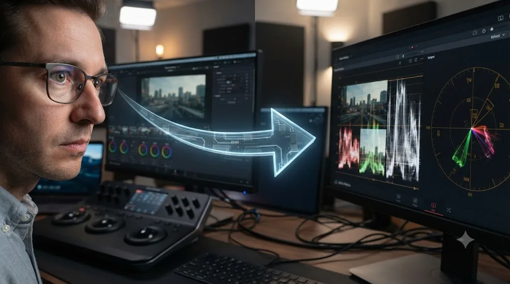
How many video editors and colorists are actually colorblind?
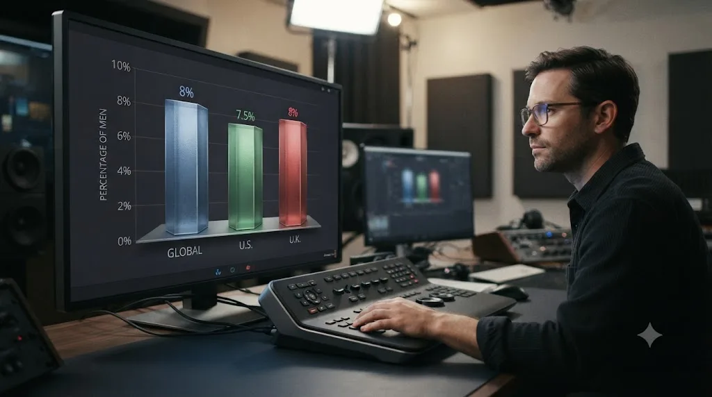
More than most edit bays realize, because color blindness rarely gets mentioned out loud at work. Globally, about 8 percent of men and 0.5 percent of women have some form of inherited color vision deficiency, per Colour Blind Awareness's overview of types of colour blindness, a figure that climbs to 10 to 11 percent of men in parts of Scandinavia specifically.
In the United States, about 7 percent of the male population, roughly 10.5 million men, either can't distinguish red from green or see those colors differently than most people do, according to Vision Center's review of color blindness prevalence data. In the UK, Colour Blind Awareness puts the number at 1 in 12 men (about 8 percent) and 1 in 200 women, adding up to roughly 3 million colorblind people in Britain, about 4.5 percent of the entire population, and notes that any workplace with more than twelve male employees is statistically likely to have at least one colorblind staff member on the same types page.
Run those numbers against any editing team, freelance roster, or Discord server full of Resolve users, and the math is blunt: color blindness isn't a rare edge case in this industry. It's a near-certainty in any room with more than a handful of men in it, most of whom have never mentioned it because nobody asked and the software never brought it up either.
EnChroma's own 2021 workforce survey of 810 colorblind respondents, the largest of its kind at the time, found that 90 percent said correctly identifying colors plays a role in their job, 75 percent said being colorblind slows them down at work, and over 20 percent said they can't perform certain work that requires accurate color identification, per EnChroma's published study results. Erik Ritchie, EnChroma's CEO, framed the finding plainly in the same release: "Colour blind people are just as successful and productive as any employee, but they can use a hand to reduce the everyday nuisances and obstacles they experience related to colour in the workplace." Color grading, a job built entirely around color, is about as color-critical as work gets. That's exactly why this guide exists.
What are the different types of color blindness, and how does each change what you see in a grade?
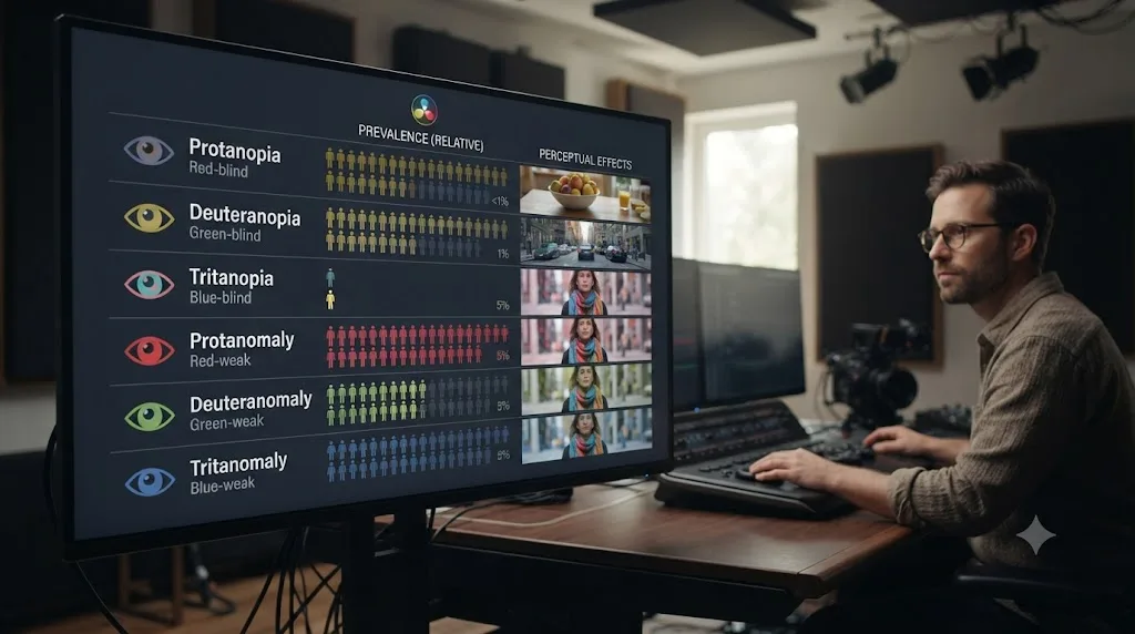
Not all color blindness looks the same at a grading station, and the specific type someone has changes which parts of this guide matter most to them. Color vision deficiency isn't one condition. It's a family of conditions, most inherited, that reduce or remove sensitivity to red, green, or blue light in different combinations and different severities.
| Type | Roughly how common in men | What changes | What it means at the grading station |
|---|---|---|---|
| Deuteranomaly (green-weak) | ~5%, the most common single type | Reduced sensitivity to green light | Reds, greens, browns, and oranges blur together; the most likely type sitting at any given edit bay |
| Protanomaly (red-weak) | ~1% | Reduced sensitivity to red light | Similar reds/greens/browns confusion, plus reds can look darker than they actually are |
| Deuteranopia (no green cones) | ~1% | No green perception at all | Full red-green confusion with no partial cue to fall back on |
| Protanopia (no red cones) | ~1% | No red perception at all | Same full red-green confusion, with red specifically reading much darker |
| Tritanomaly / tritanopia (blue-weak or absent) | Roughly 1 in 30,000-50,000, affects men and women equally | Reduced or absent blue sensitivity | Blue-yellow and violet-red distinctions swap or vanish; rare enough most bays never encounter it |
| Achromatopsia (monochromacy) | About 1 in 33,000 | No color perception at all | Full grayscale vision; every technique in this guide becomes mandatory, not optional |
Those figures come from Colour Blind Awareness's breakdown of colour blindness types, which also describes the practical experience of each type in plain terms: someone with protanopia or deuteranopia sees a world of "murky greens where blues and yellows stand out," with brown, orange, and red-green combinations easily confused, while someone with tritanopia is more likely to mix up light blues with grays and mid-greens with blues.
Deuteranomaly alone accounts for roughly 5 of every 8 colorblind men, which makes it the single most common form of color vision deficiency any editing team is likely to encounter. That matters for this guide's scope: most of what follows is written with red-green deficiency specifically in mind, since it covers the overwhelming majority of colorblind editors a Resolve project will ever pass through. Tritan-type deficiency and total monochromacy get their own notes where the workflow genuinely differs.
Does DaVinci Resolve have a colorblind mode or color vision simulator?
No. As of DaVinci Resolve 21.0.3, Blackmagic Design has not shipped a built-in colorblind simulation, filter, or accessibility mode anywhere in Resolve, and nothing on Blackmagic's own Color page, which lists every scope, qualifier, and grading tool the software ships with, mentions one. That's a real gap, not an oversight on your part if you went looking for it and came up empty.
It's worth naming honestly rather than working around silently: Photoshop has a View > Proof Colors simulation for a handful of conditions, and some design tools ship a colorblind preview mode by default. Resolve doesn't have an equivalent, and there's no indication one is coming in a near-term point release. If you're hoping Resolve itself will one day show you what your grade looks like to a colorblind viewer, or let you toggle a filter that corrects for your own deficiency while you work, that feature doesn't exist yet.
What does exist sits one layer up, at the operating system, and one layer over in free third-party tools built specifically for this. The next two sections cover both, and where each one genuinely helps versus where it can quietly mislead you.
Should you turn on your Mac or Windows color filters while grading in DaVinci Resolve?
For reading Resolve's own interface, yes, cautiously. For judging your actual graded image, no, and this distinction matters more than it sounds like it should. Both macOS and Windows ship system-wide color filters built for color vision deficiency, and both apply to literally everything on screen, including your viewer.
On a Mac, go to System Settings > Accessibility > Display > Color Filters, and choose from Red/Green (for protanopia), Green/Red (for deuteranopia), Blue/Yellow (for tritanopia), or a grayscale option, per Apple's own support documentation. Option-Command-F5 toggles filters on and off quickly once configured, or three quick presses of Touch ID on a Mac that has it. On Windows, press Windows key + U, or go to Settings > Accessibility > Color filters, and choose from deuteranopia, protanopia, or tritanopia presets with adjustable intensity, per Microsoft's support guide. Windows key + Ctrl + C toggles the filter once the shortcut is enabled in settings.
Here's the trap. An OS-level color filter recolors your entire screen, including the graded image in your viewer, which means it's actively lying to you about the footage the moment you turn it on. A filter built to help you tell a red node dot apart from a green one is, by design, also remapping the actual colors of the shot you're trying to judge. Leave it on while you're evaluating a final grade and you're not grading the footage anymore. You're grading a filtered version of it that nobody watching the delivered file will ever see.
The workable pattern most colorblind editors land on is toggling the filter on specifically to read the interface, node dots, timeline flags, the small colored icons scattered across Resolve's UI, then toggling it back off before making any actual color decision in the viewer. Treat it as a UI reading aid you switch on and off deliberately, never as a permanent lens you grade through.
| Situation | Filter on or off | Why |
|---|---|---|
| Reading node colors, timeline flags, or UI icons | On is fine | The filter's job is distinguishing interface elements, not judging footage |
| Checking exposure, white balance, or saturation on a shot | Off, use the scopes instead | The filter recolors the actual image you're trying to judge |
| Reviewing a final grade before delivery | Off | Nobody watching the delivered file sees your filter |
| Quickly identifying which of several similarly labeled nodes is selected | On, briefly | A fast interface check, not a color judgment |
Third-party CVD simulators work differently and serve a different purpose entirely: they show you, or a sighted collaborator, what a specific still would look like to a colorblind viewer, for review purposes rather than as something to grade through. Sim Daltonism, a free, open-source Mac and iOS app by Michel Fortin, lets you drag a floating window over any part of your screen to preview deuteranopia, protanopia, tritanopia, or monochromacy in real time. Color Oracle does the same job as a free, cross-platform full-screen filter for Windows, Mac, and Linux. Both are genuinely useful for a sighted director or supervisor checking whether a specific shot's color-coded graphic or a subtle grade choice will read correctly for a colorblind audience member. Neither is meant to run continuously while you grade.
How do you build a color grading workflow that doesn't depend on hue perception?
Around DaVinci Resolve's scopes, specifically the Waveform, RGB Parade, and Vectorscope, since all three report a shot's technical state as numbers and positions rather than as colors you have to correctly identify by eye. This is the actual core of everything in this guide, and it's worth understanding why it works before walking through each scope individually.
Jarle Leirpoll, a filmmaker and colorist, put the underlying principle bluntly in a piece for Frame.io Insider: "You trust your scopes. Video scopes never lie." That advice is usually framed as a warning against trusting an uncalibrated monitor. For a colorblind editor, it does something more direct: it replaces an entire category of judgment call, "does this color look right," with a category that never depended on typical color vision in the first place, "where does this trace sit relative to a fixed target."
The Waveform plots brightness on a 0 to 1023 vertical scale, per our full guide to reading DaVinci Resolve's scopes, with shadows near the floor and highlights near the ceiling. Reading it requires distinguishing a trace's height, not its hue. The RGB Parade splits that same signal into three separate channels, red, green, and blue, displayed side by side, and a neutral object's three traces should sit at the same height when white balance is correct. Reading that comparison is a height-matching task across three separate graphs, not a color-naming task. The Vectorscope maps hue and saturation onto a circle, which sounds like the one scope that would defeat a colorblind editor, and it's the one that needs the most specific technique, covered in the next section.
None of DaVinci Resolve's three primary scopes ask you to correctly name a color. They ask you to compare a position, a height, or a distance against a fixed target, which is a task color vision deficiency doesn't touch at all. That single fact is the entire reason a full grading career is possible without relying on hue perception. It's also, not coincidentally, the exact workflow every serious working colorist is already supposed to follow, sighted or not, because a monitor lies to everyone eventually.
An editor who became the primary color corrector at Pritt Entertainment Group after starting out worried their color blindness would disqualify them from the job described exactly this shift in a company blog post: "We live in a digital world and that applies to coloring footage in software like [Adobe] Premiere," relying on vectorscopes and waveform monitors to read numerical red, green, and blue levels instead of trusting their own color perception, per PEG's own account of the story. The tool was Premiere in that specific case, but the underlying scope reading is identical in DaVinci Resolve, and Resolve's scope set is, if anything, more complete.
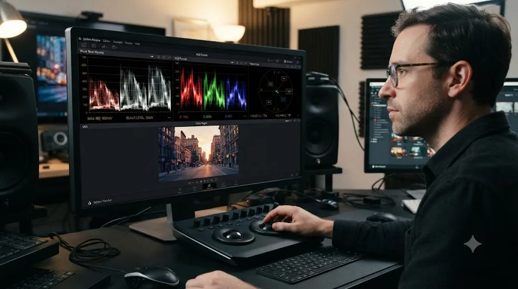
How do you read DaVinci Resolve's vectorscope and skin tone line if you can't reliably tell hues apart?
By distance and angle, not by naming the hue at all. The vectorscope maps every pixel in your frame onto a circular graph, where distance from the center represents saturation and angle around the circle represents hue, per Blackmagic's own manual. That sounds like exactly the scope a colorblind editor would struggle with, since it's fundamentally a hue map. In practice, it's workable precisely because you never have to identify a hue by looking at it. You're comparing a trace's angular position against a fixed reference line, which is a geometry task, not a color-naming task.
The single most useful reference for skin specifically is the vectorscope's built-in skin tone indicator. Open the vectorscope's settings and enable Show Skin Tone Indicator, and a diagonal line appears between the red and yellow targets, at roughly the ten o'clock position on the circle. Skin, across every human complexion, falls on almost exactly that same hue angle, a real physical property of how melanin and hemoglobin interact with light, not an approximation. Isolate skin with a qualifier or power window, zoom into the vectorscope, and check whether the isolated trace sits near that line's angle. If it does, skin is color-balanced correctly, regardless of what color you personally perceive that trace to be.
Saturation gets checked the same geometric way: distance from center, not the specific hue at that distance. Skin tones generally fall between roughly 20 and 50 percent saturation, closer to the center than the outer edge, a rule of thumb our full scopes guide covers in more depth. You don't need to see that a trace is "too red." You need to see that it's sitting further from center than the 20 to 50 percent band, which is a measurement any vectorscope reading gives you regardless of hue perception.
A vectorscope trace's position, its distance from center and its angle around the circle, tells you everything the scope has to offer, and neither measurement requires you to correctly name the color at that position. That reframing is the difference between the vectorscope being the one scope a colorblind editor can't use, and it being the scope that settles color balance questions faster than eyes alone ever could, for any editor, colorblind or not.
For deuteranopia and protanopia specifically, the red-magenta-yellow region of the wheel, roughly where the skin tone line sits, is exactly where hue confusion is worst. That makes the skin tone indicator line more load-bearing for those two types than for deuteranomaly or tritan-type deficiency, where the confusion sits in a different part of the circle. Whatever your specific type, the fix is the same: enable the line, check the angle, trust the number over the impression.
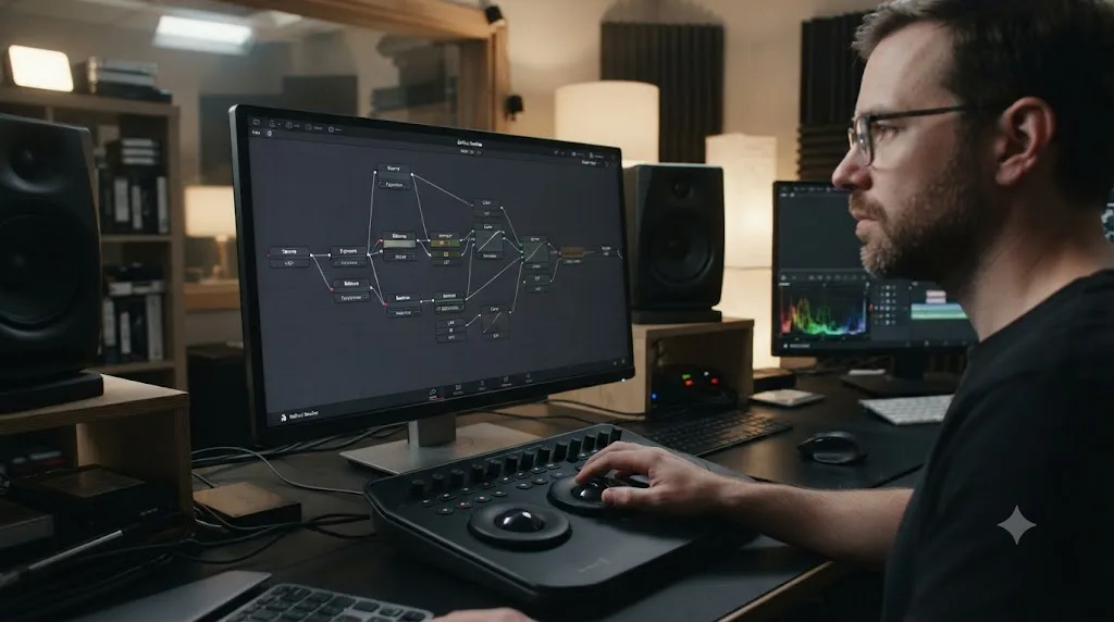
How do you organize nodes so you're not relying on node color to track your own grade?
With text labels first, and node color as a secondary, non-essential layer on top. DaVinci Resolve lets you right-click any node in the Color page and choose Node Label to rename it, or Set Color to color-code it, per our full guide to node labels and colors. Most tutorials teach color-coding as the primary organizational system: blue for balance, green for secondaries, purple for looks, whatever convention a given colorist prefers. For a colorblind editor, building your entire node map around a color convention you may not reliably perceive is a structural risk waiting to surface the moment a six-node chain needs revisiting three weeks later.
Text labels don't have that failure mode. A node labeled "Balance," "Skin Secondary," or "Sky Qualifier" reads identically regardless of what color vision the person reading it has. Default-sized nodes show up to 12 characters before truncating, per our node labels guide, so short, specific names read better than full sentences: "Exposure," "WB fix," "Look" all fit cleanly.
That doesn't mean skip color-coding entirely. Color still helps at a glance, for you and for anyone else who opens your project, and there's no reason to give up a genuinely useful organizational layer just because one channel of it, hue, is less reliable for you personally. The fix is ordering your reliance correctly: read the label first, treat the color as a bonus confirmation when it happens to be legible, and never build a workflow where the color is the only place a node's purpose lives.
| Organizational layer | Reliable for a colorblind editor? | Role in your workflow |
|---|---|---|
| Node Label (text) | Yes, always | Primary identification, read this first |
| Node color (Set Color) | Depends on your specific CVD type and the palette used | Secondary confirmation, useful but never load-bearing alone |
| Node badges and tooltips | Yes, text-based | Extra context on hover, same reliability as labels |
| Sticky notes on the node graph | Yes, text-based | Good for longer explanations a short label can't hold |
A node's color can fail you the moment lighting, monitor calibration, or your own specific type of color blindness makes two of Resolve's default node colors look similar enough to confuse. A node's text label can't fail that way, ever. Build the habit of labeling every node the moment you create it, not as cleanup at the end of a session, and the color-coding question stops being load-bearing at all. If you do want a color system as backup, our node labels and colors guide covers building one that also holds up for sighted collaborators reviewing your project later.
How do you verify a Color Qualifier selection you can't judge by color?
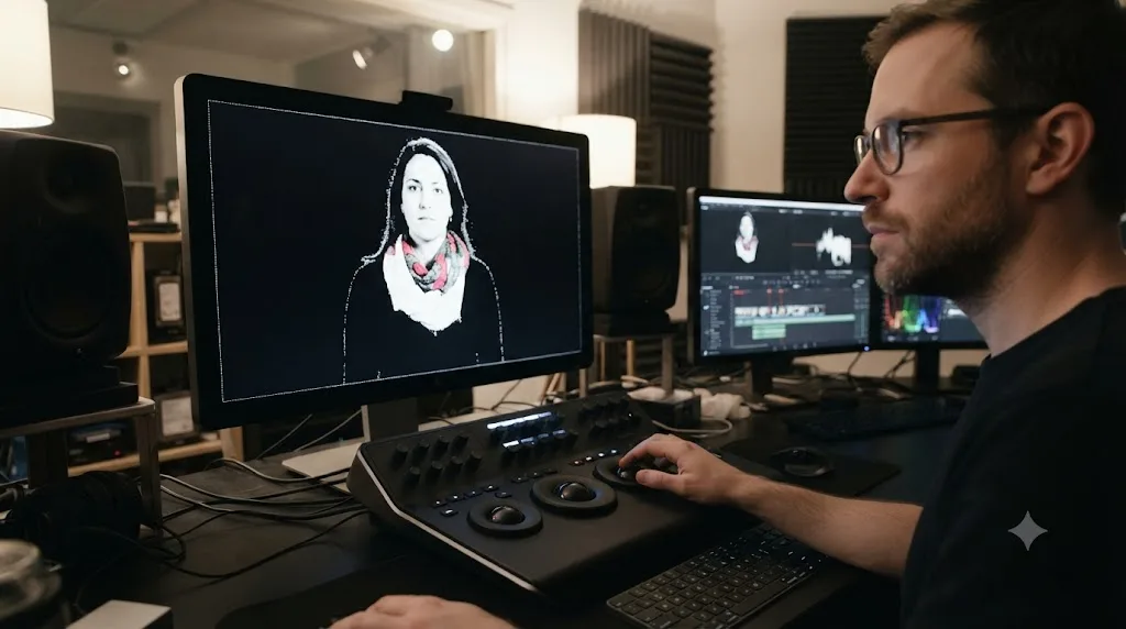
By switching Resolve's matte view to high-contrast black and white instead of trying to eyeball whether a colored selection looks complete. This is one of the more specific, genuinely load-bearing techniques in this entire guide, and it's built directly into Resolve, not something you have to work around.
Press Shift-H to toggle Highlight, which shows the selected portion of the image in its original colors and the unselected portion as flat gray, per Blackmagic's manual. That default mode is only partly useful here, since it still asks you to judge selected-versus-unselected partly by whether the color looks "present." Press Option-Shift-H (Alt-Shift-H on Windows) instead, and the view flips to pure black and white: the selected portion of the image reads white, the unselected portion reads black, with zero color information left in the display at all. Judging a matte in that view is a shape-and-edge task, not a color task, and it works identically regardless of your color vision.
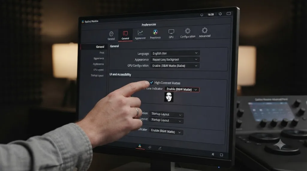
If you'd rather not remember to toggle the high-contrast variant every time, there's a permanent setting for it. Under Preferences > User > Color, enable the checkbox labeled "Mattes display high contrast black and white," and every future Highlight toggle defaults straight to the black-and-white view rather than the flat-gray one. Turn this on once, at the start of your very first Resolve project, and you never have to think about which Highlight shortcut to reach for again.
A qualifier selection judged in high-contrast black and white shows every stray pixel and thin gap in stark relief, which is a genuinely better way to catch a bad matte than judging it in color, for any editor, not just a colorblind one. That's worth sitting with. This isn't a workaround that makes a colorblind editor's qualifier work merely adequate. For catching edge noise and holes specifically, it's the more rigorous method, and most sighted colorists never bother switching to it because the default view looks fine enough to their eyes.
Our full guide to fixing a Color Qualifier that's not selecting correctly covers the rest of the Matte Finesse toolkit, Pre-Filter, Denoise, and Blur Radius, for cleaning up whatever the high-contrast view reveals. None of those cleanup tools depend on color perception either, since they're all judged against the same black-and-white matte you're already reading.
How do you use markers, flags, and clip colors without relying on color memory?
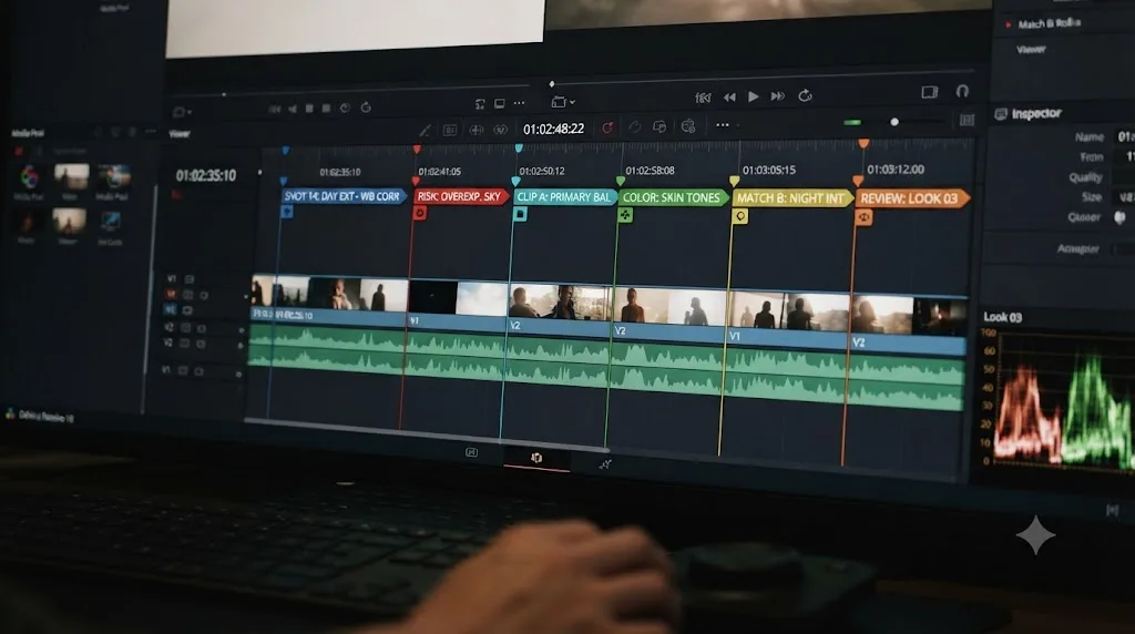
The same way you organize nodes: text first, color second. DaVinci Resolve gives you 16 marker and flag colors to choose from, including Blue, Cyan, Green, Yellow, Red, Purple, Fuchsia, Rose, Lavender, Sky, Mint, Lemon, Sand, Cocoa, and Cream, per Blackmagic's manual on flags, markers, and clip colors. That's a lot of colors, several of which sit close enough on the spectrum, Rose versus Fuchsia, Sand versus Cocoa, Mint versus Sky, that even editors with typical color vision mix them up in a busy timeline.
The manual notes that markers can carry a name and a note, not just a color, and that's the feature to lean on. Instead of building a system where "green marker means client note, yellow marker means needs a fix," which requires you to correctly identify green versus yellow every time you scan the timeline, type the actual word into the marker's name field: "CLIENT NOTE" or "NEEDS FIX," directly in the text. Resolve's marker panel lists every marker with its note text visible, searchable, and filterable, all without asking you to distinguish 16 colors from each other first.
Flags work slightly differently from markers, per the same manual page: flagging one clip flags every other clip in the Media Pool that shares the same source media, while marker colors and clip colors are frame-specific and clip-specific respectively. That distinction matters less for this guide's purpose than the underlying fix does. Whichever of the three you're using, markers, flags, or clip colors, treat the color as a fast visual sort for people who can reliably read it, and treat the text field as the actual information for everyone else, including you.
Keyboard navigation removes color from the equation entirely for moving between markers. Jumping marker to marker along the timeline with the standard navigation shortcuts finds every marker regardless of its color, and reading each one's note text as you land on it tells you exactly what it's for without a single color judgment involved.
Should a colorblind editor get a second opinion before locking a final grade?
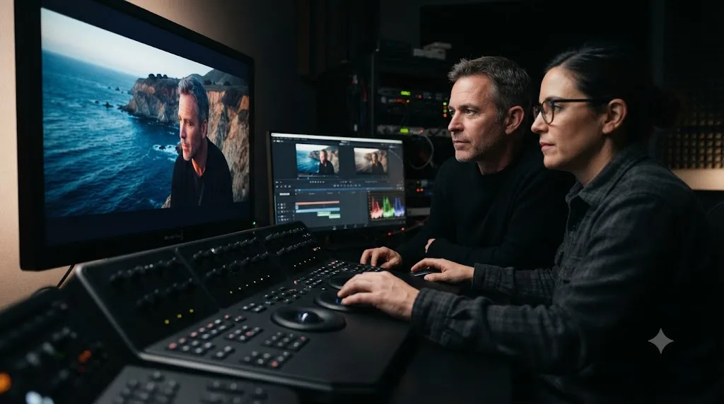
For the one judgment scopes genuinely can't fully replace, yes, and this is worth being direct about rather than pretending the scope-based workflow covers everything. Scopes verify that exposure sits in range, white balance is neutral on a reference object, and saturation falls within a reasonable band. They don't tell you whether a shot's overall warmth feels emotionally right for the scene, or whether a stylized teal-and-orange grade reads as intentional rather than broken. That's a creative call, and creative calls about color are the one place typical color vision still carries a real advantage.
This isn't a special accommodation unique to colorblind editors, either. Every serious colorist working on anything client-facing gets a second set of eyes on a final grade before delivery, a supervisor, a director, a client review session, precisely because a single person's color judgment, colorblind or not, is never the only checkpoint on work that's going to be watched by thousands of people with every variety of vision. The difference for a colorblind editor is simply that the second opinion carries more specific weight on the "does this creative color choice read correctly" question, since the scopes have already handled everything technical.
The PEG editor's story mentioned earlier makes the shape of this clear without dramatizing it. Their supervisor, Jeffrey, reviewed the graded footage before knowing the editor was colorblind at all, and approved it on the merits, at which point the editor volunteered the information rather than hiding it, joking, "I thought it was pretty good for a colorblind editor," per PEG's own account. The review process that caught nothing wrong wasn't a special colorblind-accommodation step. It was the same supervisor review any editor's work goes through, and it worked exactly as designed.
Asking for a second opinion on final saturation and warmth isn't an admission that the scope-based workflow failed. It's the same quality gate every professional grade passes through before delivery, colorblind editor or not. Frame it that way to yourself and to collaborators, and it stops feeling like a special accommodation and starts looking like what it actually is: standard practice that happens to matter a bit more for you specifically.
Do EnChroma or colorblind glasses help with color grading in DaVinci Resolve?
Not reliably enough to use as your primary tool, and the honest answer here has real scientific disagreement behind it worth naming plainly. EnChroma states that roughly 80 percent of people with red-green color blindness see some improvement wearing its glasses, primarily people with the milder anomalous types, deuteranomaly and protanomaly, rather than the complete dichromatic types, deuteranopia and protanopia, per Vision Center's independent review.
That claim has real pushback behind it. A study out of the University of Granada, covered by Phys.org, concluded that a colorblind person wearing EnChroma glasses doesn't gain new color perception, they see the same colors shifted in a different way, and that the glasses didn't improve results on standard diagnostic color tests or produce a color experience resembling a non-colorblind observer's. Vision Center's own review echoes the same caveat: the glasses are an assistive tool, not a correction, and EnChroma itself has never marketed them as a cure.
For color grading specifically, that distinction matters more than it does for everyday tasks like sorting laundry or picking ripe fruit. A shift in perceived color, rather than an accurate restoration of it, is exactly the wrong property for a tool you're using to make final delivery-critical color decisions. One user account surfaced in research for this guide described exactly that failure mode: pushing saturation on a shot far higher than intended while wearing the glasses, since colors were barely visible through them at typical levels, only for the result to read as wildly oversaturated to everyone else once the glasses came off.
The honest verdict: treat colorblind glasses as a personal comfort tool for everyday life if you find them helpful, and keep them entirely out of your grading decisions. Every color judgment that matters for a delivered file should still route through the scopes, unfiltered by any lens between your eyes and the monitor. A tool that shifts your color perception without correcting it is the wrong instrument for a job where the final output has to look right to everyone else's unfiltered eyes, not just your own filtered ones. The scopes don't have that problem, because they were never filtering anything to begin with.
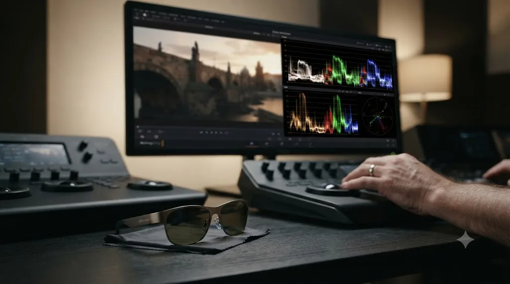
Can you actually become a professional colorist if you're colorblind?
Yes, and it's worth stating that without hedging, because the honest research behind this guide backs it up rather than just offering encouragement. Kathryn Albany-Ward, founder and CEO of Colour Blind Awareness, made a version of this point about creative work generally in an interview with Elephant magazine: "I think in art, in many ways, you're less disabled as a colourblind person, because working in the arts is much freer. You might notice shapes and imagery no one else would." Color grading isn't unstructured fine art, it's technically precise, client-facing work with real delivery specs. But her underlying point holds specifically because of how Resolve's scopes function: the parts of grading that are technically precise are exactly the parts a scope-based workflow makes measurable regardless of color vision.
That doesn't mean color blindness disappears as a factor. Albany-Ward has also described how colorblind people can feel excluded from "a world that's so colourful and becoming even more so," per the same interview, and that friction is real in a field where color literally is the product. The PEG editor's account, becoming their company's primary color corrector after starting from a place of real uncertainty about whether they could do the job at all, is a genuine, specific data point against the assumption that color blindness disqualifies someone from color-critical work, not a guarantee that every colorblind editor's path looks the same.
It's worth naming the honest consensus around learning color grading generally, since none of it currently addresses color vision deficiency specifically. Blackmagic's own free training books teach the Color page's tools without a single mention of accessibility for color blindness. YouTube creators like Casey Faris cover grading technique thoroughly and skillfully, again without addressing the question this guide is built around. That's not a criticism of any of those resources, they're genuinely useful for the technique itself. It's a real gap, and it's the specific gap this guide exists to fill: the mainstream path into color grading assumes typical color vision by default, silently, because almost nobody writing about it has had a reason to think about the alternative.
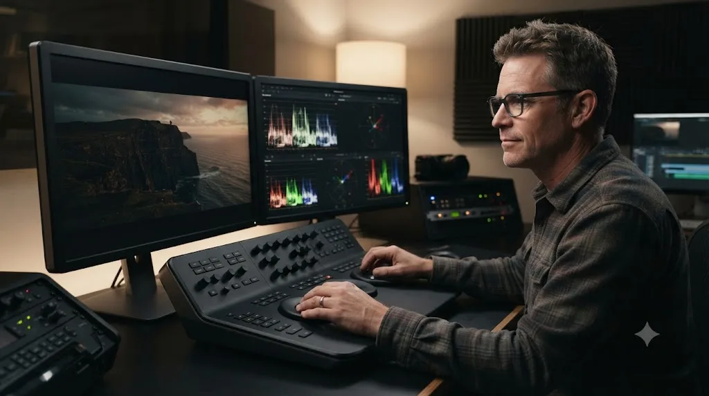
Does the workflow change for mild color blindness versus total color blindness?
Somewhat, and it's worth separating out rather than treating "colorblind" as one uniform experience, because how much of this guide's workflow is strictly necessary depends on severity.
Anomalous trichromacy, deuteranomaly and protanomaly, the mild, far more common forms, means reduced sensitivity to a specific color, not its total absence. Someone with mild deuteranomaly might read most of a vectorscope trace correctly most of the time, with confusion appearing specifically in low-saturation, low-contrast situations, a pale skin tone against a similarly pale background, a subtle green cast on a gray wall. For that pattern, the scope-based workflow in this guide functions as a verification layer on top of color vision that mostly works, catching the specific edge cases where perception gets unreliable rather than replacing perception entirely.
Dichromacy, deuteranopia and protanopia, the complete forms, removes an entire color channel's information rather than just weakening it. For that pattern, the scope-based workflow isn't a verification layer, it's the primary tool, full stop, for anything involving red-green discrimination specifically. There's no partial visual cue to fall back on when the vectorscope's skin tone line disagrees with an impression, because there's no reliable impression to disagree with in the first place.
| CVD severity | How color vision behaves | How this guide's workflow applies |
|---|---|---|
| Anomalous (deuteranomaly, protanomaly) | Reduced sensitivity, some cues still usable | Scopes as a verification layer on functioning-but-unreliable color vision |
| Dichromatic (deuteranopia, protanopia) | One color channel entirely absent | Scopes as the primary tool for anything involving that missing channel |
| Tritan-type (tritanomaly, tritanopia) | Blue-yellow channel affected, red-green typically unaffected | Same scope discipline, applied specifically to white balance and blue-heavy shots rather than skin and red-green work |
| Achromatopsia (monochromacy) | No color perception at all | Every technique in this guide, full stop, with color-coding of any kind providing zero information |
Tritan-type deficiency deserves its own note, since most of the discussion around color blindness, including most of this guide, centers on red-green confusion because it's so much more common. Someone with tritanomaly or tritanopia typically has entirely typical red-green perception, which means skin tone judgment and most of the qualifier work in this guide is unaffected. Where it bites is white balance on blue-heavy shots and the blue-yellow axis of the RGB Parade specifically, which is exactly where that same Parade comparison, matching a neutral object's three channel heights, does the same job it does for red-green deficiency, just applied to a different pair of channels.
Severity changes how much of this guide is a safety net versus a load-bearing wall, but it never changes which tools are the right ones to reach for. The scopes, the text labels, and the high-contrast matte view work the same way regardless of whether color vision deficiency is mild or total. What changes is simply how much weight each piece of the system is carrying for you personally.
A worked example: grading a talking-head interview using only scopes and labels
Abstract technique is easier to nod along with than to actually run, so here's one full session, start to finish, applying every piece of this guide to a single real task: a Rec.709 talking-head interview shot on an overcast day, the exact kind of project our color grading basics guide walks a first-time grader through from the sighted-editor default assumptions.
Setup, before touching the footage. Preferences > User > Color has "Mattes display high contrast black and white" already checked, from the one-time setup covered later in this guide. The scopes window is open in a permanent multi-scope layout: Waveform and Vectorscope side by side, Parade a click away. The vectorscope's Show Skin Tone Indicator is on.
Step one: add a balance node and check exposure on the Waveform. The trace shows shadows sitting around 60, comfortably clear of the floor, and the subject's light gray shirt peaking around 700, well short of the 1023 ceiling. Nothing is flat-lining against either end, so exposure needs a small lift rather than a rescue. Raise Gain a few points until the shirt's highlight climbs toward 850.
Step two: check white balance on the RGB Parade. The subject's gray shirt serves as the neutral reference. Its red, green, and blue traces aren't level, blue sits roughly 40 points above red, confirming a cool cast. Nudge Temp warmer and watch the three traces on the shirt converge, a height-matching task with zero color-naming involved.
Step three: label this node immediately. Right-click, Node Label, type "Balance." Not "Node 1." The node's color, if one gets assigned, is a bonus, not the record of what this node does.
Step four: add a second node for skin, isolate it with a qualifier, and check the matte in high contrast. Draw the qualifier sample on skin, then confirm the selection with Option-Shift-H, or just glance at it since high-contrast is already the default. The matte shows a clean silhouette around the face and neck with no stray holes. If it had shown speckling or gaps, our qualifier troubleshooting guide covers the Matte Finesse cleanup from here.
Step five: check the isolated skin sample against the vectorscope's skin tone line. Zoom into the vectorscope. The isolated trace sits close to the diagonal skin tone line by angle, but its distance from center reads around 55 percent, above the rough 20 to 50 percent guideline. Pull back Saturation on this node specifically, watching the trace's distance from center settle back into range, all without ever needing to judge whether the color "looked" oversaturated.
Step six: label this node "Skin Secondary," and add a third node for the final creative look if the project calls for one. A subtle warm look LUT or a small overall saturation lift goes here, kept separate from the technical correction nodes so it can be toggled off independently.
Step seven: get the second opinion. Before export, a colleague or the client glances at the finished grade specifically for warmth and overall saturation, the one judgment this whole session hasn't fully covered on its own. Everything technical, exposure, white balance, skin saturation, matte cleanliness, was already verified without a single color-naming judgment along the way.
Seven steps, three labeled nodes, zero moments where the workflow required correctly identifying a color by eye. That's the whole method from this guide, applied to one real, ordinary project.
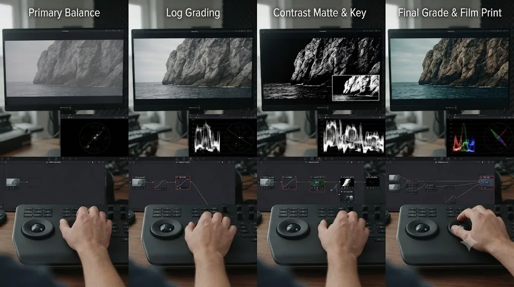
What DaVinci Resolve settings and shortcuts should a colorblind editor set up first?
A short, specific list, worth configuring in your very first session rather than discovering piecemeal over months. None of these are Studio-exclusive; per Blackmagic's Studio product page, every scope and every technique in this guide, the Waveform, Parade, Vectorscope, skin tone indicator, Highlight modes, and node labeling, ships identically in the free version and Studio. The one Studio-specific scope feature, HDR nit-value display, has no bearing on anything in this guide.
| Setting or shortcut | Where to find it | Why it matters |
|---|---|---|
| High-contrast mattes by default | Preferences > User > Color | Every future Highlight toggle shows black and white instead of flat gray with color |
| Show Skin Tone Indicator | Vectorscope's own settings menu | Gives skin a fixed angle reference instead of a color judgment |
| Multi-scope layout | Scopes window's layout icon | Waveform and Vectorscope visible together at all times, Parade one click away |
| Scopes window shortcut | Command-Shift-W (Mac) / Ctrl-Shift-W (Windows) | Fastest way to bring the scopes forward mid-session |
| Highlight (flat gray) | Shift-H | Quick selected-versus-unselected check |
| Highlight (high contrast) | Option-Shift-H (Alt-Shift-H on Windows) | The actual matte-verification view; redundant once the preference above is set |
| Node Label | Right-click a node | Text identity for every node, independent of node color |
| OS color filter toggle | Option-Command-F5 (Mac) / Windows key + Ctrl + C (Windows), once enabled | Fast on-off for reading UI elements, never left on while judging footage |
Set these once, at the start of a project rather than the middle of a deadline crunch, and every technique covered earlier in this guide becomes a default habit instead of something you have to remember to reach for under pressure.
What mistakes do colorblind editors make when grading in DaVinci Resolve?
A specific handful, and nearly all of them come from treating a workaround as complete when it's actually partial.
Leaving an OS color filter on while judging the actual grade. It's an easy trap precisely because the filter is genuinely helpful for reading the interface. The mistake is forgetting to toggle it off before making a color decision in the viewer, which means the last thing evaluated wasn't the footage anyone else will ever see.
Building a node system entirely around color, with no text labels at all. It looks organized in the moment. It stops being readable the first time you, or anyone else, reopens the project weeks later and has to click through every node to remember what it does, at which point the color-coding was never actually carrying the information it looked like it was carrying.
Trusting colorblind glasses as a grading tool rather than a personal comfort aid. Given the honest, mixed research on what the glasses actually do, perceptually shift rather than correct, using them as your primary judgment tool for a delivery-critical grade risks the exact failure mode covered earlier: a shot that reads correctly through the glasses and wildly oversaturated to everyone else.
Skipping the skin tone indicator line because it feels like an extra step. It's a single settings toggle, and it's the one reference point that turns the vectorscope from a scope you'd otherwise have to guess at into one with a fixed, reliable target for the single most common subject in professional footage.
Never asking for a second opinion, out of a sense that doing so is an admission of inadequacy. Every serious colorist's work gets reviewed before delivery. Skipping that step specifically to avoid drawing attention to color blindness removes a normal quality gate that would exist regardless, and it's the one part of this workflow that genuinely benefits from another person's input.
Assuming the whole workflow is unnecessary because color vision is "mostly fine." Mild anomalous trichromacy can feel like it's not causing problems most of the time, right up until a specific low-contrast shot or subtle cast slips through unnoticed. The scope-based habit costs almost nothing to run on every project and catches exactly the cases where "mostly fine" quietly wasn't.
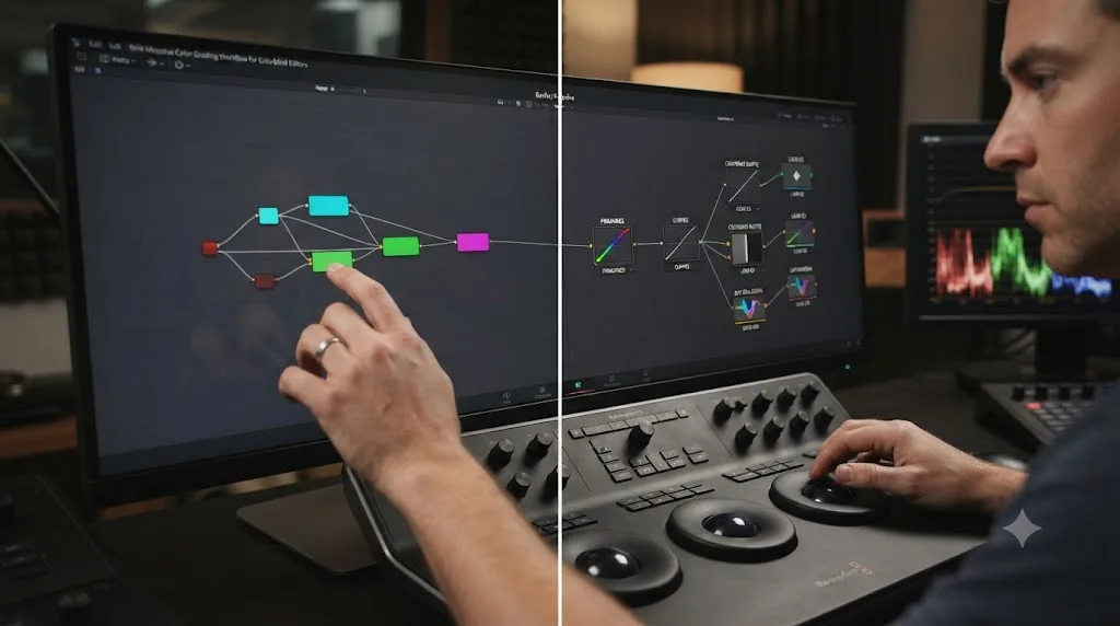
Is there an AI tool that helps while you're color grading in DaVinci Resolve?
A narrow, specific category exists worth knowing about honestly, and it's not the same category as an automation tool that edits for you. TryUncle is the on-screen assistant for DaVinci Resolve on macOS: ask in plain words and Uncle points at the exact control on your screen. That's a different job than the automation tools covered elsewhere on this site, and the distinction matters here specifically because a scope-based workflow raises a lot of small, specific questions, where exactly is the skin tone indicator toggle, which preference checkbox controls matte display, that a search engine answers slower than a tool looking at your actual open project would.
It's worth naming the real alternatives honestly rather than pretending TryUncle is the only option in this space. CutAgent executes a plain-language instruction directly on your Resolve timeline, planning and running the edit itself rather than pointing you toward doing it yourself. Eddie, at heyeddie.ai, builds a rough cut from a transcript before you even open Resolve. Sottocut automates cuts and captions from a transcript in a similar shape to Eddie's. PremiereCopilot bundles silence cuts and AI captions, but it's built for Adobe Premiere Pro specifically, not Resolve, worth naming plainly since it isn't a same-category option for readers of this guide.
| Tool | What it actually does | Points at controls while you work? | Platform |
|---|---|---|---|
| TryUncle | Watches your live screen and points at the control, you make the move | Yes, that's the whole design | macOS only |
| CutAgent | Executes plain-language edit commands directly on your timeline | No, it automates the edit | macOS, Resolve Free/Studio |
| Eddie (heyeddie.ai) | Builds a rough cut from a transcript before you open Resolve | No, it front-loads the assembly | Exports to Resolve, Premiere, FCP |
| Sottocut | Automates cuts and captions from a transcript | No, same automation shape as Eddie | See Sottocut's pricing page |
| PremiereCopilot | Silence cuts, captions, AI B-roll | Not applicable to Resolve users, built for Premiere | Premiere Pro plugin |
None of these tools are built specifically for color vision deficiency, and it's worth being clear about that rather than overselling the fit. What TryUncle does happen to solve, incidentally, is the exact gap this guide keeps returning to: a stuck moment mid-session, wondering where a specific scope setting lives, that would otherwise cost ten minutes in a search tab instead of ten seconds pointed at directly on your own screen. TryUncle is currently in founder pricing for its first 100 seats, macOS only, and worth checking the current rate directly since a price like that doesn't hold indefinitely. If the vectorscope's skin tone toggle or the matte-display preference from earlier in this guide is the kind of setting you'd otherwise have to hunt for, that's exactly the moment Uncle can point through.
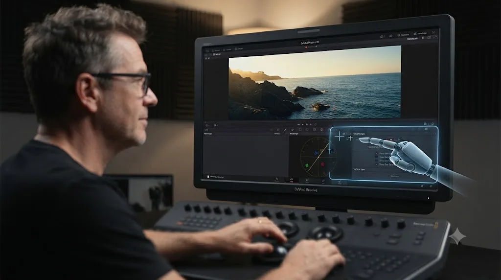
Do sighted colorists actually work any differently?
Less than you'd expect, and that's genuinely reassuring rather than a technicality. Every technique in this guide, checking exposure on the Waveform instead of trusting the monitor, verifying white balance on the Parade against a neutral object, checking saturation against the vectorscope's skin tone line, labeling nodes with text, verifying qualifier mattes in high contrast, is standard professional practice that any working colorist is supposed to follow regardless of their own color vision. A monitor drifts out of calibration for everyone. Ambient light shifts through the day for everyone. Visual adaptation, the eye's tendency to normalize whatever it's been staring at, affects sighted colorists just as much as anyone else.
What actually differs isn't the toolkit. It's how optional the toolkit feels. A sighted colorist can skip checking the Parade on a shot that "looks" neutral and get away with it most of the time, because their eyes, while imperfect, are usually close enough. A colorblind editor doesn't have that fallback available for red-green judgments specifically, which means the scope-based discipline isn't a nice habit to build toward eventually. It's the actual floor the work stands on from day one.
The workflow in this guide isn't a colorblind-specific accommodation bolted onto normal color grading. It's normal color grading, done with the discipline every colorist is supposed to have and most only apply when they remember to. That reframing matters for how you think about your own path into this work. You're not doing a diminished version of what a sighted colorist does. You're doing the rigorous version that the job actually calls for, applied consistently instead of optionally.
So what should you actually do first?
Open Preferences > User > Color and check the high-contrast mattes box. Open the scopes window and set a permanent multi-scope layout with Waveform and Vectorscope visible together. Turn on the vectorscope's skin tone indicator. That's three settings, five minutes, and it's the entire foundation the rest of this guide builds on.
From there, label every node the moment you create it, check exposure on the Waveform before you touch a color wheel, check white balance on the Parade against a neutral object, and check saturation and skin against the vectorscope's fixed line rather than an impression. Get a second opinion on the one judgment that's genuinely still subjective, final warmth and saturation, and treat that as standard practice, not a special accommodation.
A grading workflow built on numbers instead of color names doesn't just work around color blindness. It's the more rigorous version of color grading that every colorist should be running, whether they need to or not. Set the three preferences, open the scopes, and start the next project from there. That's the whole method, and it's already proven out by editors doing exactly this work today.
Frequently asked questions
- Can a colorblind person become a professional colorist?
- Yes. DaVinci Resolve's Waveform, RGB Parade, Vectorscope, and skin tone indicator report exposure, white balance, and saturation as numbers and positions, not colors you have to name correctly, so a grade can be verified without relying on hue perception at all. Kathryn Albany-Ward, founder of Colour Blind Awareness, put it plainly to Elephant magazine: 'I think in art, in many ways, you're less disabled as a colourblind person, because working in the arts is much freer.' The scopes, not your eyes, are the actual pass-fail instrument, and every working colorblind editor this guide references leans on exactly that.
- Does DaVinci Resolve have a colorblind mode or color vision simulator?
- No. As of DaVinci Resolve 21.0.3, Blackmagic Design has not shipped a built-in colorblind simulation, filter, or accessibility mode inside Resolve itself, and none of Blackmagic's own feature documentation for the Color page mentions one. The workaround is your operating system's color filters, macOS or Windows, run separately from Resolve, plus free third-party simulators like Sim Daltonism or Color Oracle for checking how a graded still will read to colorblind viewers.
- How do you color grade in DaVinci Resolve if you're colorblind?
- Build every judgment around a number or a position instead of a hue. Check exposure on the Waveform, white balance on the RGB Parade by aligning a neutral object's three channels, and saturation on the Vectorscope using its skin tone indicator line and percentage distance from center. Label every node with text through Node Label instead of memorizing node colors, and switch Qualifier mattes to high-contrast black and white with Option-Shift-H so you're judging a selection by shape, not color.
- Do EnChroma or colorblind glasses help with color grading?
- Not reliably enough to use as your primary tool. EnChroma states about 80 percent of people with red-green color blindness see some improvement wearing its glasses, but a University of Granada study concluded the glasses don't give colorblind wearers color vision that resembles a non-colorblind observer's, they just shift how existing colors are perceived. Treat glasses as a personal comfort aid at most, and keep the scopes as the actual verification step before you deliver anything.
- What percentage of video editors are colorblind?
- There's no editor-specific figure, but the general population rate gives a working estimate. Roughly 8 percent of men and 0.5 percent of women worldwide have some form of color vision deficiency, according to Colour Blind Awareness, which means most edit bays with more than a handful of male staff already have someone working around it, whether or not they've said so out loud.
- Is there an AI tool that helps colorblind editors while using DaVinci Resolve?
- TryUncle is the on-screen assistant for DaVinci Resolve on macOS: ask in plain words and Uncle points at the exact control on your screen, which matters specifically when a scope reading raises a question you'd normally have to search a forum to answer. It's a paid app in founder pricing, not a colorblind-specific product, and it doesn't replace the scope-based workflow this guide describes. It just answers the stuck moment inside it.
Sources
- Colour Blind Awareness: Types of Colour Blindness
- Colour Blind Awareness: Careers and the Workplace
- Colour Blind Awareness: About Us
- Elephant: What Does Art Look Like If You're Colourblind?, by Charlotte Jansen
- Vision Center: Prevalence of Color Blindness, Global and Regional Statistics
- EnChroma: Seventy-Five Percent of Color Blind People Experience Challenges at Work, EnChroma Study Finds
- Vision Center: Do EnChroma Glasses Really Work for Colorblindness?
- Phys.org: Scientists Debunk the Effectiveness of EnChroma Glasses
- Pritt Entertainment Group (PEG) Blog: Learning to Color Correct with Color Blindness
- Sim Daltonism, by Michel Fortin
- Color Oracle: Free Color Blindness Simulator
- Apple Support: Use Color Filters on Mac
- Microsoft Support: Use Color Filters in Windows
- DaVinci Resolve Manual: Using Highlight to See What You're Isolating (VFXPedia mirror)
- DaVinci Resolve Manual: Vectorscope (VFXPedia mirror)
- DaVinci Resolve Manual: Video Scope Measurement Using Scales (VFXPedia mirror)
- DaVinci Resolve Manual: Flags, Markers, and Clip Colors (VFXPedia mirror)
- DaVinci Resolve - Color (Blackmagic Design)
- DaVinci Resolve Studio product page (Blackmagic Design)
- DaVinci Resolve - Training (Blackmagic Design, free books and lesson files)
- How to Use and Read the Four Primary Video Scopes, by Jarle Leirpoll (Frame.io Insider)
- PetaPixel: DaVinci Resolve 21 officially released with new photo editing, AI tools, and much more
- CG Channel: Blackmagic Design releases DaVinci Resolve 21.0
- CutAgent - AI video editing for DaVinci Resolve
- Eddie AI - The Assistant Video Editor for Pros (heyeddie.ai)
- Sottocut Pricing
- PremiereCopilot - The AI Copilot for Adobe Premiere Pro
- Casey Faris - YouTube channel
- TryUncle (product site: how Uncle works, pricing, setup)
- TryUncle FAQ
Keep reading
Guides · Jul 10, 2026 · 30 min
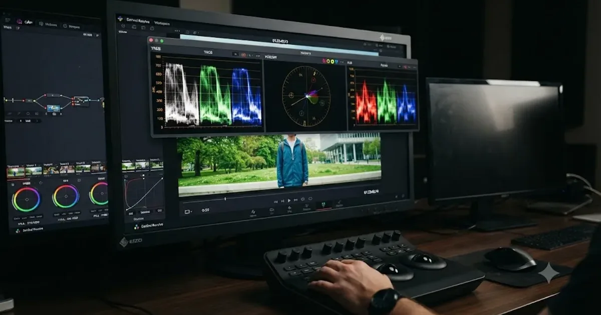
How to Read DaVinci Resolve Scopes: Waveform and Vectorscope
Learn to read DaVinci Resolve's waveform, RGB Parade, and vectorscope: what balanced exposure, white balance, and skin tone actually look like on each.
Guides · Jul 16, 2026 · 29 min
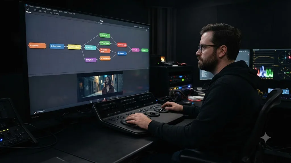
DaVinci Resolve Node Labels and Colors for Organized Grading
Rename and color-code DaVinci Resolve nodes so a six-node grade still makes sense months later. Labels, colors, badges, and a system that actually holds up.
Comparisons · Jul 26, 2026 · 33 min
Trackball vs Mouse for Color Grading in DaVinci Resolve
Trackball panel or mouse for DaVinci Resolve color grading? Panel prices, the Lift/Gain math difference, ergonomics, and a buy-or-skip verdict.