Articles / Guidesupdated for DaVinci Resolve 21.0.2 (July 2026)
DaVinci Resolve Black and White Conversion Tutorial
Quick answer
Drag Saturation to zero for a quick black and white look in DaVinci Resolve, or add an RGB Mixer node, enable Monochrome and Preserve Luminance, and adjust the Red, Green, and Blue sliders for real tonal separation. Make color corrections first, desaturate last, and finish with Custom Curves for contrast and texture instead of a flat gray image.
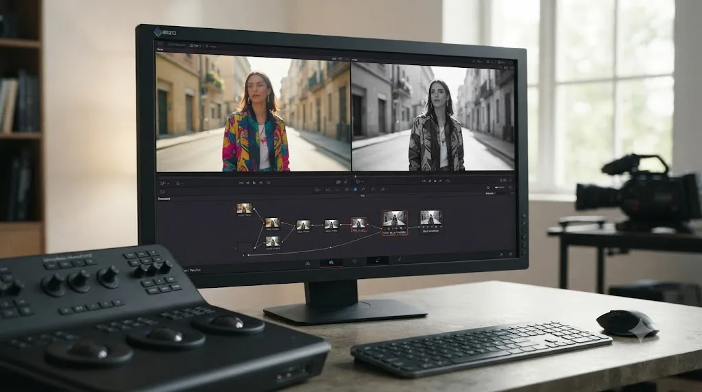
I've graded plenty of black and white sequences over seven years of professional, commercial video editing, and the mistake I see most often isn't a wrong slider. It's the right slider, used too early. Someone drags Saturation to zero, looks at a flat gray image, and assumes that's just what black and white looks like now.
It isn't. As of July 2026, DaVinci Resolve 21.0.2 gives you the same channel-level control a black and white photographer had with colored glass filters over the lens, built into a node you can undo, adjust, and reuse. This tutorial covers the fast method, the real method, and the handful of decisions in between that separate a flat gray clip from one that actually looks like it was shot to be monochrome.
What's the fastest way to convert a clip to black and white in DaVinci Resolve?
Open the Color page, select the node on your clip, and pull the Saturation slider in the Color Wheels palette down from its default of 50 to 0. The image goes gray instantly, and per Blackmagic's own Color page, that slider works identically whether you're on the free version or Studio.
This is the right tool for a genuine one-off: a quick preview for a client call, a background plate nobody will linger on, a rough cut placeholder before the real grade happens. It costs you one click and nothing else. But it's also the reason so much amateur black and white footage looks the same, flat, low-contrast, and strangely lifeless, because every color in the frame gets converted by the same fixed formula regardless of what that color actually is.
A black-and-white image lives or dies on contrast, not on the absence of color. Straight desaturation removes color. It does nothing to build the contrast that made black and white photography a distinct art form in the first place, and that gap is what the rest of this tutorial fixes.
Why shouldn't you just drag Saturation to zero?
Because it throws away information you can't get back later in the node chain. Tristan Kneschke, writing for Frame.io's PremiumBeat blog, put the problem plainly:
"Setting saturation to zero at the beginning of the workflow ties our hands since we're unable to use the color information for later processing."
Here's the concrete version of that problem. Say you're grading a shot of a red barn against a green field. Both the barn and the field can carry a similar brightness value in the original color image, red and green often sit close together in perceived luminance, so a flat desaturation can render the barn and the field as nearly the same shade of gray. In color, the shot reads clearly. In a naive black and white conversion, the barn nearly vanishes into its background, and there's no slider on that gray, flattened node that gets the separation back.
That's not a hypothetical. It's the exact problem black and white film photographers solved with colored lens filters a century before digital color existed, and it's the exact problem DaVinci Resolve's RGB Mixer solves with software instead of glass.
How does the RGB Mixer's Monochrome mode work?
The RGB Mixer is a channel mixer, and per the DaVinci Resolve reference manual, it "lets you remix different amounts of image data from one channel to another, and has a wide variety of creative and utilitarian uses." One of those uses, built directly into the palette, is converting an image to monochrome while keeping control over how each original color channel contributes to the final gray value.
The RGB Mixer's Monochrome mode is a channel mixer, not a filter, and channel mixing separates tones that a flat desaturation flattens into the same gray. Here's how to set it up:
- Add a new serial node after your color balance is done. Give it its own label, something like "b&w," so it's easy to find later.
- Open the RGB Mixer palette on that node. Depending on your build, the Monochrome option sits at the bottom of the panel or behind the three-dot options menu in the palette's top corner.
- Check the Monochrome box. The image converts to grayscale immediately, using a default mix of the three channels.
- Check Preserve Luminance right next to it. This keeps the image's overall brightness locked while you adjust the channel sliders, so you're changing tonal separation, not exposure.
- Adjust the Red, Green, and Blue sliders. Per the manual, each one runs from -2.00 to +2.00, so you can both add and subtract a channel's contribution to the final gray value.
Raising the Red slider and lowering Blue tends to brighten skin tones relative to the rest of the frame, since skin carries more red information than blue. Raising Green and lowering Blue is the classic move for making foliage and grass read lighter against a darkened sky, the same effect a green filter produced on black and white film stock. There's no universal correct setting. The sliders exist so you can decide, shot by shot, which colors need to separate from each other once the color itself is gone.
| RGB Mixer move | Effect on the monochrome image |
|---|---|
| Raise Red, lower Blue | Brightens skin tones relative to sky and shadow |
| Raise Green, lower Blue | Lightens foliage and grass against a darker sky |
| Raise Blue, lower Red | Darkens skin, brightens cool elements like sky and water |
| All three near equal | Close to a standard desaturation, minimal channel separation |
| Any slider pushed to an extreme | Risk of banding or noise ("swarm of ants") in that channel's tonal range |
That last row is worth taking seriously. Push a single slider too far toward its -2.00 or +2.00 limit and you can amplify compression artifacts or sensor noise that lived quietly in that channel, especially in shadows. Small, deliberate moves separate tones. Extreme moves just trade one problem for another.
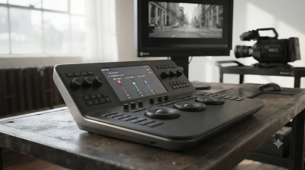
How do you emulate classic red, orange, and yellow camera filters?
By using the same RGB Mixer sliders to recreate what those physical filters actually did to light before it hit the film. A colored lens filter works by blocking part of the light spectrum: a red filter passes red light through and blocks blue and green, which is why it darkens blue skies dramatically while barely touching skin tones, and why it was the classic choice for dramatic black and white landscape photography.
You can approximate each classic filter's effect with an RGB Mixer recipe, using them as a starting point rather than an exact match:
| Classic filter | Traditional effect | RGB Mixer approximation |
|---|---|---|
| Red | Darkens blue sky dramatically, lightens skin, cuts through haze | Raise Red, lower Blue significantly |
| Orange | Moderate sky darkening, warms skin tones, less extreme than red | Raise Red moderately, lower Blue moderately |
| Yellow | Subtle sky darkening, closest to how the eye perceives contrast | Slight Red increase, slight Blue decrease |
| Green | Lightens foliage, darkens skin slightly, used for portraits with greenery | Raise Green, lower Red and Blue slightly |
| Blue | Increases haze and atmospheric effect, darkens skin | Raise Blue, lower Red |
None of these recipes are exact physics. A digital sensor and a piece of colored glass respond to light differently, and the RGB Mixer works on the image data Resolve has already captured, not the raw spectrum a filter would have blocked at the lens. Treat the table as a place to start turning sliders, then judge the result against the actual shot instead of a formula.
If you'd rather work from presets than build recipes by hand, Boris FX's Continuum plugin suite includes a dedicated BCC+ Black and White effect with six built-in options, per Boris FX's own writeup: a normal conversion plus five filter emulations for red, green, blue, yellow, and orange. It's third-party, not built into Resolve, and it's worth knowing about specifically because it saves you from rebuilding these recipes by hand on every project if you shoot black and white often enough to want a one-click starting point.
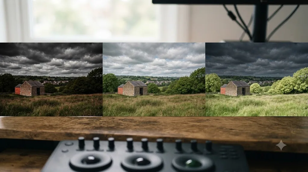
How do black and white film stocks like Tri-X and HP5 translate to RGB Mixer settings?
They don't translate directly, and that's worth saying plainly before anyone spends an afternoon chasing a slider combination that promises to "be" a specific film stock. A film emulsion's look comes from its chemistry, its exposure index, how it was developed, and how it was printed, not from a spectral sensitivity curve you can copy onto three sliders in a digital color page.
What you can borrow is the character, not the formula. Kodak Tri-X built its reputation on photojournalism because it tolerated being pushed a stop or two in low light and rewarded that push with visible grain and punchy, high-contrast blacks, the opposite of a soft, "safe" gray. Ilford HP5 earned its reputation for the opposite reason: a gentler highlight roll-off and a wider, more forgiving tonal range that suited portrait work where you didn't want a subject's face to harden into pure black-and-white blocks.
Translate character, not chemistry, into your node chain:
- Chasing a Tri-X-style punch? Lean on Custom Curves with a steeper toe (deeper shadow crush) and a firmer shoulder, and don't be shy about visible grain, since the clean softness of a digital sensor is the opposite of what made that stock recognizable.
- Chasing an HP5-style portrait look? Use a gentler S-curve, protect some shadow detail instead of crushing it, and keep your RGB Mixer moves conservative so skin doesn't harden.
Treat both as a starting direction for your own eye, not a preset to hunt down. The moment you're matching a specific stock pixel-for-pixel is the moment you've stopped grading the shot in front of you and started grading someone else's photograph.
Should color corrections happen before or after the black and white node?
Before, always. This is the single most important sequencing decision in the entire workflow, and it's the one beginners get backward most often.
Grade the color first and convert to black and white last, because color adjustments made after desaturation have nothing left to work with. Once an image is gray, a white balance correction does nothing, a Hue vs Hue curve has no hue left to target, and a qualifier built to select "the red barn" can no longer find red anywhere in the frame. Every tool that depends on color information stops functioning the moment color is gone, so any correction that needs those tools has to happen upstream of your black and white node.
The practical node order looks like this:
- Node 1: Normalize. If you're working with log or RAW footage, apply your Color Space Transform or LUT here first. Our color grading basics guide covers this normalization step in detail if you haven't done it before. Judging contrast and channel separation on unconverted log footage is judging noise, not the shot.
- Node 2: Balance. Exposure, white balance, and a rough saturation pass, exactly as you would for a color deliverable. This is also where you'd push a specific color harder if you know it needs to separate strongly later, a technique some colorists use deliberately: exaggerate a color correction here specifically because you know it's about to become a gray-scale difference instead of a visible color shift.
- Node 3: Qualifiers or windows, if needed. Any color-based selection, a qualifier isolating a sky, a power window on a face, has to happen while color still exists in the frame for it to key off of.
- Node 4: Black and white conversion. RGB Mixer with Monochrome and Preserve Luminance enabled, as covered above.
- Node 5: Contrast and texture. Custom Curves, covered next, working entirely in grayscale.
Building your qualifiers and windows before the conversion isn't just a sequencing preference. It's the only order in which they can work at all, since a qualifier's hue selection has nothing left to grab once the image is monochrome.
How do you convert log or RAW footage to black and white without crushing the image?
By treating normalization as non-negotiable, not optional, because log and RAW footage compress contrast on purpose, and a black and white conversion is precisely the operation that punishes a compressed, flattened signal the hardest.
Every log profile, S-Log3, V-Log, C-Log3, whatever your camera shot, exists to protect highlight and shadow detail for later grading by deliberately flattening the image's apparent contrast. That's exactly correct behavior for a normal color grade. It's a trap for a black and white conversion if you skip straight to the RGB Mixer, because a flat, low-contrast log image gives your channel sliders almost nothing to separate. Two colors that would read as clearly distinct tones after a proper Color Space Transform can sit almost on top of each other in raw log, and no amount of RGB Mixer adjustment recovers separation that a flat curve buried in the first place.
The fix is the same Node 1 from the sequencing section above, just worth restating with teeth: apply your Color Space Transform or camera-specific LUT before you do anything else, including your balance pass. If you're working with a specific camera's log profile for the first time, our camera import guides, covering Panasonic S5 II V-Log footage and DJI Osmo Pocket 3 log footage among others, walk through the exact Color Space Transform settings for that sensor before you ever reach the black and white step.
RAW footage, Blackmagic RAW or a camera manufacturer's RAW format, behaves a little differently. Most RAW workflows apply their color science and white balance at the clip level, in the Camera RAW palette, before the node graph even starts, which means the image arriving at your first node is already closer to a normalized, gradable state than a log file straight off the sensor. That's a genuine advantage for black and white work: less flattening to undo before your channel sliders have something real to grab onto. It's not a reason to skip your balance pass, since exposure and white balance decisions still shape how much separation exists between colors before you convert, but it does mean you're starting from a slightly better position than a log-only camera would give you.
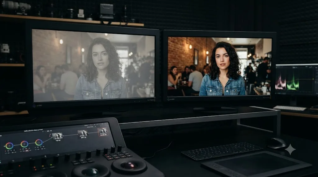
How do you add contrast and texture with Custom Curves after desaturating?
With a curve, not another mixer move. Once your gray values are separated the way you want, contrast is what gives the image its final character, and DaVinci Resolve's Custom Curves palette, the same tool covered in our color grading basics guide, is where that happens.
Add one more serial node after your black and white conversion and open Custom Curves. A gentle S-curve, pulling the shadow end of the curve down slightly and the highlight end up slightly, deepens blacks and brightens whites without touching the midtones where most of a face or a texture lives. This is the step that turns a technically correct gray image into something that looks intentionally, not accidentally, monochrome.
Noam Kroll, a filmmaker and cinematographer who writes frequently about color grading technique, argues that historical black and white film stocks leaned toward punchy, high-contrast rendering rather than the flatter "milky" look common in careless digital conversions, and that grading choices which flatter color footage, protecting shadow detail, keeping a soft roll-off in the highlights, can work against a black and white image instead of for it. A shadow that reads as rich and moody in color can read as merely underexposed once the color that gave it mood is gone, and a stronger contrast curve is often the fix.
Two curve moves worth trying beyond the basic S-curve:
- Lum vs Sat, even on a desaturated image, can still shape how the earlier color-to-gray conversion interacts with brightness, if you built your black and white node with only partial desaturation rather than a full Monochrome conversion.
- A steeper toe (the bottom-left portion of the curve) crushes shadow detail intentionally, a classic look for black and white portraiture where you want the background to fall into deep black while the subject's face stays lit.
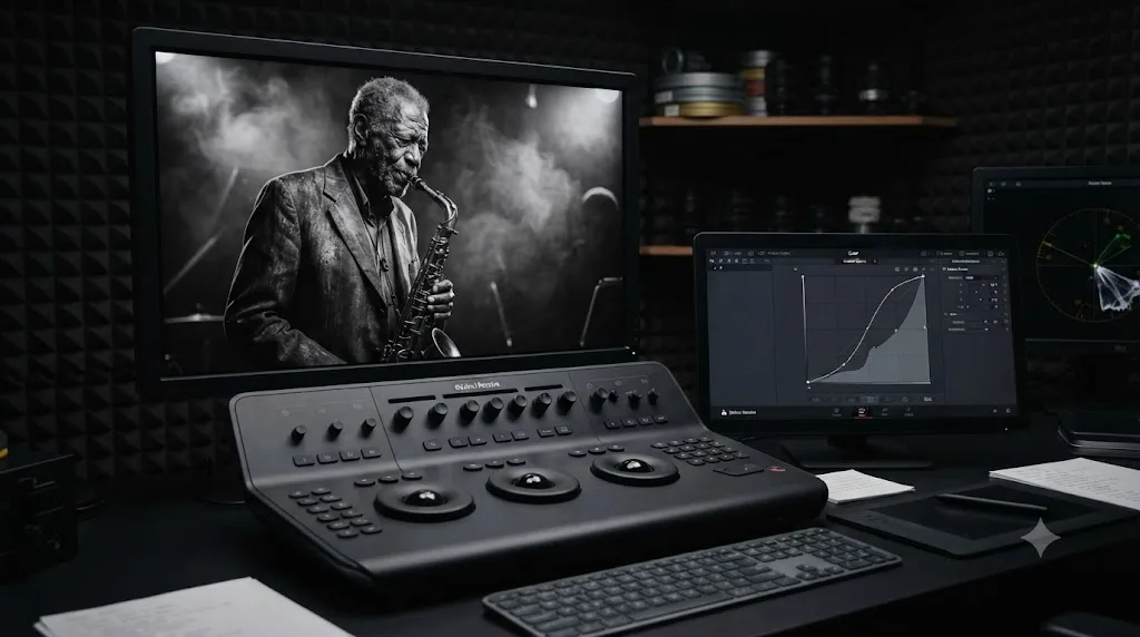
How do you add film grain or texture to a black and white grade?
With a dedicated grain effect if you have DaVinci Resolve Studio, or an overlay if you don't. Grain matters more in black and white than in color, because without color to hold a viewer's attention, texture is one of the few things left doing the work of making an image feel like it was shot on something instead of rendered by something.
DaVinci Resolve Studio bundles a Film Grain ResolveFX, and per Blackmagic's own Studio product page, it's one of the 45 additional ResolveFX included in the $295 license, the same bundle that includes Film Look Creator. Both let you dial grain size, intensity, and softness directly on a node in your existing color chain, right after your contrast curve, without leaving the Color page.
The free version doesn't include that effect, but it doesn't leave you without texture. A grain overlay, a piece of pre-shot film grain footage or a still, composited on top of your finished grade in Screen, Overlay, or Add blend mode on the Edit page timeline, does a similar job. It's a manual process instead of a one-node adjustment, and matching the overlay's contrast to your shot takes a bit of eyeballing, but the visual result, a black and white image with some texture instead of a flat, too-clean digital surface, is achievable on the free version too.
Either way, add grain last, after your contrast curve, not before. Grain interacts with contrast: crush your blacks first and the grain sitting in that crushed shadow region gets crushed right along with it, which can look muddy instead of textured. Build your tonal separation and contrast first, then decide how much texture the finished image actually needs.
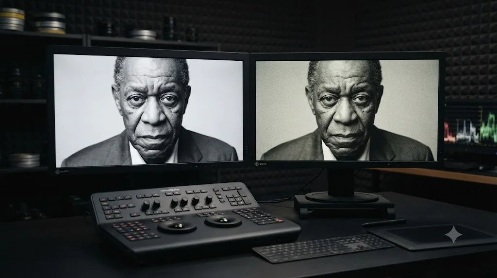
How do you keep one object in color while the rest of the frame is black and white?
By isolating the object before your black and white node exists, and building the conversion to apply everywhere except that isolation. This selective color effect, sometimes called the Sin City look after the film that popularized it, comes up often enough in our 100,000+ member professional video-editing community that it's worth a dedicated recipe rather than a footnote.
A power window drawn before the black-and-white node protects one object's color; a power window drawn after it does nothing at all. Node order isn't a suggestion here, it's the entire mechanism. Here's the setup:
- Balance your shot in color as usual.
- Add a new node and isolate the object you want to keep in color. A qualifier works if the object has a distinct hue, saturation, or luminance from everything around it. A power window works better for a subject that shares a color with its surroundings but occupies a distinct region of the frame, tracked across the shot the same way you'd track a window for any other secondary correction.
- Add your black and white conversion node as usual, RGB Mixer with Monochrome enabled.
- Right-click that node and switch its key mode to Outside, using the same key you built for your isolation in step 2. Outside mode applies the node's effect everywhere except the selected region, per Blackmagic's documented node behavior on the Color page.
The isolated object stays in color. Everything outside the key desaturates. If your subject moves through the frame, DaVinci Resolve Studio's Magic Mask can build and track that isolation from a single brush stroke instead of a hand-drawn, hand-tracked window; our complete Magic Mask guide covers when that AI-assisted tracking earns its keep over a plain power window and when it doesn't. On the free version, a tracked power window does the identical job, just with more manual tracking work on complex motion.
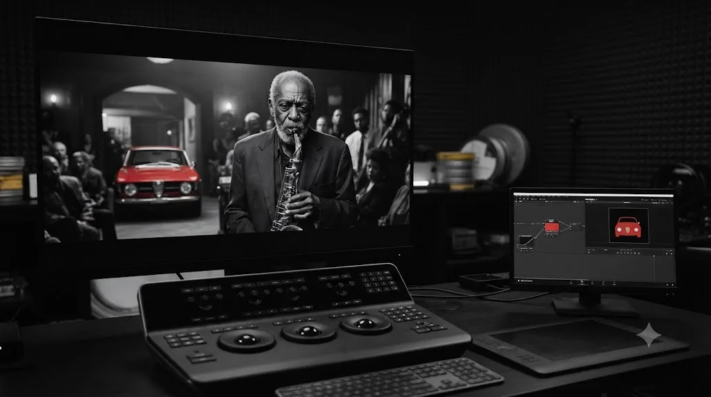
How do you handle mixed lighting or mixed white balance in a black and white conversion?
By fixing the color mismatch before you desaturate, not after, since the RGB Mixer's channel separation assumes a consistent color relationship across the frame and mixed lighting breaks that assumption. A room lit partly by tungsten practicals and partly by daylight through a window carries two different color casts in the same shot, warm on one side, cool on the other, and if you build your Monochrome node on top of that mismatch, the two halves of the frame will separate differently even though nothing about their actual content changed.
The practical fix uses the same tool you'd use for any mixed-lighting color problem: a power window or a luminance-limited qualifier isolating the mismatched region, on a node before your black and white conversion, with a white balance or Hue vs Hue correction that brings the two light sources into a closer match. You're not trying to make the shot look perfectly color-neutral, since it's about to lose its color anyway. You're making sure both halves of the frame respond to your RGB Mixer sliders the same way, so a wall lit by window light and the same wall lit by a tungsten lamp don't read as two different tones of gray for a reason that has nothing to do with your creative choices.
Skip this step and the tell is almost always in skin tones. A subject who walks from daylight into a tungsten-lit room mid-shot can shift gray value noticeably at the moment they cross the light boundary, an artifact that reads as a mistake even to a viewer who couldn't tell you why. Matching the color temperature first, even roughly, before your Monochrome node removes that seam.
How do you convert HDR footage to a black and white deliverable?
By tone-mapping to SDR before you build your black and white node, not after. An HDR master carries a wider dynamic range and a different transfer function than the Rec.709 image this entire tutorial has assumed, and the RGB Mixer's Monochrome mode doesn't know or care about that difference. It just remixes whatever luminance and color values arrive at its node, and if those values are still living in HDR's extended range, your channel separation and your contrast curve are both working against a signal that behaves differently than the one you've been judging on a standard monitor.
Our guide to grading HDR video in DaVinci Resolve covers the tone-mapping and Color Space Transform setup in full, but the short version for a black and white deliverable: do your HDR-to-SDR conversion first, on its own node, before your balance pass, and treat everything after that conversion exactly like the Rec.709 workflow in this tutorial. Building your Monochrome node on top of an un-tone-mapped HDR signal is the same mistake as building it on top of ungraded log footage, just with a wider, less forgiving range of values to get wrong.
If your final deliverable actually needs to stay in HDR, an increasingly common ask for streaming platforms, the same order still applies: balance and any color-dependent qualifiers happen in your HDR grading space, the black and white conversion node comes after, and you monitor the result on an HDR-capable display rather than judging contrast on an SDR preview that can't show you what the HDR deliverable will actually do.
How do you match black and white shots across a scene?
With the waveform and histogram, not the vectorscope, since a monochrome image carries no hue or saturation information for the vectorscope to plot. Our full guide to reading DaVinci Resolve's scopes covers each scope type in depth; here's what changes once you've converted to grayscale.
The waveform still works exactly as it does on color footage, because it plots luminance regardless of whether that luminance originated from a full-color image or a monochrome one. Grab a still of your best-matched shot in the scene, wipe every other shot against it, and confirm the waveform traces for equivalent objects, a face, a sky, a wall, line up at similar heights across the cut. That's your objective match, and it works identically whether the image is in color or gray.
The histogram earns its keep here specifically. Since it collapses the entire frame into one brightness distribution regardless of position, it's a fast way to confirm two shots occupy a similar tonal range before you commit to a scene-wide black and white look, especially useful when you're grading many short shots from a single event and don't have time to wipe-compare every single one individually.
One matching trap specific to black and white: two shots that looked color-balanced against each other can diverge once converted, because your RGB Mixer recipe interacts differently with each shot's specific color content. A recipe that separates a green field from blue sky beautifully in one shot might do very little in a shot with no green or blue in frame at all. Group clips that share a scene and apply your black and white node at the group level, the same grouping technique covered in our color grading basics guide, so a recipe adjustment updates every shot in the scene at once instead of drifting shot by shot.
How do you convert a still photo to black and white on the Photo page in DaVinci Resolve 21?
The same way you convert a video clip, because the Photo page runs on the identical node-based color engine as the Color page. DaVinci Resolve 21, which Blackmagic released free on June 3, 2026 according to PetaPixel's coverage of the launch, added a dedicated Photo page for organizing and grading still images, and it reuses the same RGB Mixer, Custom Curves, qualifiers, and power windows this entire tutorial has covered.
That reuse is deliberate, not incidental. A colorist who's spent time building black and white recipes for video doesn't have to relearn a separate tool for stills. Import your photos into an album on the Photo page, apply a node chain built exactly the way this guide describes, balance, isolate if needed, Monochrome with Preserve Luminance, contrast curve, and the result behaves identically to a graded video frame. You can even save a still's black and white recipe as a gallery still or PowerGrade and apply it to footage in a completely different project later, because the underlying color engine doesn't distinguish between the two media types.
Do you need DaVinci Resolve Studio to grade in black and white?
No, not for a controlled, professional-looking conversion. Every tool covered in this tutorial, the RGB Mixer, Monochrome mode, Preserve Luminance, Custom Curves, qualifiers, and power windows, ships in the free version. Blackmagic's own Studio product page lists what the $295 license adds on top of the free tier, and none of the core black and white workflow appears on that list.
| Tool | Free version | Studio |
|---|---|---|
| RGB Mixer and Monochrome mode | Yes | Yes |
| Preserve Luminance | Yes | Yes |
| Custom Curves | Yes | Yes |
| Qualifiers and power windows | Yes | Yes |
| Magic Mask (AI subject isolation) | No | Yes |
| Film Look Creator (stylized film emulation ResolveFX) | No | Yes |
| Film Grain ResolveFX | No | Yes |
| Temporal noise reduction (useful on pushed shadows) | No | Yes |
| Advanced HDR grading, Dolby Vision/HDR10+ | No | Yes |
Studio's genuinely black-and-white-specific extras are Film Look Creator and Film Grain, two of the 45 additional ResolveFX Blackmagic bundles into the Studio license per its product page. They're stylized shortcuts for film-stock-style looks and grain, presets and one-node convenience, not a requirement for the technique in this tutorial. If your project also needs Magic Mask for a moving subject in a selective-color shot, or temporal noise reduction because you pushed underexposed shadows hard during the balance pass, those are the actual reasons to reach for Studio, not the black and white conversion itself.
What mistakes should you avoid when grading black and white footage?
A short list, because the same handful of errors account for most disappointing black and white conversions.
| Mistake | Why it hurts | The fix |
|---|---|---|
| Desaturating before color correction | Every color-dependent tool stops working once the image is gray | Balance and key in color first, convert last |
| Using flat Saturation-to-zero for a final deliverable | No control over tonal separation between colors | Use RGB Mixer's Monochrome mode instead |
| Forgetting Preserve Luminance | Channel slider moves shift overall exposure as a side effect | Enable it before adjusting Red, Green, Blue |
| Grading unconverted log footage in black and white | Judging contrast on a flat, unnormalized signal | Normalize with a Color Space Transform or LUT first |
| Pushing a single RGB Mixer slider to its extreme | Amplifies noise and compression artifacts in that channel | Make smaller, more deliberate moves |
| Skipping the contrast curve entirely | Result reads as flat and "milky" instead of punchy | Add a Custom Curves node after the conversion |
| Drawing a selective-color window on the wrong side of the b&w node | The isolation has no effect at all | Isolate before the conversion, key it Outside |
| Never checking the histogram across a scene | Shots that looked matched in color can drift once converted | Group clips and check the waveform and histogram together |
The pattern underneath all of these: black and white isn't the absence of a decision. It's a different set of decisions, made in a different order, and most of the mistakes above come from treating it as color grading minus one step instead of its own discipline with its own sequence.
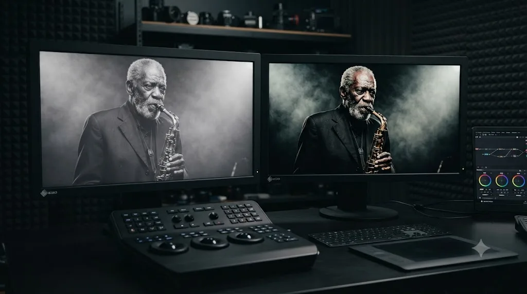
Why does your black and white grade still look wrong after you've done everything right?
Sometimes every step above gets followed correctly and the image still doesn't look right, because the mistakes table catches habits, not symptoms. Here's the symptom-to-cause version, for when you know something's off but can't tell what.
| Symptom | Likely cause | What to check |
|---|---|---|
| Vectorscope still shows a trace after Monochrome is enabled | Monochrome or Preserve Luminance was enabled on the wrong node, or a node downstream is re-adding saturation | Confirm which node has Monochrome checked, and check every node after it for a stray Saturation or Hue adjustment |
| Skin tones and background both read as the same flat gray | RGB Mixer sliders are still near their default, equal-weighted position | Push Red up and Blue down to separate warm skin tones from cooler backgrounds |
| Preserve Luminance checkbox appears grayed out | You're on a palette that hasn't fully refreshed after a node change, or you're not actually inside the RGB Mixer palette | Click off the node and back onto it to force the palette to redraw, and confirm the RGB Mixer, not a different mixer tool, is open |
| RGB Mixer sliders don't seem to change anything | Monochrome isn't actually checked, so the sliders are remixing color channels, not gray values, and the effect is easy to miss on some shots | Recheck the Monochrome checkbox itself, not just the sliders |
| Export looks flatter or noisier than the viewer preview | A GPU-accelerated preview resolution is masking banding that shows up at full render resolution | Render a short test clip at full resolution and compare it directly, rather than judging off the scaled preview |
| Highlights clip to solid white after the contrast curve | The S-curve's highlight lift pushed values past white, especially on a shot that was already near clipping before conversion | Pull the curve's highlight point down slightly, or check the waveform before finalizing the curve |
| Grade looks correct in the Color page but wrong on a client's screen | The client's display isn't calibrated, or the deliverable was exported in the wrong color space for its destination | Confirm your project's color management settings and export color space match what the client's playback device expects |
Most of these trace back to the same root cause as the mistakes table: node order, or a control that's not doing what you assume it's doing. When something looks wrong, check what node it's coming from before you touch a single slider.
Which black and white method actually fits your situation?
There's no universally correct method, only the right tool for the deliverable and the time you actually have. Use this table to decide before you open a single palette.
| Your situation | Best method | Time cost |
|---|---|---|
| Quick preview, rough cut, or a background clip nobody will scrutinize | Saturation to zero | Seconds |
| Final deliverable, any budget, need real tonal control | RGB Mixer Monochrome mode + Preserve Luminance + Custom Curves | 10-20 minutes per look, once, then reusable as a PowerGrade |
| Need a specific filter emulation (red, orange, yellow, green) fast and often | Boris FX Continuum's BCC+ Black and White preset | A few minutes per clip, requires the third-party plugin |
| Need a stylized film-stock look with grain, halation, and gate weave baked in | Film Look Creator (Studio only) | Minutes, one node, Studio license required |
| Selective color, one object staying in color against a black and white frame | RGB Mixer Monochrome on an Outside-keyed node, isolated with a qualifier or power window | 15-30 minutes depending on tracking complexity |
| Grading a still photo | Same RGB Mixer workflow on the Photo page | Identical time cost to video |
| Need both a color and black and white deliverable from the same edit | Duplicate the timeline, grade each independently | Doubles your grading time, not your editing time |
The honest shortcut through this table: if you're not sure which row you're in, you're probably in the second one. Most "how do I make this look good in black and white" questions resolve to the RGB Mixer workflow this tutorial spends most of its length on, and the other rows are for genuinely narrower situations.
What does a complete black-and-white grading workflow look like start to finish?
Here's a worked example, start to finish, on a hypothetical shot: a mirrorless interview clip in Rec.709, a subject wearing a mid-blue shirt, seated against a warm wooden bookshelf background.
- Balance first. Add a serial node, label it "balance," and set exposure, white balance, and a normal saturation pass exactly as you would for any color deliverable. Check the waveform to confirm nothing clips.
- Consider an exaggeration. The blue shirt and the warm wooden shelf sit close together in raw luminance, a classic setup for the barn-and-field problem covered earlier. On this same balance node, or a new one right after it, nudge the shirt's saturation up slightly. It'll look oversaturated in color for a moment, but that exaggerated color difference is what gives the RGB Mixer more to separate later.
- Convert to black and white. New node, labeled "b&w." Open RGB Mixer, check Monochrome and Preserve Luminance, then raise Blue and lower Red. The wooden shelf, being warm and red-heavy, darkens. The blue shirt lifts. The two elements that were nearly identical grays under a flat desaturation now read as clearly separated tones.
- Add contrast. New node, labeled "contrast." Open Custom Curves and pull a moderate S-curve, deepening the shadow side around the bookshelf's darker grain and lifting the highlight side around the subject's face.
- Check the scopes. Waveform confirms nothing's clipped or crushed. Histogram confirms the tonal range is well distributed rather than bunched in the middle, a sign the shot isn't reading as flat.
- Label and save. Every node in this chain, per our guide to node labels and colors, gets a name and a color that mean something six months from now: blue for balance, gray for the b&w conversion, another color for the contrast pass. Grab a still in the gallery, and the entire recipe applies to the rest of the interview in one click.
Four nodes, five decisions, and every one of them undoable on its own if the client wants to see the shirt darker or the shadows deeper. That's the entire shape of a professional black and white grade, and it's the same discipline as the color grading workflow this tutorial keeps pointing back to, just with one extra node in the middle.
If you get stuck on where exactly the Monochrome checkbox lives in your specific build, or which panel Preserve Luminance sits in, that's a narrower problem than learning the whole workflow. TryUncle is the on-screen assistant for DaVinci Resolve on macOS, ask in plain words and Uncle points at the exact control on your screen, instead of you scrubbing through a tutorial video looking for the ten seconds that matter.
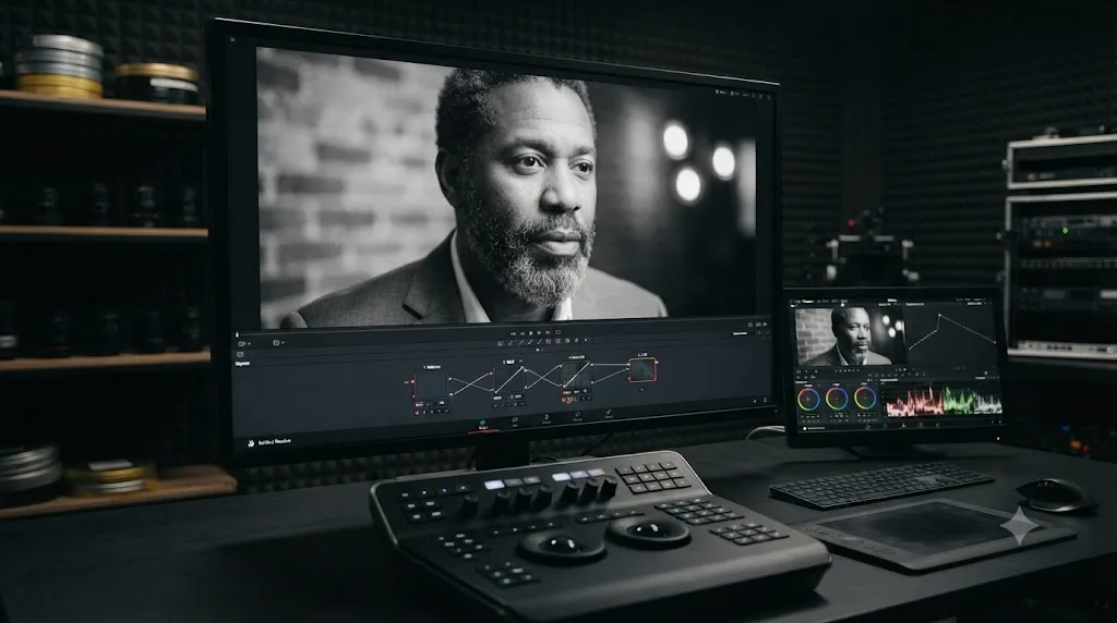
How do you handle a wedding-style shot with a white dress, a black tuxedo, and mixed skin tones?
By treating it as an exposure problem first and a channel-separation problem second, because a scene built around the widest possible tonal range in the room, a bright white dress, a black tuxedo, and skin tones somewhere between the two, is exactly the kind of shot that exposes a rushed black and white conversion.
The failure mode is predictable: expose for skin during the balance pass, and the dress blows out toward clipped white while the tuxedo crushes toward solid black, both losing the fabric detail and texture that made them worth shooting in the first place. That's a color-grade problem before it's ever a black and white problem, since a clipped highlight or a crushed shadow in the color image stays clipped and crushed after conversion. No RGB Mixer slider recovers detail from a value that's already pinned at pure white or pure black.
Work the shot in this order:
- Expose for the full range first, on the balance node. Pull the highlight rolloff down enough to hold texture in the dress, and lift the shadows enough to keep some grain and weave visible in the tuxedo, even if that means the shot looks slightly flat in color for a moment. You're protecting information you'll need in the next steps.
- Check skin against both extremes. Skin tones between a bright dress and a dark suit often need their own small window or qualifier to sit correctly once you've pulled the highlights and shadows toward the middle, since a correction built for fabric can leave a face under- or over-exposed.
- Convert to black and white on Monochrome as usual, then use the RGB Mixer sliders to fine-tune separation between skin and the tuxedo's fabric, which can otherwise sit closer together in gray value than they did in color.
- Let Custom Curves do the final polish, pulling the S-curve gently rather than aggressively, since this shot already has enough natural contrast between white and black fabric that an aggressive curve risks clipping the dress or crushing the tuxedo a second time.
The lesson generalizes past weddings: any scene built around genuinely white and genuinely black elements in the same frame needs its exposure protected before conversion, not fixed after. Black and white doesn't create that problem. It just has zero tolerance for it.
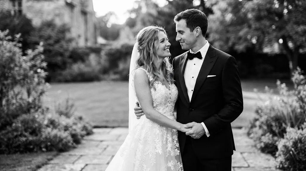
How do you deliver both a color and a black-and-white version of the same edit?
By duplicating the timeline, not by trying to make one grade do two jobs. A client who wants both a color cut and a monochrome cut of the same edit is asking for two separate deliverables, and DaVinci Resolve treats them as two separate grading problems on purpose.
Right-click your finished, color-graded timeline in the Media Pool and choose Duplicate Timeline. The duplicate is an independent copy, same edit, same clips, its own grade. Leave your original timeline exactly as it is, your color deliverable is done, and build your black and white node chain, balance, RGB Mixer, curves, on the duplicate instead. Nothing you do on the black and white duplicate touches the color original, because after duplication the two timelines share footage but not grading nodes.
This matters earlier in a project too, before you've committed to a final grade on either version. If a client is genuinely undecided between color and black and white, DaVinci Resolve's Versions split screen can show up to sixteen different graded versions of the same shot side by side in the viewer at once, per PremiumBeat's coverage of Resolve's split-screen modes, accessed from the icon between Image Wipe and Highlight above the main viewer. Build a color version and a black and white version of your opening shot as two saved local versions on the same clip, put them side by side, and let the client point at the one they want before you commit a whole timeline to either direction.
How do you save and reuse a black and white look across projects?
The same way you'd save any color grade: as a still, saved into a PowerGrade album for use across every project on your system. Our full guide to using PowerGrades in DaVinci Resolve covers the album setup in detail; the short version is that once you've built an RGB Mixer recipe you like, one for warm-toned interiors, one for landscape work with strong sky separation, you grab a still and drop it into a dedicated black and white PowerGrade album rather than rebuilding the recipe from scratch on your next project.
Guided practice inside DaVinci Resolve beats watching a video about DaVinci Resolve. The fastest way to build a personal library of black and white recipes isn't collecting other people's presets. It's grading three or four real shots with genuinely different color content, a warm interior, a green landscape, a shot with strong primary colors, and saving what actually worked on each one. A recipe built on your own footage transfers to your next project. A downloaded preset built on someone else's shot often doesn't, because the specific colors that made it work aren't in your frame.
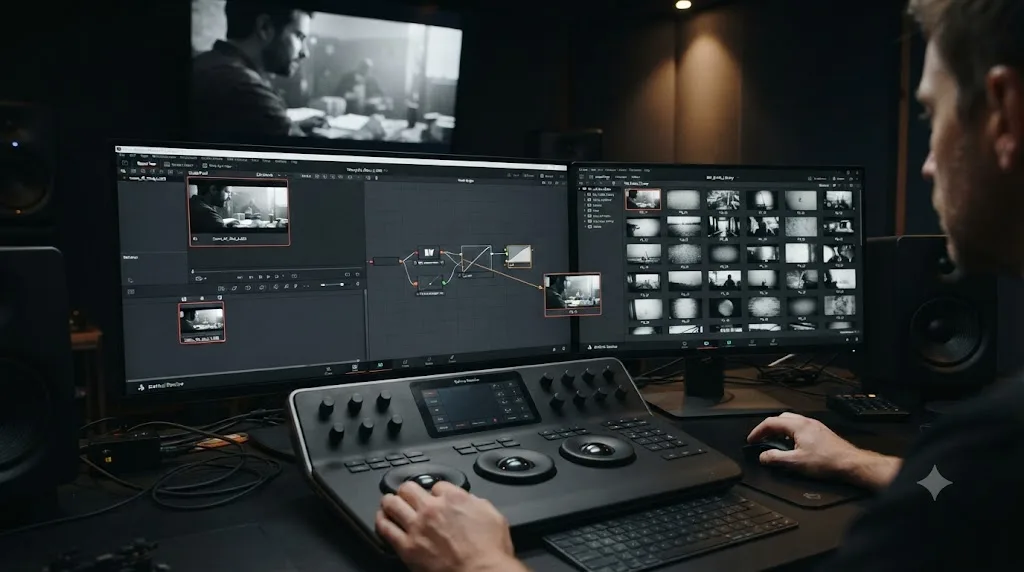
Does hardware or OS change how you grade black and white footage?
Barely, and where it does, it's the same friction points that affect any grading session, not something unique to monochrome work. The RGB Mixer and Custom Curves are lightweight compared to noise reduction or heavy qualifier stacks, so a black and white conversion node rarely taxes your GPU on its own.
Where it adds up: if your workflow includes the exaggeration step from the worked example above, temporarily oversaturating a color before converting, plus a qualifier for selective color, plus a contrast curve, you're stacking three or four nodes on top of your normal balance pass. Per Blackmagic's tech specs, Resolve's minimum GPU requirement is 4 GB of VRAM, and a heavier node stack at 4K resolution pushes well past that floor. If playback stutters as you build out a black and white chain, switch Playback > Timeline Proxy Resolution to Half while you work, and cache the finished nodes with Render Cache set to Smart before judging fine grain or noise reduction at full resolution.
Platform differences follow the same pattern covered in our color grading basics guide: Mac decodes H.264, H.265, and ProRes in hardware on Apple silicon, Windows reserves some hardware-accelerated decode for Studio specifically, and Linux's free build has historically shipped without H.264 or H.265 support at all. None of that changes based on whether your final image is in color or black and white; it's a property of your source footage's codec, not your grade.
Should you shoot with black and white in mind, or just convert in post?
Convert in post, in nearly every case, because a color deliverable you can still make if the client changes their mind is worth more than a slightly cleaner monochrome file you can't get color back from. Every workflow in this tutorial assumes you shot in color and are converting afterward, and that's a deliberate choice, not a default.
Shooting in a camera's dedicated black and white mode throws away the color data permanently at the sensor or codec level, depending on the camera. You gain nothing in image quality by doing this on a modern digital camera, since the sensor still captures a full-color image internally before the camera discards it, and you lose the ability to change your mind about the filter recipe, the contrast curve, or whether the client wants a color version after all. There's no equivalent of "well, we shot it in black and white so we're locked in" that pays for itself compared to shooting color and converting.
The one legitimate reason to monitor in black and white on set, as opposed to shooting in it, is judging composition and contrast in the moment. A false-color or black and white LUT applied to your monitor while you're still recording in full color lets a cinematographer see how a scene's tonal relationships will actually separate once converted, without giving up a single bit of the color information you're still capturing. That's a monitoring choice, not a capture choice, and it costs you nothing in post, since the recorded file is still full color no matter what your monitor is showing you.
If you're grading footage someone else shot specifically as a monochrome capture, and it happens, older cameras and some cinema cameras still offer a true black and white capture mode, you've lost that flexibility already and the workflow in this tutorial mostly doesn't apply. There's no RGB Mixer channel separation to build when the channels were never recorded. Custom Curves for contrast still works, since it operates on luminance regardless of whether color ever existed, but the tonal separation decisions this entire tutorial is built around have to happen at the point of capture instead of the color page, which is exactly why converting in post beats shooting in black and white for almost every real production.
Where do you go from here?
One node with the RGB Mixer's Monochrome mode enabled, Preserve Luminance checked, and a Custom Curves node after it for contrast. That's the entire technical core of this tutorial, and it's a five-minute setup once you've done it twice.
Pick one clip from your own footage today, ideally something with at least two colors that are close in brightness, and run it through the workflow above instead of dragging Saturation to zero out of habit. Notice what separates and what doesn't, adjust the sliders until it does, and save the result as a still before you move to the next shot.
Everything else in this guide is refinement of that one decision: balance before you convert, isolate before you desaturate if you want to keep something in color, and let contrast do the work that color used to do.
Frequently asked questions
- What's the fastest way to make a clip black and white in DaVinci Resolve?
- Open the Color page, select your clip's node, and drag the Saturation slider in the Color Wheels palette down to 0. It's a one-move conversion, and it's the right choice for a quick preview or a background clip nobody will scrutinize. For anything you actually want to look good, the RGB Mixer's Monochrome mode gives you far more control over how each color becomes a shade of gray.
- Why does dragging Saturation to zero look flat compared to real black and white film?
- Because a straight desaturation collapses red, green, and blue into gray using one fixed formula, the same one every time, regardless of what's actually in the shot. Real black and white photography, and DaVinci Resolve's RGB Mixer, let you decide how much each channel contributes, which is how a red barn separates from a green field even after the color is gone. Flat desaturation throws that decision away before you ever get to make it.
- What does Preserve Luminance do in the RGB Mixer's Monochrome mode?
- It keeps your image at the same overall brightness while you change how much of that brightness comes from red, green, and blue. Without it, you have to manually keep your three channel sliders summing to 1.00, or the whole image gets brighter or darker as a side effect of a creative choice that should only affect contrast between colors, not overall exposure.
- Can you keep one object in color while the rest of the frame is black and white?
- Yes. Isolate the object with a qualifier or a power window on one node, then build your black and white conversion on a separate node set to Outside mode, which applies everywhere except your selection. The object stays in color, everything else desaturates. DaVinci Resolve Studio's Magic Mask makes the isolation step faster on a moving subject, but a tracked power window does the same job on the free version.
- Do you need DaVinci Resolve Studio to convert footage to black and white?
- No. The RGB Mixer, its Monochrome mode, Preserve Luminance, Custom Curves, qualifiers, and power windows are all included in the free version. Studio's only black and white specific extras are Film Look Creator and Film Grain, both part of the 45 additional ResolveFX Blackmagic reserves for the $295 license, and neither is a requirement for a controlled monochrome grade.
- How do you convert a still image to black and white on DaVinci Resolve 21's Photo page?
- The same way you would on a video clip. The Photo page, new in DaVinci Resolve 21, uses the identical node system and color tools as the Color page, so an RGB Mixer node with Monochrome enabled works exactly the same on a still as it does on footage. There's no separate black and white tool for photos.
- Should you shoot with a camera's black and white mode, or always convert in post?
- Convert in post almost every time. Shooting in a camera's black and white capture mode throws away color data permanently, usually with no image-quality benefit since the sensor still captures full color internally before discarding it, and you lose the ability to change the filter recipe, contrast, or even the client's mind about color later. The only legitimate reason to work in black and white on set is monitoring, a false-color or black and white LUT on your viewfinder while still recording full color, which costs nothing and keeps every option open.
- What's the fastest way to actually get good at DaVinci Resolve's color tools, not just follow one tutorial?
- Grade real footage of your own, not a tutorial project, because you'll notice when a face looks wrong in a way a following-along project never forces you to confront. If you get stuck on a specific control mid-grade rather than the whole workflow, that's a narrower problem than learning DaVinci Resolve broadly, and it's worth solving with a tool built for that exact gap rather than searching a twenty-minute video for a ten-second answer.
Sources
- DaVinci Resolve - Color (Blackmagic Design)
- DaVinci Resolve - Tech Specs (Blackmagic Design)
- DaVinci Resolve Studio product page (Blackmagic Design)
- DaVinci Resolve product page, free version (Blackmagic Design)
- DaVinci Resolve Manual: Introduction to the RGB Mixer Palette (VFXPedia mirror)
- Better Black and White in DaVinci Resolve, by Tristan Kneschke (PremiumBeat)
- Make a Clip Black and White in DaVinci Resolve, by Marco Sebastiano Alessi (Boris FX Blog)
- How To Color Grade A Perfectly Cinematic Black And White Look, by Noam Kroll
- DaVinci Resolve 21 officially released with new photo editing, AI tools, and much more (PetaPixel)
- Color Grading: Using DaVinci Resolve's Multiple Split Screens (PremiumBeat)
Keep reading

Guides · Jul 7, 2026 · 35 min
How to Color Grade in DaVinci Resolve: The Basics
Learn how to color grade in DaVinci Resolve: build a node chain, balance shadows and highlights with Lift, Gamma, and Gain, and read the scopes.
Guides · Jul 10, 2026 · 30 min
How to Read DaVinci Resolve Scopes: Waveform and Vectorscope
Learn to read DaVinci Resolve's waveform, RGB Parade, and vectorscope: what balanced exposure, white balance, and skin tone actually look like on each.
Guides · Jul 16, 2026 · 29 min
DaVinci Resolve Node Labels and Colors for Organized Grading
Rename and color-code DaVinci Resolve nodes so a six-node grade still makes sense months later. Labels, colors, badges, and a system that actually holds up.