Articles / Guidesupdated for DaVinci Resolve 21.0.2 (July 2026)
DaVinci Resolve Pastel Aesthetic Color Grading Tutorial
Quick answer
Build a pastel grade in DaVinci Resolve with one node: lift blacks slightly, pull Gain down a touch, drop Saturation to around 30-35, and add a cool-to-warm split tone in Lift and Gain. Protect skin with a Hue vs Sat curve, check the result on the vectorscope, then save it as a still to reuse across your timeline.
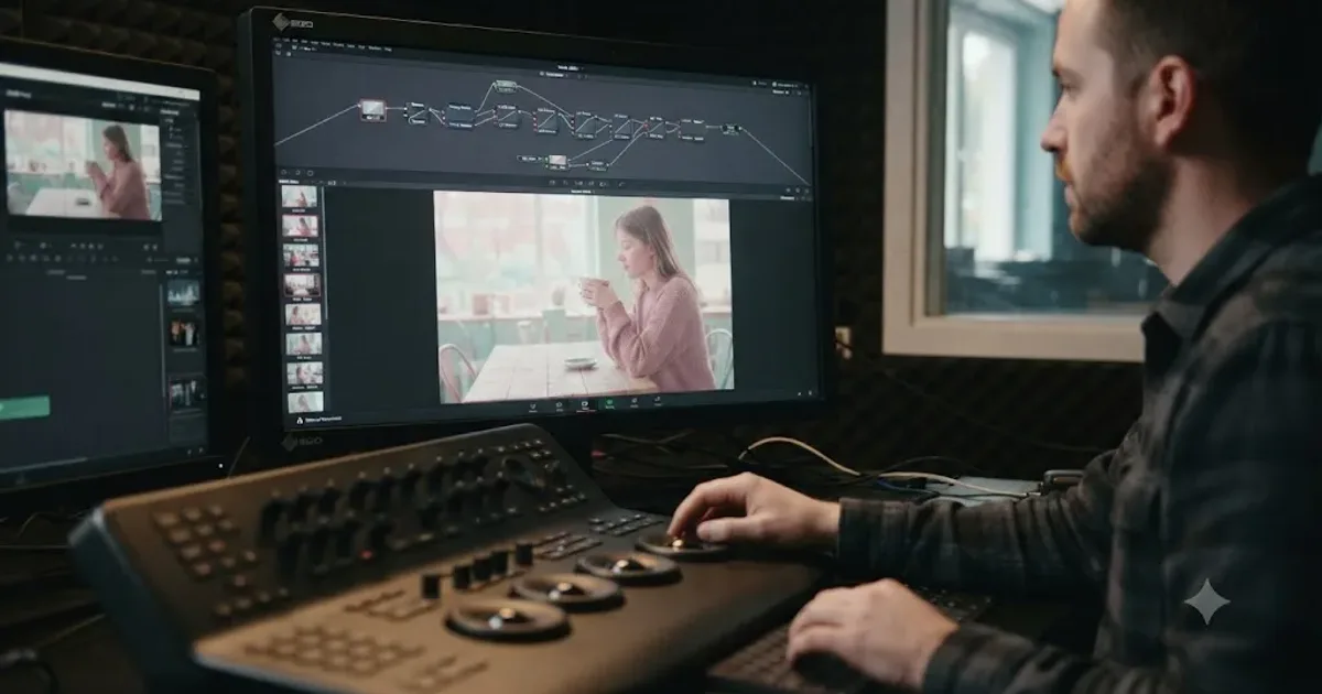
I keep seeing the same request in comment sections and in our own community: someone found a pastel-toned edit they love and wants the exact recipe, not a theory lecture. This guide gives you that recipe, built from DaVinci Resolve's actual controls, plus the reasoning behind each move so you can adjust it for footage that doesn't behave the way a tutorial clip does.
We've spent seven years cutting and grading commercial work, and we run a video-editing community of more than 100,000 members where "how do I get that pastel look" is one of the questions that resurfaces every few months, usually right after a trend clip goes around on TikTok or Pinterest. It's not a new idea. It's candy-colored production design, faded film stock, and a soft matte finish, repackaged for a vertical feed. As of July 2026, DaVinci Resolve 21.0.2 handles every piece of it without a single paid plugin.
What is the pastel aesthetic in color grading, and how is it different from a faded film look?
A pastel grade is a low-saturation, lifted-black image built around soft, pale hues, pinks, lavenders, mints, and butter yellows, instead of the deep primaries a normal grade protects. A faded film look is a related but separate idea: it lowers contrast and lifts blacks to mimic an old, chemically-faded print, and it doesn't require pale colors at all. You can fade a shot without making it pastel, and you can push a pastel palette without fading the contrast underneath it.
The confusion is understandable because the two techniques share tools. Both lean on a lifted black point and a soft highlight roll-off. Both often add a split tone, a different color in the shadows than in the highlights. Where they diverge is saturation and color choice: pastel keeps saturation low across the whole frame and leans specifically toward candy colors, while a faded film look can stay saturated in the midtones and lean toward any color pairing, teal and orange included.
A pastel grade is a color choice built on top of a contrast choice, not a substitute for one. Skip the contrast step and you get a foggy, undersaturated mess instead of the soft, dreamy image you're after. That distinction drives almost every mistake covered later in this guide.
If you're still learning the node system itself, wheels, curves, and how corrections chain together, our color grading basics guide covers that foundation before you build a specific look on top of it.
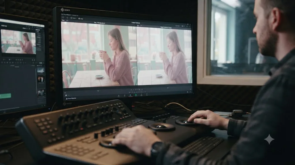
What do you need before you start a pastel grade in DaVinci Resolve?
A locked cut and a clip with real dynamic range, meaning it isn't already crushed or blown out at capture. Grading a shot that later gets trimmed wastes the work, and a pastel look specifically depends on having usable detail in the shadows and highlights to soften, so start with reasonably well-exposed footage.
Open the Color page from the page selector at the bottom of the interface. If your project mixes log footage from different cameras, normalize it first with Color Space Transform or DaVinci YRGB Color Managed before you build the pastel look on top, the same way our color grading basics guide walks through. Building a pastel grade on top of unbalanced log footage means every clip drifts to a different pastel shade instead of matching.
One hardware note worth flagging early: per Blackmagic's tech specs, DaVinci Resolve wants at least 4 GB of VRAM to stay responsive, and Puget Systems' hardware guide recommends 12 GB or more for a 4K timeline with several nodes stacked, which a full pastel chain, base grade, skin protection curve, split tone, and optional grain, will get you close to quickly.
What wheel settings create a pastel base grade in DaVinci Resolve?
Start in one serial node with a normal, correctly contrasted image, then make four moves that pull it toward pastel without breaking the contrast underneath. Every number below is a starting point to nudge from on your own footage, not a fixed formula, since exposure and lighting vary too much for one setting to fit every clip.
| Control | Typical move for pastel | What it does to the image |
|---|---|---|
| Lift | Raise slightly, a few points off zero | Turns pure black into a soft, pale dark gray, the core of the "lifted" pastel look |
| Gain | Pull down slightly from its default | Softens the whites so highlights read as cream or pale instead of a hard clip |
| Saturation | Drop from the default of 50 to roughly 30-35 | Removes punch from every color at once, the base of the pale palette |
| Offset | Small push toward a cool or warm cast | Sets the overall temperature the rest of the pastel palette builds around |
Work Lift and Gain before Saturation, in that order. A shot with real contrast desaturates into something that still reads as an image with depth. A flat shot desaturates into fog, because there's no tonal separation left to notice once the color drains out.
Lifting a shot's black point without first setting real contrast is the single fastest way to turn a pastel grade into a gray one. That single sentence explains most of the disappointing pastel attempts you'll see online, where the colors look correct in a still frame from the tutorial but collapse the moment someone applies the same numbers to their own unbalanced footage.
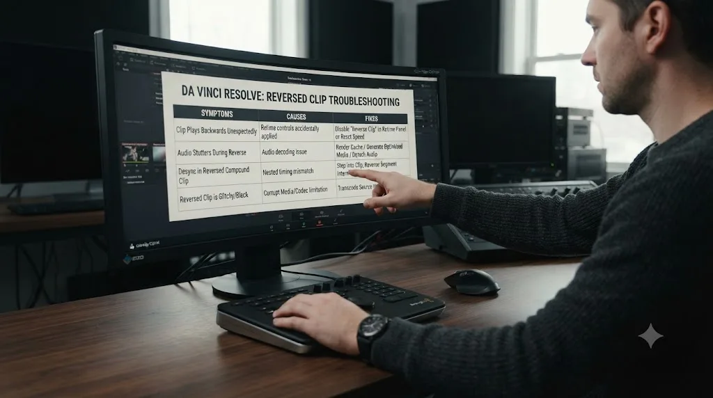
Should you crush blacks and then lift them, or just lift?
Set real contrast first, using Lift and Gain the way you would on any normal correction, and only raise the floor afterward. That two-step order, not the lift alone, is what separates a pastel image with depth from one that looks like it's shot through fog.
Here's why the order matters. If you lift a shot that never had a defined black point, there's nothing underneath the lift to protect the sense of depth, and the whole frame reads as uniformly pale and low-contrast, the "washed out" complaint that shows up in almost every pastel grading forum thread. If you establish contrast first, dial in the darkest part of the frame against the highlights with the waveform open, and then lift the floor, the shadow detail that was there a moment ago stays visible under the paler tone, and the eye reads it as soft rather than empty.
Cullen Kelly, a Los Angeles-based senior colorist whose work spans Netflix, HBO, and Hulu, covers a related move for a different problem, fixing crushed blacks, in a Frame.io write-up: raising Lift and then bringing Gamma back down slightly recovers detail in shadows that clipped too hard. The pastel version runs the same logic forward on purpose. You're not fixing an accident. You're choosing to compress the shadow range deliberately, and doing it after contrast is set is what keeps the compression from reading as a mistake.
How do you desaturate a shot without it going flat and muddy?
Desaturate after contrast is set, and split the job between the plain Saturation control and Color Boost instead of relying on Saturation alone. Color Boost lifts weak, barely-present colors more aggressively than it touches colors that are already strong, which is the opposite behavior of the Saturation slider, and it's exactly the asymmetry a pastel grade wants.
Here's the practical difference. Pull Saturation down to 30 by itself and every color in the frame loses the same percentage of its intensity, including whatever color was doing the visual work, a blue sky, a pink wall, a green plant. The frame can end up evenly gray instead of evenly pastel. Add a touch of Color Boost back in after the Saturation pull and the colors that were strongest to begin with come back just enough to read as color again, pale, but present, while flatter areas of the frame stay quiet.
A Lum vs Sat curve adds a second layer of control worth knowing for this specific look. Pull the curve down harder in the shadows than in the highlights and the darkest parts of the frame desaturate more than the brightest parts, which mimics how real faded film stock behaves and adds a sense of depth a flat Saturation move can't produce on its own. Our color grading basics guide covers the full specialty curve set, including Lum vs Sat, if this is your first time opening the Curves palette.
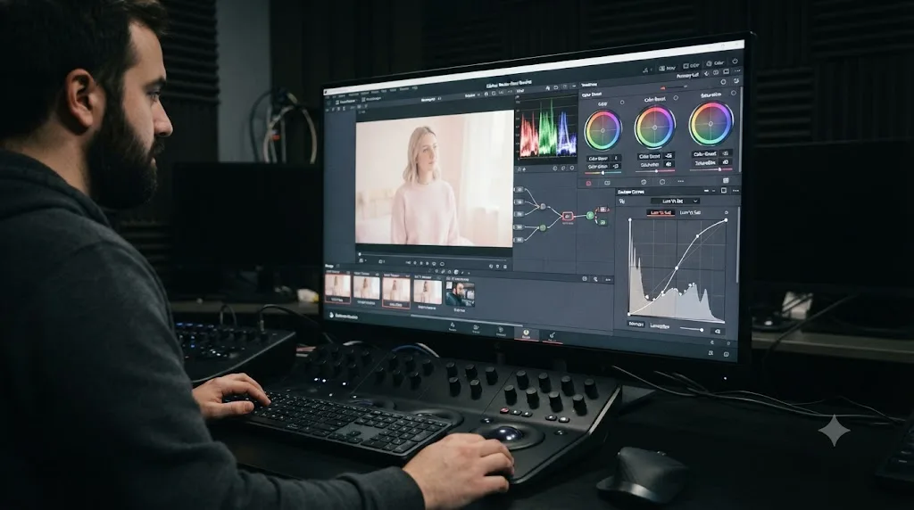
How do you fix banding when a lifted, desaturated pastel grade exposes gradient stripes?
Pastel grading makes banding worse, not better. You're asking the image to spread a lifted black point and a stack of pale midtones over a shortened dynamic and saturation range, and 8-bit footage doesn't have enough discrete steps to render that compressed range smoothly. The sky behind your subject, the wall of a bedroom, the soft blur of an out-of-focus background: these gradients start showing visible stripes instead of a smooth transition, right where a pastel look needs to look smoothest.
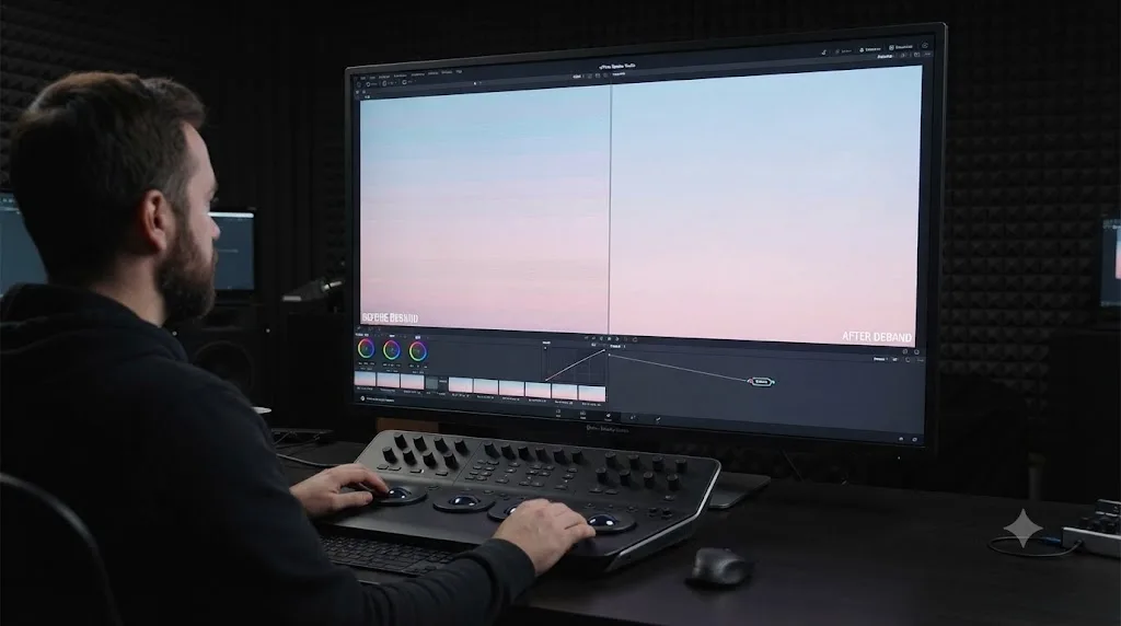
The fix isn't to abandon the grade. It's to add a debanding step after it. DaVinci Resolve ships a dedicated Deband effect in the Effects panel, on both the Edit and Color pages, that isolates the edges of a banding stripe and dithers pixels from either side of it to soften the transition, according to PremiumBeat's breakdown of the tool. Four parameters control it: Edge Threshold decides how defined an edge has to be before the tool touches it, Radius sets how far the dithering spreads, Post-Refine narrows or widens the affected area, and Display Edge shows you exactly which pixels the tool is changing so you're not guessing.
Isolate the problem area first with a qualifier or a power window rather than running Deband over the whole frame. A sky that's banding and a face that isn't don't need the same treatment, and running Deband everywhere softens detail you didn't need to touch.
If Deband isn't fixing it on its own, grain does the same dithering job by a cruder method: a small amount of noise breaks up the flat steps a compressed pastel gradient produces, and PremiumBeat notes that "the mix of grain and online compression dilutes the hard edge of the digital banding." Film Look Creator's own Grain control, covered later in this guide, does double duty here: the same texture that makes a pastel grade feel like faded film also happens to be one of the cheapest debanding tools in the app.
Banding shows up more in a pastel grade than in a normal one because you've deliberately compressed the range the image has to work with. The real long-term fix, when it's available to you, is starting from higher bit-depth source footage and exporting through a codec that preserves it. For a final file, PremiumBeat recommends H.265 with the Main10 profile over H.264 specifically because it keeps the extra bit depth 10-bit or 12-bit footage was shot with, instead of crushing it down to 8-bit on the way out. Deband and grain are the fix for footage you already have. Bit depth is the fix for the next shoot.
How do you protect skin tones while pushing a pastel palette?
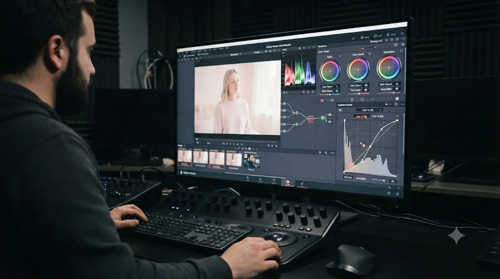
Add a Hue vs Sat curve after your base grade and pull a control point down specifically at the skin tone hue range so skin holds more color than the rest of the pale frame. Skin is the one part of almost any shot a pastel grade shouldn't fully surrender, because a face that goes as pale as the background reads as sick rather than dreamy.
The Hue vs Sat curve maps saturation as a function of hue, so you can lower saturation everywhere except one narrow band. Open the Curves palette, switch to Hue vs Sat, use the picker to click the skin in your viewer, and Resolve drops a control point at that hue automatically. Drag that point up relative to the rest of the curve, and skin keeps more of its natural color while everything around it stays pale.
Check the result on the vectorscope rather than trusting your eyes here specifically, because a pastel frame is exactly the situation where your eyes get fooled: correctly saturated skin can look washed out purely by contrast with an even paler background. Enable the skin tone indicator line in the vectorscope's settings menu and confirm skin still falls close to that diagonal reference, even if its distance from center, its saturation, sits lower than it would in a normal grade. Our guide to reading DaVinci Resolve's scopes walks through the full vectorscope and waveform reading in more depth if scopes are new to you.
How did the colorist on Barbie get pastel skin tones next to full-saturation everywhere else?
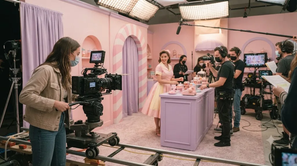
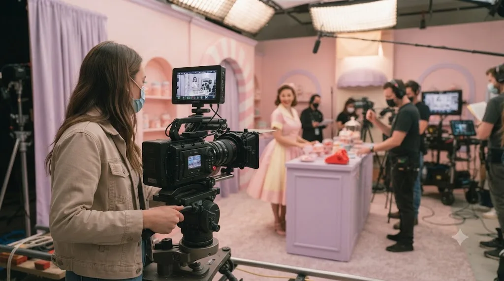
The same principle at feature-film scale: isolate skin from the rest of the palette instead of grading the whole frame as one unit. Barbie's Barbie Land sequences pushed pinks, reds, and blues hard while keeping skin tones deliberately pastel and undersaturated, a split that colorist Yvan Lucas of Company 3 and cinematographer Rodrigo Prieto built with a custom plug-in specifically so the saturated set colors wouldn't drag skin along with them.
Lucas built the film's overall look around a custom LUT that combined film emulation with a Technicolor-style push on specific hues, developed before principal photography even started so the whole crew was grading toward the same target. He described the process in an interview with Company 3:
"We did quite a lot of work to finetune every shot, but everybody had a strong concept of where this look would come together from the start because of the LUT."
That's the same relationship a downloaded pastel LUT has to your own footage, just at a much larger scale: the LUT sets the direction everyone agrees on, and the fine-tuning per shot is still separate, manual work. Director Greta Gerwig's own account of the color decision, given to Rolling Stone and reported by SlashFilm, gets at why a candy palette reads as emotionally warm rather than just decorative:
"So we were picking these bright, saturated colors. The result was that the set was like a dopamine generator. People would walk in and smile."
A pastel or candy-color palette works because it's a deliberate emotional choice, not because pale colors are inherently more tasteful than saturated ones. Keep that in mind when you're tempted to desaturate a shot uniformly out of habit. The goal isn't lower saturation for its own sake, it's a specific, chosen feeling, and skin usually needs to sit slightly outside that choice to still read as human.
How do you keep one strongly colored element from turning pastel with the rest of the frame?
Sometimes one thing in the shot needs to stay saturated while everything around it goes pale: a product in a product shot, a logo, a single flower in an otherwise muted garden, the exact red of a client's brand color. Skin tone protection, covered above, solves this for faces specifically because a Hue vs Sat curve targets a hue range across the whole frame. A single object needs a different tool, because the color you want to protect might share a hue with something else you do want desaturated.
Add a new serial node after your base pastel grade and build an HSL Qualifier keyed to the object's specific color, then apply the correction on a parallel node so the rest of the frame keeps its pastel treatment while the qualified object gets pushed back toward full saturation. Use the qualifier's highlight view, the black-and-white matte overlay, to confirm you've isolated only the object and not stray pixels elsewhere in the frame that happen to share its hue.
A power window tightens the selection further when a qualifier alone grabs too much. If the object you're protecting shares a color with, say, a patch of sky in the background, add a window shaped to the object and set the qualifier's key to only apply inside it. That combination, a color key confined to a spatial window, is the same pairing colorists reach for whenever a single color exists in more than one place in a frame and only one of those places should get the correction.
A pastel grade doesn't have to be pastel everywhere. Products, logos, and brand colors are the most common reason to break the rule on purpose, and the fix is the same qualifier-plus-window combination that solves dozens of other selective-correction problems in Resolve, not a special pastel-specific tool. If your qualifier keeps grabbing the wrong pixels when you try this, our guide to fixing qualifiers that won't select correctly covers the matte finesse controls that usually fix it.
How do you add a split tone for a cotton-candy color pairing?
Add a new serial node and push a cool color into Lift while pushing a warm color into Gain, the classic split tone move that gives a pastel grade its signature two-color pairing, soft blue shadows against peachy highlights, or lavender against butter yellow.
Split toning works because the eye reads shadow color and highlight color as two separate decisions, even though they're happening in the same frame. On the color wheels, click and drag the Lift wheel's center point a short distance toward blue or lavender, and drag the Gain wheel's center point a short distance toward peach, pink, or warm yellow. Keep both moves small. A split tone that's visible as "two colors" rather than "one cohesive mood" has gone too far, and it's an easy mistake to make once you can see the effect working.
DaVinci Resolve's Film Look Creator plugin, covered in more detail next, includes a dedicated Split Tone control with Hue Angle and Pivot parameters that does the same job with a cleaner interface than dragging wheel center points by hand, if you'd rather work with numeric precision than a trackball-style drag.
Order matters here too: build the split tone after saturation is set, on its own node, not folded into your base grade node. One node, one job, is what makes a pastel grade easy to adjust six months later instead of a tangle you're afraid to touch. If a client asks you to cool the highlights slightly, you want that to be a thirty-second change to one node, not a hunt through a stack of combined adjustments. Our guide to node labels and colors covers labeling this kind of node chain so it stays readable as it grows.
What does DaVinci Resolve 21's Film Look Creator add for pastel and faded looks?
Film Look Creator is Blackmagic's built-in look-development plugin, and several of its controls map directly onto pastel grading without needing a third-party tool. Drop it on its own node from the Effects panel, under ResolveFX Color, or from the Film Look Creator category, and it works entirely inside your existing node chain.
The controls most relevant here: Subtractive Saturation and Richness, which desaturate with a different mathematical curve than the ordinary Saturation slider and often produce a softer pastel base with less manual tuning; a Split Tone section with Hue Angle and Pivot controls, a numeric version of the wheel-drag technique above; and texture tools, Halation, Bloom, Grain, Vignette, Flicker, and Gate Weave, that add the physical imperfection real faded film stock has and a purely digital pastel grade lacks.
Resolve 21 specifically improved two of those texture tools. Per Newsshooter's coverage of the Resolve 21 release, Film Look Creator gained an Aurora preset and new contrast roll-off controls, both aimed squarely at the soft, faded contrast curve a pastel look depends on. And per Cullen Kelly's own breakdown of the plugin for Frame.io, the rebuilt halation tool, which softens and blooms the brightest parts of a frame, is a meaningful upgrade over what came before: "the new one feels a lot better to me."
Use these tools last, after your base grade, skin protection, and split tone are already set. Halation and grain read as finishing texture, and applied too early they make every subsequent adjustment harder to judge because you're fighting noise and bloom while trying to set clean contrast.
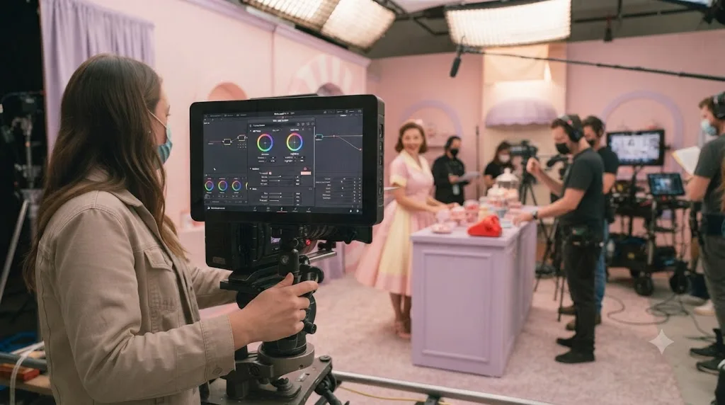
Should you build a pastel look manually or start from a LUT?
Both work, and the honest answer depends on how much your footage varies. A LUT gets you to a rough pastel destination in one click; a manual node chain takes longer to build the first time but adapts cleanly to footage a LUT wasn't designed for.
| LUT-based pastel look | Manual node chain | |
|---|---|---|
| Speed to first result | Fast, one click | Slower, several controls to set |
| Consistency across mismatched footage | Poor, a LUT built for one exposure range clips or crushes on different footage | Strong, you adjust per shot as you go |
| Editability later | Limited, a LUT is a fixed transform | Full, every node stays adjustable |
| Best for | A single-camera, consistently lit project, or a fast starting point | Mixed footage, client work, or footage you'll revisit |
Choose a LUT if you're working with one camera under consistent light and want a fast first pass, especially early on while you're still learning what a pastel grade should look like. Choose a manual build if your footage comes from multiple sources, multiple lighting setups, or if this is client work you'll need to adjust later without starting over.
The honest middle path, and the one professionals actually use: treat a downloaded LUT as your first node, not your final answer. Drop it on its own labeled node, then add a second node for whatever it gets wrong on your specific shot, usually skin tone or overall exposure. Fashion and film-emulation LUT packs marketed as dreamy, faded, or matte are worth searching for by exactly those terms if you want a pastel starting point to build from rather than starting from a blank node. Our guide to creating a custom LUT covers exporting your own manual pastel build as a reusable LUT once you've dialed it in, so you get the speed of a LUT with a grade you actually built.
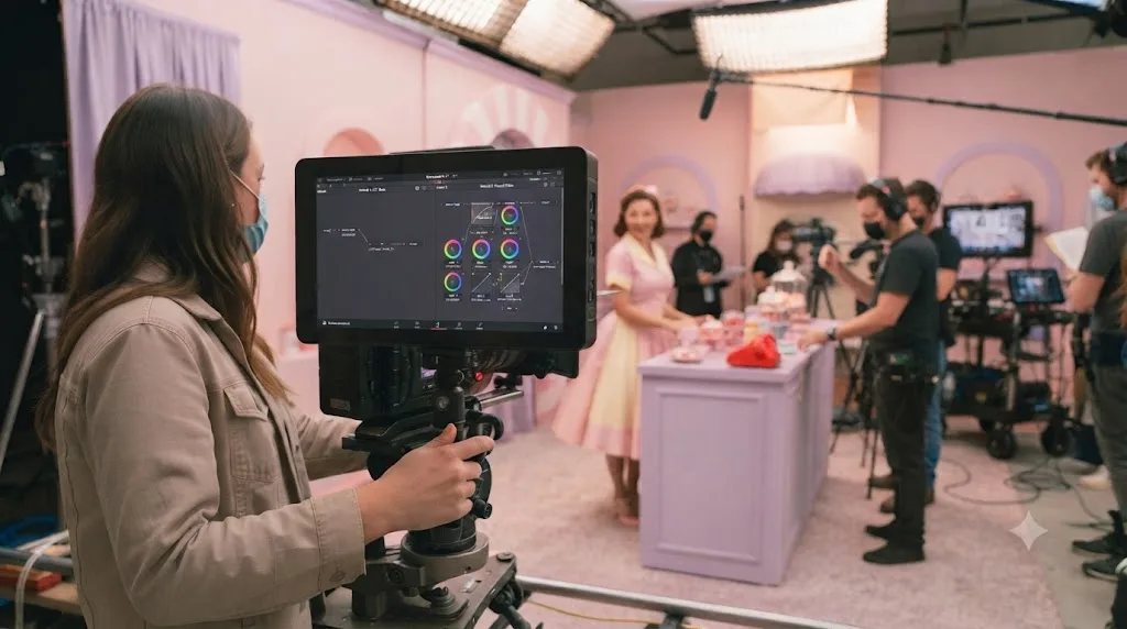
How do you adapt the pastel recipe for S-Log3, V-Log, C-Log3, or D-Log M footage?
Every wheel value in this guide assumes you're grading a normalized Rec.709 image, not raw log footage straight off the sensor. Log profiles like Sony's S-Log3, Panasonic's V-Log, Canon's C-Log3, and DJI's D-Log M all deliberately flatten contrast and desaturate color at capture to protect dynamic range for the grade, and building a pastel look directly on top of that flat image means you're desaturating something that's already desaturated, which produces murky, directionless color instead of a controlled pastel palette.
Normalize first. Apply a Color Space Transform node, or switch the project to DaVinci YRGB Color Managed and set the input color space per clip, before you touch a single pastel wheel. That step restores the contrast and color the log profile intentionally hid, and it's the same normalization step our color grading basics guide walks through for any grade, pastel or otherwise. Skip it and you're back to the same problem covered earlier: lifting and desaturating a shot that never had real contrast in the first place, just at the sensor level instead of the node level.
Once normalized, the log profile itself stops mattering much. S-Log3, V-Log, C-Log3, and D-Log M all converge on the same Rec.709 starting point after a correct transform, so the pastel wheel values from earlier in this guide apply the same way regardless of which camera shot the footage. What changes is how much correction the normalization step itself needs, since sensors and log curves clip highlights and protect shadow noise differently. Our Sony A7 IV S-Log3 grading settings and DJI Air 3 D-Log M grading settings guides cover the exact transform settings per camera if you're starting from one of those specifically, and the same logic applies to Canon's C-Log3 or Panasonic's V-Log with the matching input color space swapped in.
A pastel grade built on unnormalized log footage is the single most common reason a "correct" pastel recipe looks wrong on someone else's camera. If you mix cameras in one project, a wedding shot on a Sony body and a drone shot on a DJI, normalize both to the same working color space before either one touches a pastel node, or the two clips will drift to different pastel shades the moment you cut between them.
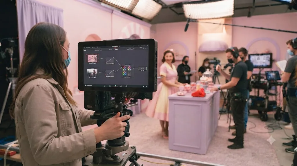
What's a full step-by-step pastel grade in DaVinci Resolve, node by node?
Here's the whole process on a concrete clip: a daylight exterior shot on a mirrorless camera, standard Rec.709 picture profile, decent exposure, nothing dramatic to fix first.
- Balance first. Serial node, label it "balance". Set exposure and contrast with Lift and Gain against the waveform, correct white balance with Temp and Tint against the RGB Parade. Judge nothing pastel yet, this node is a normal, honest correction.
- Lift the floor, ease the ceiling. Same node or a new one labeled "pastel base": raise Lift a few points so the darkest part of the frame sits as a pale gray instead of true black, pull Gain down slightly so the brightest highlight reads as cream instead of clipped white.
- Drop saturation, add Color Boost back. Pull Saturation to roughly 30-35, then dial Color Boost up until the strongest colors in the frame, a patch of sky, a piece of wardrobe, read as pale but still present, not gray.
- Add a Lum vs Sat curve. New control in the same node or a fresh one: pull saturation down slightly harder in the shadows than the highlights for a touch of depth the flat Saturation slider can't produce alone.
- Protect skin. New node labeled "skin", Hue vs Sat curve, click the skin in the viewer, pull that hue's control point up relative to the surrounding pale palette so the face still reads as a face.
- Split tone. New node labeled "split tone", cool color pushed into Lift, warm color pushed into Gain, kept subtle enough that it reads as one mood rather than two competing colors.
- Texture, if the shot calls for it. New node labeled "texture", Film Look Creator's Halation and Grain, dialed in gently, useful for a handheld or documentary-style pastel edit, skippable for a clean, modern one.
- Check the scopes. Waveform confirms your lifted floor and eased ceiling didn't collapse into a flat line, vectorscope confirms saturation is genuinely low and even, not accidentally crushed in one channel.
- Grab a still. Right-click the viewer, Grab Still, and every other shot in the scene now matches against this reference instead of your memory of what you built five minutes ago.
Six labeled nodes, each doing exactly one job. That's the entire shape of a pastel grade, and it's the same discipline any professional node chain follows, just aimed at a specific palette instead of a neutral correction.
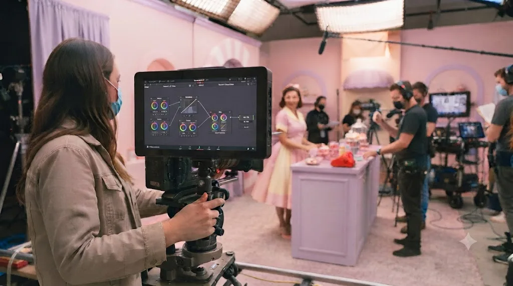
What changes for an indoor, mixed-lighting shot instead of a daylight exterior?
The daylight exterior example above assumes clean, single-source light and a sensor that captured a wide, even range. Indoors, under mixed practical light, a lamp here, a window there, maybe a cool LED panel in the corner, you're starting from a shot with a color cast baked in before you even open the Color page. The pastel steps stay the same. The order in which you fix things before them changes.
- Fix white balance before anything else. Use the eyedropper on a neutral gray or white surface in frame, not a guess with the Temp and Tint wheels. Mixed lighting often means no single white balance is perfectly correct everywhere in the shot, so pick the surface closest to your subject and accept that background light sources may sit slightly warm or cool. That's a separate problem from the pastel grade and not one to solve with saturation.
- Correct the color cast with a qualifier before lifting blacks. If a warm lamp is throwing an orange cast across one side of the frame that white balance alone can't fully neutralize, key that region with a qualifier or window and pull it back toward neutral in its own node, labeled separately from your pastel base. Skipping this step means the pastel base grade desaturates an uneven cast instead of even color, and the orange side of the frame reads as a different, muddier pastel than the rest.
- Build the pastel base the same way. Lift, Gain, Saturation, Color Boost, exactly as in the daylight example. Indoor footage often has less dynamic range to work with than a bright exterior, so expect to lift the black point less aggressively; a shot that's already close to its floor doesn't have as much room to lift before it flattens.
- Watch shadows for noise, not just banding. Indoor footage shot at a higher ISO carries more sensor noise in the shadows than a daylight exterior does, and lifting that noisy shadow floor makes the noise more visible, not less, the same way lifting blacks makes banding more visible. A touch of Temporal or Spatial noise reduction before the pastel base node, judged conservatively so you don't lose the texture the grade needs, usually solves this cleaner than trying to hide noise under film grain later.
- Recheck skin protection under artificial light. A Hue vs Sat curve tuned on a daylight-lit face doesn't always transfer cleanly to skin lit by a warm lamp or a cool LED, because the actual hue value of "skin" shifts slightly with the color temperature of the light hitting it. Re-pick the skin tone with the curve's eyedropper on this specific shot rather than reusing a saved curve from a different lighting setup without checking it first.
Mixed indoor lighting doesn't change the pastel recipe. It changes what you have to fix before the recipe applies. Treat the white balance and noise problems as their own nodes, solved before the pastel base, and the rest of the process from the daylight example carries over exactly as written.
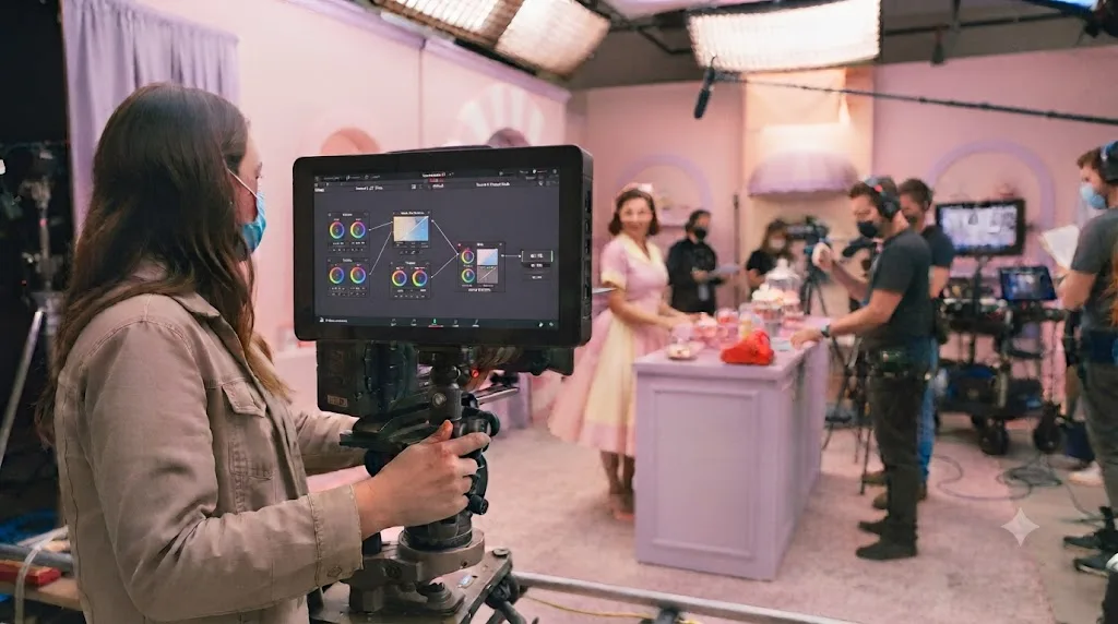
Which pastel variant matches Barbiecore, Y2K, cottagecore, or coquette?
"Pastel" isn't one look. The internet's current crop of pastel-adjacent aesthetics share the low-saturation, lifted-black foundation this guide builds, but they diverge hard on hue choice and how far you push the split tone. Knowing which variant a client or a trend clip is actually asking for saves you from building a technically correct pastel grade that still looks wrong for the reference they showed you.
| Aesthetic | Dominant hues | Typical saturation | Split tone direction | Texture |
|---|---|---|---|---|
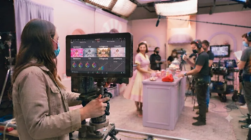
| Barbiecore | Hot pink pushed toward pale, not muted | Mid, 35-45, brighter than a true pastel | Warm pink in Gain, neutral to slightly warm Lift | Clean, little to no grain |
| Y2K | Baby blue, silver-lavender, bubblegum pink | Low, 25-35 | Cool blue in Lift, cool pink in Gain, a symmetric cool split | Slight sharpening or clarity, minimal grain |
| Cottagecore | Butter yellow, sage green, dusty rose | Low, 25-35 | Warm yellow in Gain, muted green-neutral in Lift | Soft grain, gentle halation |
| Coquette | Blush pink, cream, pale red | Low to mid, 30-40 | Warm pink-cream in both Lift and Gain, minimal contrast between them | Soft focus feel, light grain |
| Dreamcore / faded film | Any pale pairing, often desaturated across the board | Very low, 20-30 | Cool Lift, warm Gain, pushed further apart than the others | Heavy grain, strong halation, gate weave |
Every row still starts with the same balance-then-lift-then-desaturate order from earlier in this guide. What moves is which hue you push into Lift and Gain during the split tone step, how far you push Saturation, and how much texture you layer on with Film Look Creator afterward. Barbiecore, notably, sits at the brighter, more saturated edge of what most people mean by "pastel," closer to the Barbie set reference covered above than to a washed-out dreamcore look, which is exactly why copying wheel numbers from a dreamcore tutorial onto a Barbiecore brief produces a grade that reads muddy instead of punchy.
Treat this table as a starting direction, not a locked recipe. Reference clips vary more within each aesthetic than a table can fully capture, and the honest process is still to check any of these against the scopes on your own footage, the same way the rest of this guide recommends.
How do you check a pastel grade on the scopes instead of trusting your eyes?
Your monitor lies to a pastel grade more than it lies to a normal one, because the whole image sits in a narrow tonal and saturation range where small display differences read as real grading differences. Scopes read the actual signal, not your room's lighting or your screen's brightness setting.
On the waveform, confirm your lifted black point sits as a distinct band a bit above zero, not pressed flat against the floor, and your eased highlight sits a bit below 1023 rather than clipped flat at the top. A pastel grade should still use meaningful range on the waveform. It's a compressed range compared to a normal grade, not a collapsed one, and the difference between those two is the difference between "soft" and "broken."
On the vectorscope, expect a trace that stays close to the center of the graph, low saturation across the board, but not a single dot sitting exactly on center. A trace collapsed entirely to the middle means the image has gone effectively monochrome, which reads as a mistake rather than a style choice. Confirm the skin tone indicator line still has a real trace near it, distinct from the rest of the pale colors around it, using the technique from the skin protection section above. Our scopes guide covers reading both scopes from zero if this is new territory.
How do you save and reuse a pastel grade across a project?
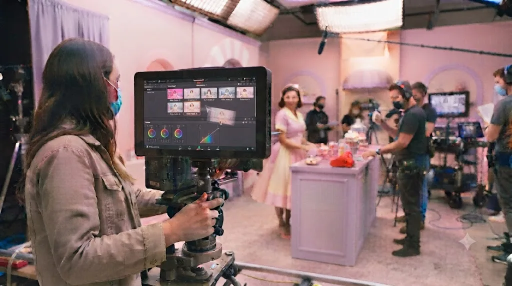
Grab a still once the grade is right, and save it into a PowerGrade album so the same base is available in every future project, not just the one you're working in now. PowerGrades live at the database level, so they follow you across projects the way an ordinary gallery still doesn't.
Right-click the viewer and choose Grab Still, then drag that still into a PowerGrade album from the Gallery's album list on the left. From here on, applying your pastel base to a new clip is a middle-click on the still's thumbnail over the clip in the timeline, or a right-click and Apply Grade for more control over which parts of the node tree transfer. Our full guide to PowerGrades covers Append Node Graph, sharing a grade as a .drx file, and organizing an album once you're building more than one look.
For matching multiple shots inside one scene, group the clips that share lighting and apply the grade to the group's Pre-Clip node graph instead of each clip individually. One adjustment to the group updates every clip in it at once, which matters more for a pastel look than most, since even a small mismatch in saturation between two adjacent shots reads as an obvious cut in a palette this narrow.
Does a pastel grade need anything different for vertical, social-first video?
Mostly not the grade itself, but two things around it change. You opened this guide because a pastel edit trending on TikTok or Pinterest probably sent you here, and most of that content ships vertically, at 9:16, viewed on a phone screen rather than a calibrated monitor.
The first difference is where you're looking while you grade. If the final export is vertical, crop or reframe to 9:16 before you finalize the pastel base, not after, since a wide shot's brightest sky or most saturated wall might sit entirely outside a vertical crop, changing what the frame's actual saturation balance looks like once cropped. Grading a 16:9 frame and cropping to vertical afterward risks a pastel balance that only worked because of color sitting in a part of the frame nobody will see in the final export.
The second difference is trusting your monitor even less than usual. Phone screens run brighter and more saturated by default than a calibrated grading display, and a pastel grade already sits in the part of the tonal range where small display differences read as real grading differences, the same issue covered in the scopes section above. A grade that looks correctly soft on your reference monitor can look oversaturated on a phone's default display mode, or washed out on one set to a dimmer battery-saving profile. Export a short test clip and actually watch it on a phone, ideally more than one, before committing to the final render, the same two-minute check recommended in the export section below, just aimed specifically at the device your actual audience will use.
A pastel grade built and checked only on a calibrated monitor is optimizing for a viewing condition almost nobody watching a vertical pastel edit will actually have. The wheel values and node order don't change for social video. What changes is which screen gets the final say on whether the grade reads correctly, and that screen is a phone, not your suite.
What mistakes make a pastel grade look washed out instead of dreamy?
Almost every disappointing pastel attempt traces back to skipping the contrast step, applying the same numbers to footage that didn't earn them, or grading a compressed range without checking what that compression costs.
| Mistake | Why it hurts | The fix |
|---|---|---|
| Lifting blacks before setting contrast | The image reads as foggy, not soft, because there's no depth underneath the lift | Balance exposure and contrast first, lift second |
| Desaturating the whole frame equally | Skin and the frame's strongest colors go gray along with everything else | Use Color Boost and a Hue vs Sat curve to protect what should stay visible |
| Copying exact wheel numbers from a tutorial onto different footage | Every shot has different exposure, so fixed numbers clip or crush unpredictably | Treat numbers as starting points, judge against the scopes on your own clip |
| A split tone pushed too far | Two competing colors instead of one soft mood | Keep the Lift and Gain wheel drags small, check it reads as one feeling |
| Applying a downloaded LUT and stopping there | A LUT built for different footage clips highlights or crushes skin | Treat the LUT as a first node, add a correction node after it |
| Grading before white balance is fixed | A pastel palette amplifies a color cast instead of hiding it | Correct Temp and Tint in the balance node before anything pastel |
| No skin protection curve at all | Faces look sick or pale instead of soft | Add the Hue vs Sat curve from the skin tone section above, every time |
| Grading log footage without normalizing it first | The image was already desaturated at capture, so a pastel pull on top produces murky, directionless color | Apply a Color Space Transform or switch to color-managed mode before any pastel adjustment |
| Ignoring the banding a lift-and-desaturate move introduces | Gradients like sky and skin show visible stripes once the range is compressed | Isolate the area and run Deband, or add a touch of grain, before calling the grade final |
The pattern underneath all nine: a pastel grade is a restrained version of a real image, not the absence of one. Every mistake in this table comes from removing something, contrast, color, care, instead of deliberately softening it.
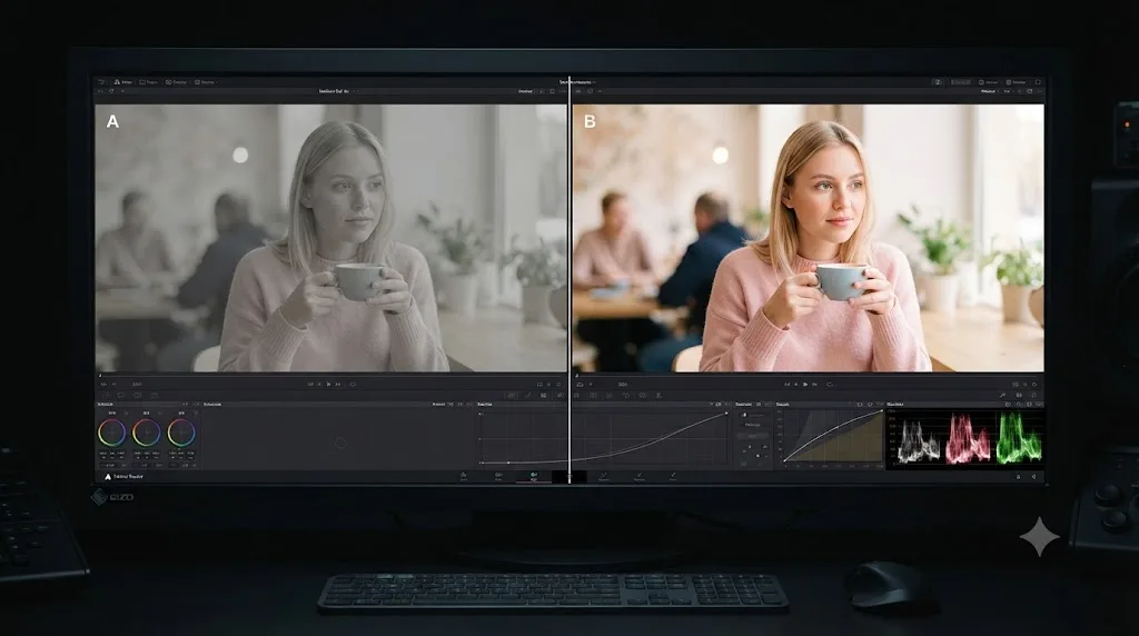
Does a pastel grade survive export the way you built it?
Yes, without any extra step, but a pastel grade is more sensitive to one specific export mismatch than a normal grade is. The Deliver page renders your node graph into the file automatically, so the grade itself is baked in. What can shift is how the exported file gets interpreted on playback.
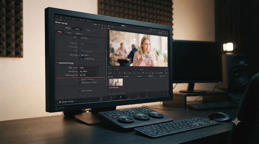
Data levels are the usual culprit. In the Deliver page's Advanced Settings, leave Data Levels on Auto unless you know the receiving platform demands otherwise. Forcing Full levels on a codec a player treats as video levels crushes your carefully lifted blacks right back down toward zero, undoing the exact softness the whole grade was built around. A pastel image has less room to hide that kind of error than a normal-contrast one, because there's less range left to absorb the mismatch.
The second common gap is platform-specific gamma handling on playback, QuickTime on a Mac in particular. A pastel grade that looks perfect in the Resolve viewer can read slightly darker or more contrasty once it hits a player with different gamma interpretation, which is the opposite direction of what you want from a look built on softness. Our export settings guide covers the exact Advanced Settings combinations per platform, gamma tags included, in more depth than makes sense to repeat here.
Render ten seconds of your most pastel-heavy scene, play it in the actual app your audience will use, phone, browser, whatever's realistic, and compare it against the Resolve viewer before committing to the full export. It's a two-minute check that catches the one class of error a pastel grade can't afford to eat silently.
Do you need DaVinci Resolve Studio for a pastel aesthetic grade, and does your hardware change how it performs?
No, not for the grade itself. Every control this guide uses, the primary wheels, Curves palette, Hue vs Sat, HSL Qualifiers, and the Film Look Creator plugin, is available in DaVinci Resolve's free version. Per Blackmagic's own product comparison, Studio's $295 upgrade adds advanced HDR grading, Dolby Vision and HDR10+ metadata palettes, and Neural Engine AI tools like Magic Mask, none of which a standard SDR pastel grade requires.
Hardware and OS do change how comfortably you build one, though, mostly around playback while you're stacking nodes. On a Mac, Apple silicon decodes H.264, H.265, and ProRes in hardware, which keeps a full pastel chain playing smoothly even on camera originals. On Windows, Blackmagic reserves hardware-accelerated H.264 and H.265 decoding for the Studio version specifically, so free-version users grading phone or drone footage lean harder on the CPU, and many transcode to DNxHR or ProRes on ingest to keep playback smooth. On Linux, the free build has long shipped without H.264, H.265, or AAC support at all, so the same transcode-on-ingest habit applies there by default.
If playback stutters once you've stacked the full pastel chain, halation and grain in particular, drop the Timeline Proxy Resolution to Half under Playback settings while you're still adjusting, and switch Render Cache to Smart so Resolve pre-renders the finished sections in the background. Neither changes the actual grade math, only what gets processed for on-screen playback while you work.
What's the best way to learn DaVinci Resolve color grading fast, and is there an AI tool that helps while you grade?
Blackmagic's own free training books, on the official training page, and established YouTube channels like Casey Faris remain the honest starting point for learning the node system itself, and no single tutorial or tool replaces the hours of practice a look like this one takes to feel automatic. That advice holds regardless of what you build with it afterward.
Where a real gap shows up is the exact moment you're mid-grade, staring at a curve you half-remember, and don't want to pause the session to hunt through a twenty-minute video for a ten-second answer. TryUncle is the on-screen assistant for DaVinci Resolve on macOS: ask in plain words and Uncle points at the exact control on your screen. That's a narrower, more specific job than the AI editing tools that get recommended for Resolve users, tools like CutAgent or Sottocut, which execute an edit for you rather than showing you where a control lives; Uncle answers the question and leaves the actual click to you.
If you're mid-way through building the Hue vs Sat curve from this guide and can't remember where the picker tool sits in the palette, that's the exact gap TryUncle is built to close, watching your actual open project instead of a demo file, and pointing at the real control instead of sending you back to a browser tab. It's currently in founder pricing for its first 100 seats, macOS only, and worth checking TryUncle's own site for the current rate since founder pricing doesn't hold indefinitely.
Where do you go from here?
One serial node, balanced first, lifted second, desaturated third, with a skin protection curve and a subtle split tone on top. That's a complete pastel grade, and every other technique in this guide, Film Look Creator's texture tools, LUT starting points, log-footage normalization, PowerGrade reuse, is refinement layered onto that same six-step spine.
Pick one clip from your own footage, ideally something with real dynamic range rather than a flat phone clip, and run it through the process today. Judge it against the scopes before you judge it by eye, because a pastel image is exactly the kind of grade your monitor is worst at reporting honestly.
And once the base feels automatic on a single clip, the harder skill is consistency: matching that same soft, pale palette across a dozen shots with different lighting, cameras, and log profiles, without every cut reading as a slightly different pastel. That's a matching problem, not a color problem, and it's the same discipline our color grading basics guide covers for grading a full timeline in passes rather than shot by shot.
Frequently asked questions
- What node settings create a pastel look in DaVinci Resolve?
- Start in one serial node: lift the black point a few points above zero, pull Gain down slightly so the whites go soft instead of clipping, drop Saturation from its default of 50 to somewhere around 30-35, and add a gentle split tone, a cool color in Lift and a warm one in Gain. Check the result against the vectorscope rather than judging it by eye.
- How do you desaturate footage for a pastel grade without it looking flat and muddy?
- Desaturate after you set contrast, not before, and use Color Boost alongside plain Saturation rather than instead of it. Color Boost lifts weak, barely-there colors more than it touches already-strong ones, which keeps a pastel image looking soft instead of gray. A Lum vs Sat curve that pulls saturation down harder in the shadows than the highlights adds the same depth a plain Saturation slider can't.
- Should you crush blacks before lifting them for a pastel grade?
- It's a real technique, not just a phrase: set your black point with real contrast first, using Lift and Gain like a normal correction, and only then raise the floor with Lift or Offset. Skip the first step and lift a shot that never had contrast, and the image looks foggy rather than pastel, because there was nothing underneath the lift to protect.
- What LUTs work for a pastel aesthetic in DaVinci Resolve?
- Fashion and film-emulation LUT packs marketed as dreamy, faded, or matte fade will get you close in one click, and they're a fine starting point. Treat any downloaded LUT as a first node, not a final answer: drop it on its own node, then add a second node to fix whatever it does wrong on your specific footage, usually skin tone or overall brightness.
- How do you keep skin tones from turning pastel and washed out?
- Add a Hue vs Sat curve after your base grade and pull a control point down at the skin tone hue range so that specific hue holds more saturation than the rest of the frame. Check it against the vectorscope's skin tone indicator line rather than trusting how it looks on your monitor, since a pastel image can make correctly saturated skin look pale by contrast.
- Is DaVinci Resolve Studio needed for a pastel aesthetic grade?
- No. Every tool this guide uses, primary wheels, curves, qualifiers, and the Film Look Creator plugin, is available in the free version. Studio's advantage shows up in HDR grading, Dolby Vision and HDR10+ metadata, and Neural Engine AI tools like Magic Mask, none of which a standard SDR pastel grade needs.
- Why does my pastel grade show banding in the sky or on skin?
- Lifting the black point and dropping saturation compresses the range 8-bit footage has to render smoothly, and that's exactly the range where banding shows up. Isolate the area with a qualifier or window and run DaVinci Resolve's Deband effect, or add a touch of Film Look Creator grain, which dithers the same stripes by a cruder but effective method. For a final export, choose H.265 with the Main10 profile instead of H.264 if your source footage is 10-bit or 12-bit, so you're not crushing bit depth on the way out.
- Is there an AI tool that helps while you're color grading in DaVinci Resolve?
- TryUncle is a paid macOS app that watches your actual Resolve window on the Color page and points at the real control when you describe what you're trying to do in plain words, instead of sending you to search a tutorial for the same answer. It's currently in founder pricing for its first 100 seats, and it's a different category from automation tools that grade a clip for you: it teaches you where the control is, and you still make the move.
Sources
- DaVinci Resolve - Color (Blackmagic Design)
- DaVinci Resolve - Tech Specs (Blackmagic Design)
- DaVinci Resolve - What's New (Blackmagic Design)
- DaVinci Resolve 21 Final Release (Newsshooter)
- What's in Resolve's New Film Look Creator Plugin? (Frame.io Insider, Cullen Kelly)
- How a Pro Colorist Handles Crushed Blacks in Resolve (Frame.io Insider, Cullen Kelly)
- Working Digitally, Thinking Filmically: Yvan Lucas on Barbie's Unique Look (Company 3)
- Greta Gerwig Wanted Barbie's Color Palette To Be A 'Dopamine Generator' (SlashFilm)
- Hardware Recommendations for DaVinci Resolve (Puget Systems)
- DaVinci Resolve's Most Useful Nodes: Serial, Parallel, and Outside (Frame.io Insider)
- Methods for Debanding Your Footage in DaVinci Resolve (PremiumBeat)
- TryUncle (product site: how Uncle works, pricing, setup)
- TryUncle FAQ
Keep reading

Guides · Jul 7, 2026 · 35 min
How to Color Grade in DaVinci Resolve: The Basics
Learn how to color grade in DaVinci Resolve: build a node chain, balance shadows and highlights with Lift, Gamma, and Gain, and read the scopes.
Guides · Jul 10, 2026 · 30 min
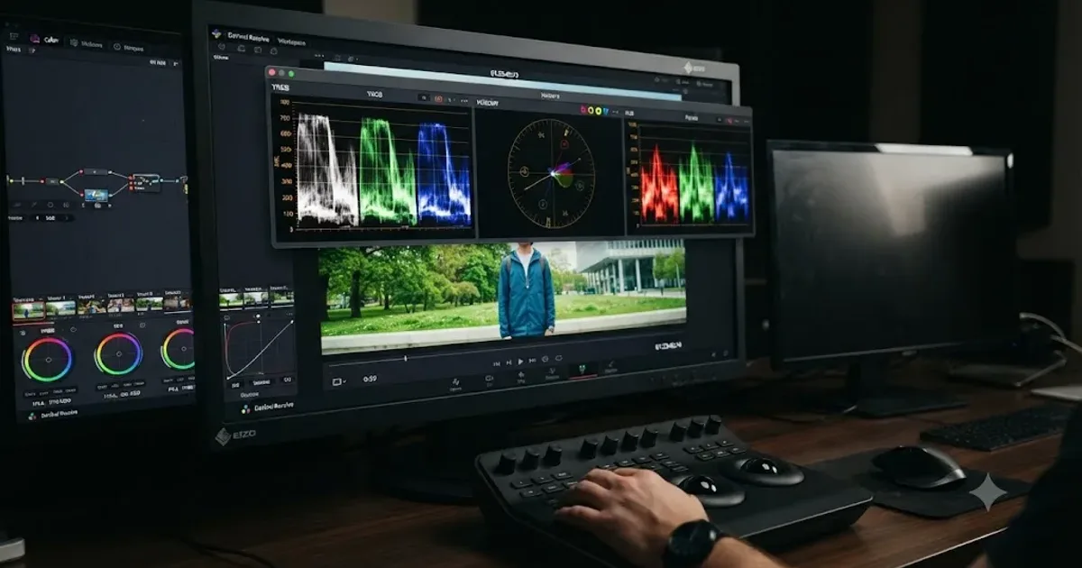
How to Read DaVinci Resolve Scopes: Waveform and Vectorscope
Learn to read DaVinci Resolve's waveform, RGB Parade, and vectorscope: what balanced exposure, white balance, and skin tone actually look like on each.
Guides · Jul 17, 2026 · 25 min
How to Use PowerGrades in DaVinci Resolve
Save, apply, and organize PowerGrades in DaVinci Resolve: grab a still, build an album, apply or append a full node tree, and share it as a .drx file.