Articles / Guidesupdated for DaVinci Resolve 21.0.3 (July 2026)
DaVinci Resolve Cyberpunk Neon Color Grading Tutorial
Quick answer
To grade a cyberpunk neon look in DaVinci Resolve, split-tone magenta highlights against cyan-blue shadows in a dedicated look node, then isolate practical neon signs with HSL qualifiers. Add controlled glow from ResolveFX Light and protect skin tones on a separate node. Check the vectorscope before export so saturated cyan and magenta don't clip in Rec.709 delivery.
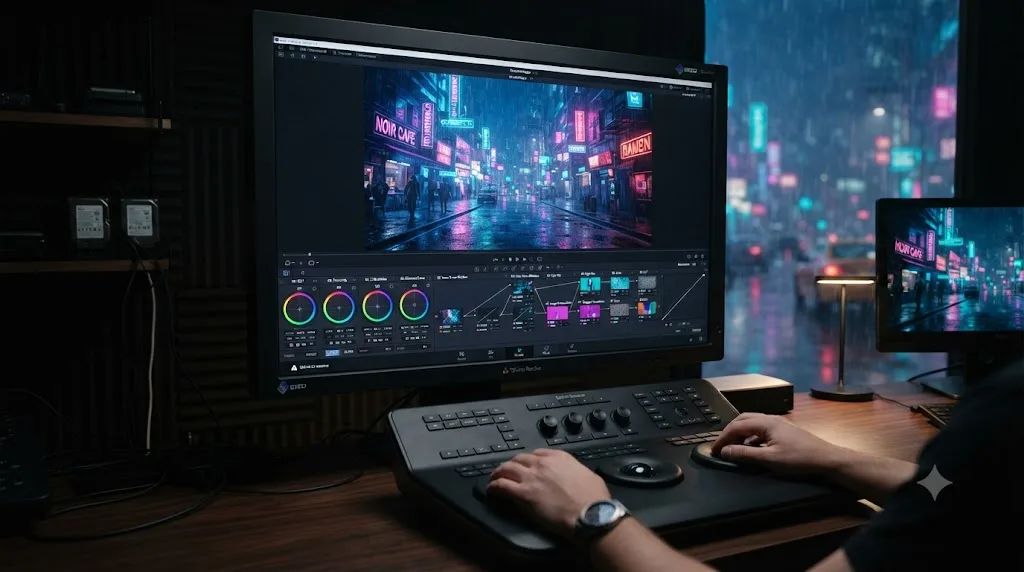
I've graded my share of neon-drenched night exteriors over seven-plus years of commercial and narrative color work, and the same request comes up on a loop in the 100,000+ member video-editing community we run: someone wants their footage to look like a Blade Runner poster, and instead it looks like a bruised, grayish mess with a few oversaturated signs poking through it. As of July 2026, on DaVinci Resolve 21.0.3, the tools to fix that are all sitting in the free version. You just have to use them in an order that actually produces the look instead of fighting it.
This guide builds a cyberpunk neon grade from a flat, balanced shot to a finished look, node by node, with the reasoning behind every move so you can adapt it to your own footage instead of copying settings that only worked on someone else's clip.
What makes a color grade look "cyberpunk"?
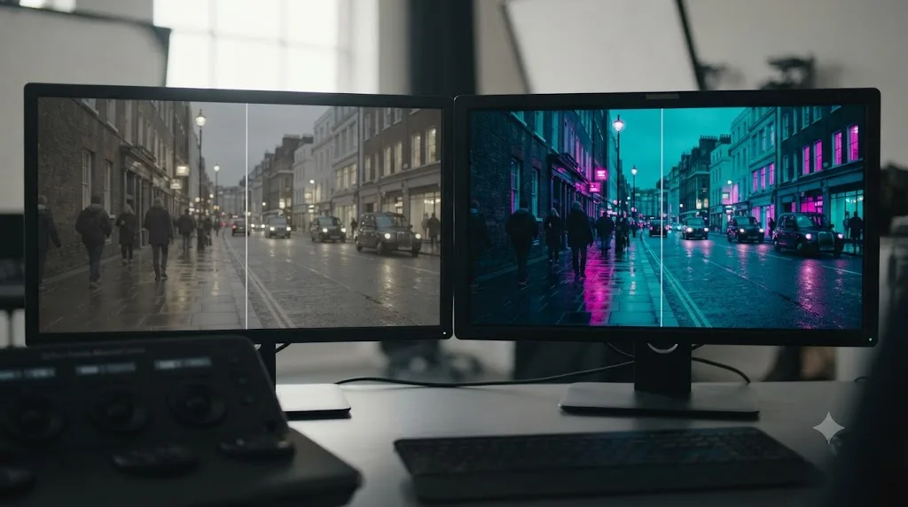
A cyberpunk grade is defined by a narrow, intense color palette rather than a wide, naturalistic one: cool cyan-blue in the shadows, hot magenta-pink in the highlights, and almost nothing warm in between. That narrowness is the entire trick. Push every color in a frame and you get an oversaturated mess. Push two opposing colors hard and suppress everything else, and you get a deliberate, stylized world.
Cinematographer Natasha Braier described exactly this discipline while explaining the visual approach on The Neon Demon, a film built around an intensely saturated, neon-lit palette closely related to what most people mean by "cyberpunk":
"We didn't do the entire rainbow. It was a limited color palette, but a very intense one. It was mostly reds, turquoise blues, magentas and violets. There was a bit of cyanish green in the motel at night. There was no yellow and no orange."
Source: Cinematography of The Neon Demon, interview with Natasha Braier, Pushing Pixels
A cyberpunk grade is a restriction, not an addition. The instinct when you first try this look is to crank saturation on everything until the whole frame glows. That's the fastest way to make it look cheap. The actual work is deciding which two or three hues get to exist in the frame at full intensity, and pulling everything else out of their way.
That restriction is why this look reads as expensive when it's done right and amateur when it isn't. A viewer's eye can tell the difference between a frame with two dominant, intentional colors and a frame where every light source is independently fighting for attention.
What colors make a scene look cyberpunk?
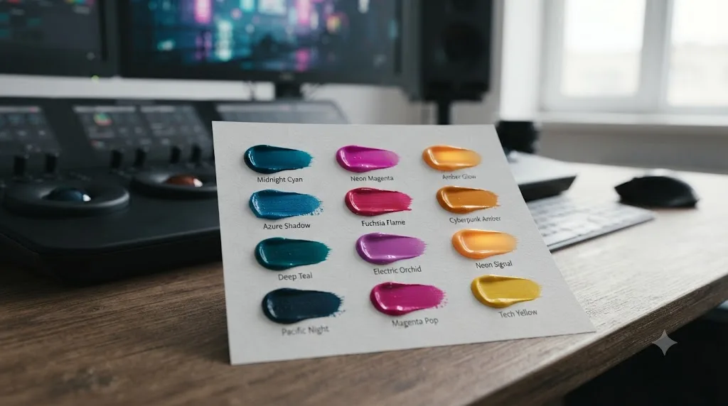
Cyan or electric blue in the shadows, magenta or hot pink in the highlights, and a deep blue-black base rather than a neutral gray one. Beyond those two anchors, cyberpunk grading borrows heavily from real neon signage, which historically leans into a handful of gas-tube colors: red-orange from neon gas itself, blue and violet from argon and mercury vapor mixes, and the full spectrum from modern LED tubing that replaced most of it.
Here's a practical palette table, built around the split-tone structure most cyberpunk grades share:
| Tonal range | Target hue | Rough hex reference | Role in the frame |
|---|---|---|---|
| Deep shadows | Cyan-blue | #0a1f3d to #123a5e | Base ambient light, wet street reflections, sky |
| Midtones | Desaturated cool gray | #2b2f3a | Neutral ground between the two extremes |
| Highlights | Magenta-pink | #d61f8a to #ff3fa4 | Practical neon, rim light, signage glow |
| Accent (used sparingly) | Amber-yellow | #ffb347 | A single warm practical, like a shopfront or a cigarette |
| Skin (protected) | Natural, pulled back toward flesh tone | Case by case | Kept legible against the stylized background |
The accent color matters more than it looks like it should. A single warm light source in an otherwise cool-cyan and magenta frame reads as more cinematic than adding a third cool color ever will. That's because contrast, not variety, is what the eye reads as intentional. One amber neon tube glowing against a cyan-and-magenta street does more storytelling work than five different cool hues competing for the same attention.
Avoid orange and yellow everywhere else in the frame. They're the two colors Braier specifically excluded from The Neon Demon's palette, and the same exclusion holds for cyberpunk work: warm midtones dilute the cool-versus-hot contrast the whole look depends on.
How do you get a cyberpunk color grade in DaVinci Resolve?
You get there through a node chain that separates correction from style: normalize and balance the shot first, split shadows and highlights into cyan and magenta on a dedicated look node, isolate practical neon signs for an extra saturation and glow push, then check the result against the vectorscope before you export. Skipping the first step is the single most common reason a cyberpunk grade looks broken instead of stylized, because pushing color extremes on top of an unbalanced image amplifies whatever was already wrong with the shot.
This mirrors the structure our color grading basics guide walks through for any grade: correction happens first, look happens last, and each stage lives in its own node so you can undo one decision without unraveling the rest. A cyberpunk grade just adds a specific, intense look on top of that same foundation.
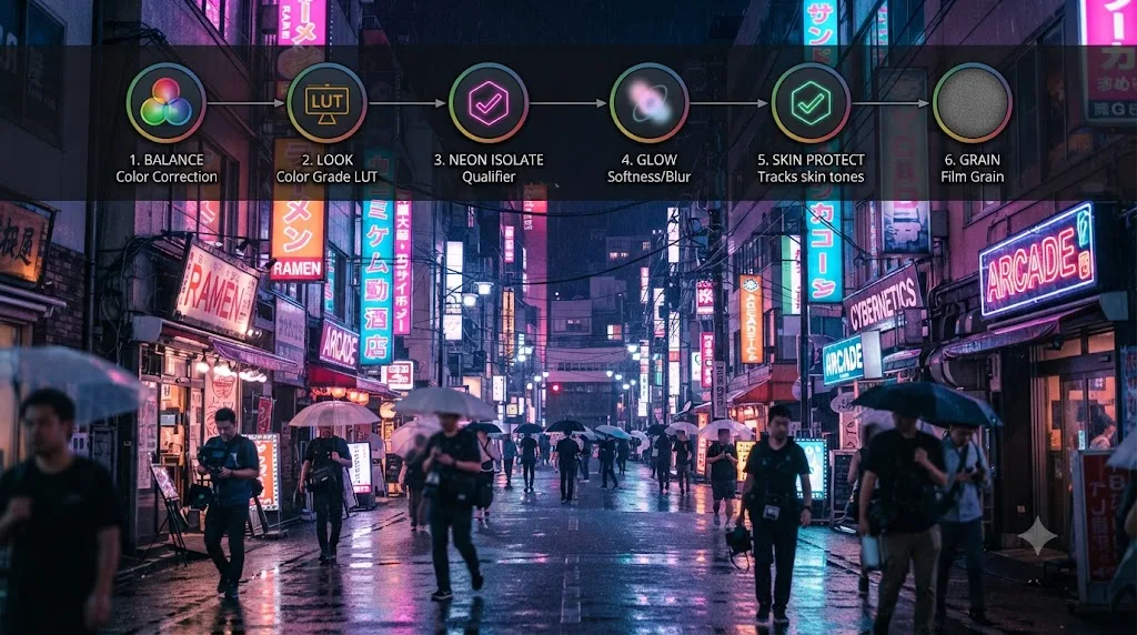
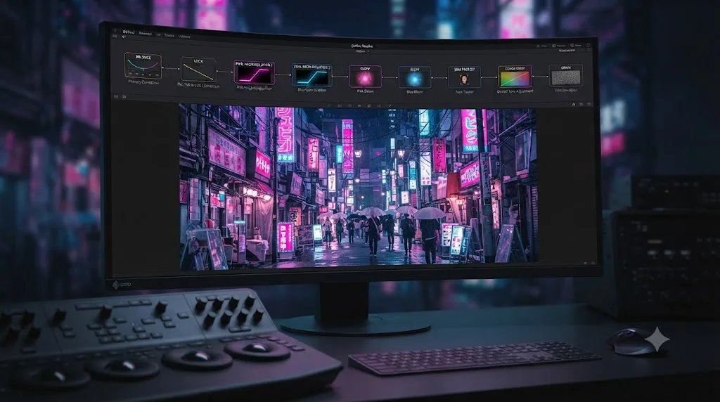
Here's the node structure this guide builds, top to bottom:
| Node | Job | New for this guide? |
|---|---|---|
| Balance | Normalize log footage, correct exposure and white balance | No, standard for any grade |
| Look (split-tone) | Push shadows cyan, highlights magenta | Yes, this is the core cyberpunk move |
| Neon isolate | HSL qualifier on practical signs, extra saturation | Yes |
| Glow | ResolveFX Light Glow on the isolated neon | Yes |
| Skin protect | Power window on faces, pulled back toward natural hue | Yes |
| Chromatic aberration / grain | Timeline-level texture pass | Yes, optional |
Six nodes for a full treatment, though a quick pass with just the balance and look nodes gets you most of the way there on a shot that's already lit with real neon.
How do you split-tone shadows and highlights for the magenta-cyan look?
Split-toning means pushing your shadows toward one color and your highlights toward a different, contrasting one, and it's the single move that does the most work in a cyberpunk grade. Do this in its own serial node, after balance, labeled "look."
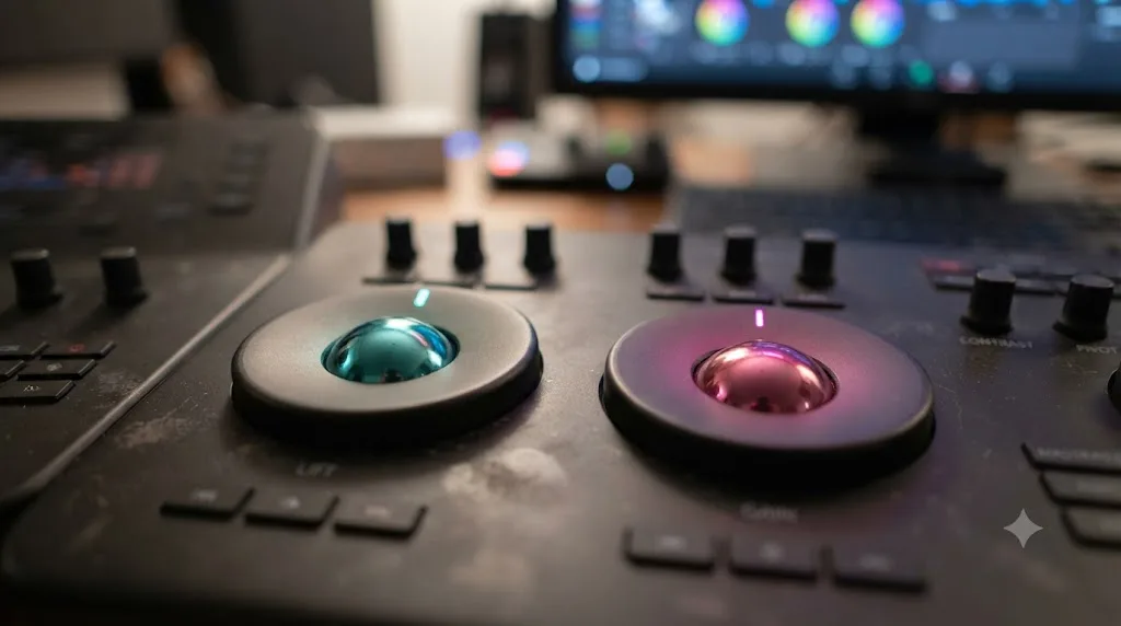
The fastest, most controllable route is the same Lift, Gamma, and Gain wheels you already use for correction, just pushed toward color instead of neutral:
- Pull the Lift wheel toward cyan-blue. Drag it away from center on the blue-cyan side of the wheel, a small distance at first. This tints your shadows and black point, which is where most of a cyberpunk frame's ambient light and wet-street reflections live.
- Pull the Gain wheel toward magenta-pink. Drag it toward the pink-magenta side. This tints your highlights and white point, which is where practical neon signage and rim light sit in most cyberpunk compositions.
- Leave Gamma mostly alone, or nudge it slightly toward whichever side the shot needs more of. Gamma controls your midtones, and in most cyberpunk grades, the midtones should read as a desaturated bridge between the two extremes rather than a third distinct color.
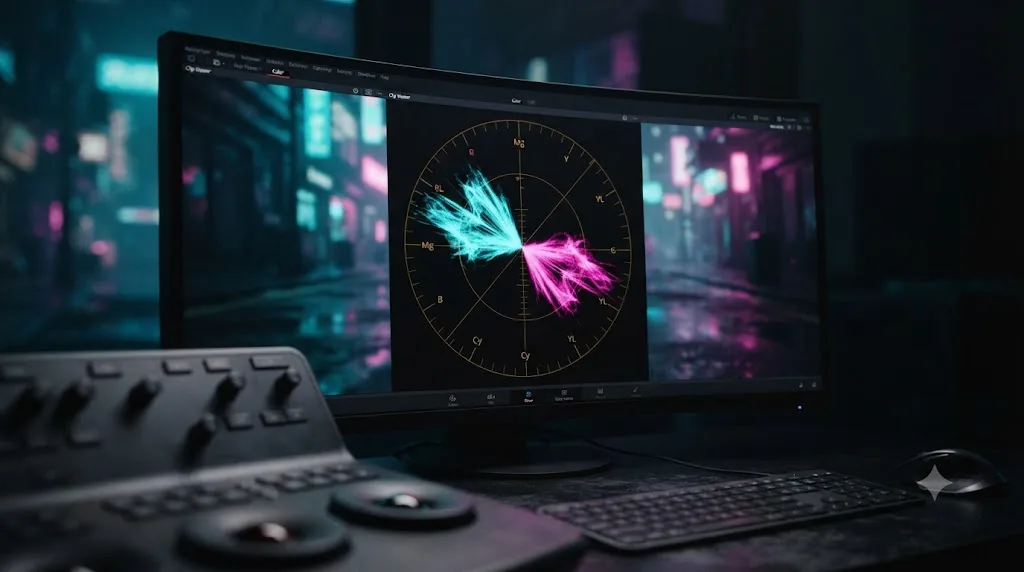
- Check the result against the waveform and vectorscope, the same scopes our scopes guide covers for standard correction work. A cyberpunk grade still needs a readable waveform. It just has a much wider color spread on the vectorscope than a naturalistic grade would.
The magenta and cyan split is what separates cyberpunk from every other color-forward style. Teal-and-orange splits cool shadows against warm highlights. Cyberpunk splits cool against cool, cyan against magenta, both leaning toward blue and violet rather than one warm and one cold. That's a deliberate choice, and it's why skin tones look artificial under this treatment. More on that trade-off later in this guide.
For finer control than the wheels give you, the Color Warper palette handles the same job with more precision. Click a shadow region in the viewer, drag its point on the Warper's hue-saturation mesh toward cyan, and the tool warps neighboring hues progressively less as distance from your click point increases, so the shift stays smooth instead of posterizing. Do the same for a highlight region, dragging toward magenta. The Warper shipped in DaVinci Resolve 17 and remains one of the more precise tools for exactly this kind of two-point hue shift.
How do you isolate and boost neon signs without blowing out the rest of the frame?
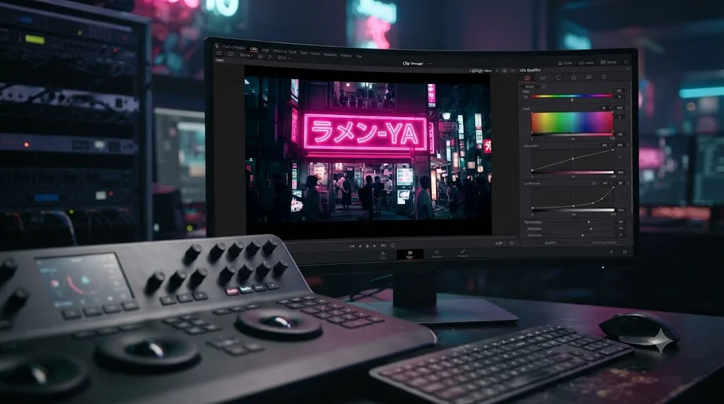
Add a new serial node after your look node, open the Qualifier palette, and click the eyedropper directly on the neon sign or light source you want to boost. This isolates just that hue so you can push its saturation, hue, and brightness independently of everything else in the frame, which is what keeps a boosted sign from dragging the entire shot's exposure or color balance along with it.
The workflow is the same HSL qualifier process our color qualifier troubleshooting guide covers for any secondary isolation, with one added wrinkle specific to neon: practical signage is often the single brightest, most saturated object in the frame, which means it's also the object most likely to already be clipping at the sensor. Check the waveform on the qualified selection before you push anything further. A sign that's already flat-lined at the top of the scale has no headroom left to push, no matter how aggressive your saturation move is.
Once the qualifier's matte looks clean:
- Press Shift+H to toggle the highlight view and confirm you've isolated the sign and not a chunk of wet pavement reflecting the same hue.
- Clean the matte in Matte Finesse. A small amount of Denoise removes chroma speckling from compressed or low-light footage, and a modest Blur Radius softens the selection's edge so the correction doesn't draw a visible outline around the sign.
- Push Hue, Sat, and Lum inside the qualified node, not the primary wheels, so the boost stays contained to the selection.
- Add a Power Window if the qualifier still grabs unwanted pixels elsewhere in the frame. Resolve intersects a qualifier and a window automatically when both are active on the same node, which is often the fastest fix for a hue that repeats somewhere you don't want it touched.
- Track the window if the sign or the camera moves. Open the Tracker palette, set it to Window mode, and press Track Forward. A static sign in a moving shot needs this step or the isolation drifts off target within a few frames.
For a scene with several different colored signs, a separate qualifier node per color group keeps each one adjustable on its own, rather than one broad qualifier trying to catch every neon hue in the frame at once. Label each node by what it isolates, "pink-sign," "cyan-sign," so the chain stays legible the way our node labeling guide recommends for any multi-secondary grade.
How do you make neon signs glow in DaVinci Resolve?
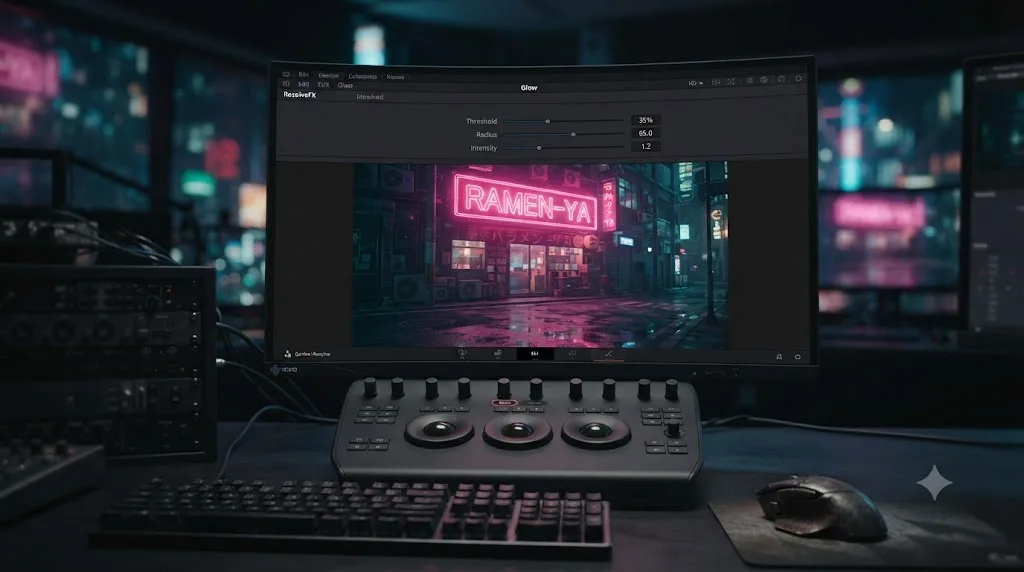
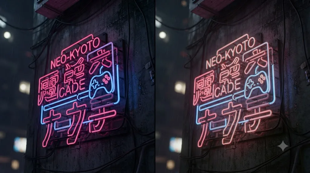
Add the Glow effect from ResolveFX Light to a node that isolates your neon sign, then lower Glow Threshold and raise Glow Intensity so only the brightest pixels in the selection bloom outward. Glow sits in the Effects Library under Open FX > Filters > ResolveFX Light > Glow, and it's included in the free version, alongside the rest of Resolve's light, blur, and color ResolveFX categories, per CineD's breakdown of what's free versus Studio-only.
Three parameters do almost all the work:
| Parameter | What it controls | Cyberpunk starting point |
|---|---|---|
| Glow Threshold | The brightness level below which pixels don't glow | Low, so only the neon itself blooms, not the whole frame |
| Glow Radius | How far the glow spreads from bright pixels | Moderate to wide, for a soft, atmospheric bloom rather than a tight halo |
| Glow Intensity | The brightness of the glow itself | Enough to read clearly at normal viewing distance, not so much it washes out the sign's actual shape |
Colorist and Mixing Light contributor Jason Bowdach frames the effect's real value as working with intent rather than randomly nudging sliders until something looks interesting, per his walkthrough of the Glow ResolveFX: the tool is versatile enough to add a touch of elegance or build a dramatic, unsettling atmosphere, and the difference between those two outcomes comes down to how deliberately you set the threshold and radius rather than the tool itself.
DaVinci Resolve 20.2, which shipped in September 2025 and carries forward into the 21.x line, added two controls directly inside the same Glow effect: Secondary Glow, a second independent glow layer you can tune separately from the primary one, and Atmosphere, a control shared across Resolve's lighting effects that adds a sense of depth to a glow or a light ray without a separate node. Bowdach's follow-up piece on the update describes Secondary Glow as finally letting a colorist integrate glow into a grade the way third-party plugins used to be required for. Practically, that means you can run a tight, bright glow directly around a sign's tubing as your primary layer, and a much wider, dimmer secondary glow to simulate how that same sign would bloom off wet pavement or a foggy window, all inside one node instead of two stacked Glow instances.
The same Resolve 20.2 update introduced AI Cinematic Haze, a Resolve FX that uses the Neural Engine's AI Depth Map to add atmospheric fog or haze that respects a scene's actual depth rather than sitting as a flat overlay, per CG Channel's coverage of the release. Since it runs on the Neural Engine, it falls into the same Studio-exclusive bucket as Magic Mask and Resolve's other AI-assisted tools, consistent with how Blackmagic gates every Neural Engine feature to Studio. If you're on the free version, a Glow node with a wide radius and low intensity, applied across the whole frame rather than just the isolated signs, gets you a comparable soft-haze feeling without it.
Glow sold subtly is atmosphere. Glow sold hard is a Snapchat filter. The temptation on a first pass is to crank Glow Intensity until the sign looks like it's on fire. Pull it back until the glow reads as "this light is genuinely bright" rather than "someone applied an effect here."
For compositors who want per-layer control that a single Resolve FX node can't give you, the Fusion page offers an alternative route: a Text+ or shape node feeding a dedicated Glow node in Fusion's own compositing tree, which lets you key the glow's opacity and falloff frame by frame rather than relying on a single threshold value across the whole clip. Our Fusion page tutorial for beginners covers the basics if you haven't built a Fusion composition before.
If you get lost hunting through the Effects Library for Secondary Glow or Atmosphere mid-grade, that specific kind of "I know this exists somewhere in this menu" moment is exactly what TryUncle is built for. TryUncle is the on-screen assistant for DaVinci Resolve on macOS - ask in plain words and Uncle points at the exact control on your screen.
Should you add chromatic aberration and lens artifacts to sell the look?
Sparingly, and only after the color work is finished. A light Chromatic Aberration pass and a subtle lens flare preset can sell the illusion that a neon-lit scene was captured on a real, slightly imperfect lens rather than built entirely in the grade, but overdoing either one reads instantly as a filter rather than a look.
Chromatic Aberration lives in the ResolveFX effects library and separates the red, green, and blue channels at the edges of high-contrast areas, mimicking the color fringing a real lens produces around bright practical lights, exactly the kind of light sources a neon-heavy frame is full of. Apply it as one of the last nodes in your chain, after the split-tone and neon isolation work, and keep the amount low. You're aiming for something a viewer wouldn't consciously notice, not a rainbow halo around every sign in the frame.
Resolve's Lens Flare effects, also in ResolveFX, ship with presets built around specific practical scenarios, including options simulating car headlights and stylized sci-fi flares, which line up directly with the kind of frame a cyberpunk scene usually needs: wet streets, passing traffic, signage bleeding light into the lens. Use these as an occasional accent on a hero shot rather than a blanket treatment across every clip in a sequence, since a flare repeated identically on every cut reads as a template rather than a captured moment.
A small amount of film grain, added at the Timeline node level so it applies once across the whole project rather than per clip, finishes the illusion. Grain breaks up the flat gradients that heavy glow and saturated color blocks can otherwise produce, especially in 8-bit delivery where a smooth cyan-to-black gradient can band visibly. Keep it subtle: enough to texture the image, not enough to fight the neon detail underneath it.
Why do saturated neon colors clip or shift when you export?
Because Rec.709, the color space almost every web and broadcast delivery target expects, has a smaller gamut than the deeply saturated cyan and magenta values a cyberpunk grade can reach inside Resolve's viewer. A color that looks perfectly intense while you're grading can get pulled back, or shift hue slightly, the moment it's mapped into the narrower space your audience will actually watch it in.
This isn't a bug in your grade. It's the same gamut-mapping problem that happens whenever a wide-gamut source gets converted down to a smaller target space, and it applies whether your source is a Rec.2020 camera file or simply a Resolve node graph pushed hard enough to reach Rec.709's edges from the inside. Per Frame.io's breakdown of when to trust your color scopes, the vectorscope's graticule targets exist specifically to show you where those edges are before delivery finds them for you.
A neon sign that looks perfect on your grading monitor can still be lying to you about what your audience will see. That's true of any grade, but a cyberpunk look pushes closer to the edge of the gamut than almost any other style, which makes this check more important here than on a naturalistic project.
A few concrete habits keep this from becoming a surprise at delivery:
- Open the vectorscope while you push saturation on your look and neon-isolate nodes, not just at the end of the grade. Watch where your cyan and magenta traces sit relative to the outer graticule targets.
- Back off saturation before a trace reaches the edge of the scope, not after. Once a color is clipping, there's no detail left inside it to recover, only a flat, posterized block of color.
- Use the soft clip controls under Custom curves if a specific channel is hard-clipping. They roll off harsh values instead of leaving a hard digital edge, which matters most on a saturated highlight like a neon tube's core.
- Render a short test clip of your most saturated shot and play it in the actual app your audience will use, not just Resolve's viewer, before committing to a full export. Player color handling varies enough that this single check catches most surprises before they reach a client or an audience.
- If you're delivering HDR, the gamut ceiling moves, and our HDR grading guide covers the wider Rec.2020 and PQ or HLG targets that give a neon-heavy grade meaningfully more headroom than SDR Rec.709 does.
How do you keep skin tones natural in a neon-heavy grade?
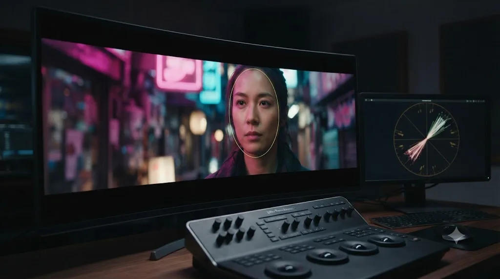
Isolate any face in the frame on its own node, placed after your look and neon-isolate nodes, and pull skin back toward its natural hue on the vectorscope's skin tone indicator line while leaving the rest of the frame fully stylized. A cyberpunk grade's magenta-cyan split works against faces by design, since neither of those hues is a skin tone, which means an unprotected face under this treatment shifts toward sickly green-magenta or artificial blue rather than reading as a person standing in colored light.
That's a real trade-off, not a mistake to quietly fix everywhere. Skin under actual neon lighting does shift color, sometimes dramatically, and a small amount of that shift is exactly what sells the scene as lit by the signs around it rather than lit normally with a filter slapped on top. The goal is legibility, not neutrality: a viewer should be able to read the actor's expression and skin as skin, even while it's visibly tinted by the environment.
The mechanics:
- Add a new serial node after "look" and "neon isolate," labeled "skin."
- Draw a power window over the face, or use a qualifier keyed to the actor's approximate hue range if the lighting is even enough for that to hold up.
- Track the window forward through the shot using Resolve's tracker, exactly as you would for any other tracked correction.
- Nudge Hue and Saturation back toward a natural tone, checking against the vectorscope's skin tone line, without fully neutralizing the color. Aim for maybe half to two-thirds of the way back toward natural, not all the way.
- Compare against a wide shot of the same actor under normal lighting, if you have one, since that's the best available reference for how far off natural the current shot has actually drifted.
For a two-shot or a group scene where multiple faces sit under different colored signage, this often means a separate tracked window per face rather than one blanket correction, since a person standing directly under a magenta sign and a person standing under a cyan one three feet away need different amounts of correction to read consistently.
What's the difference between a cyberpunk grade and teal-and-orange?
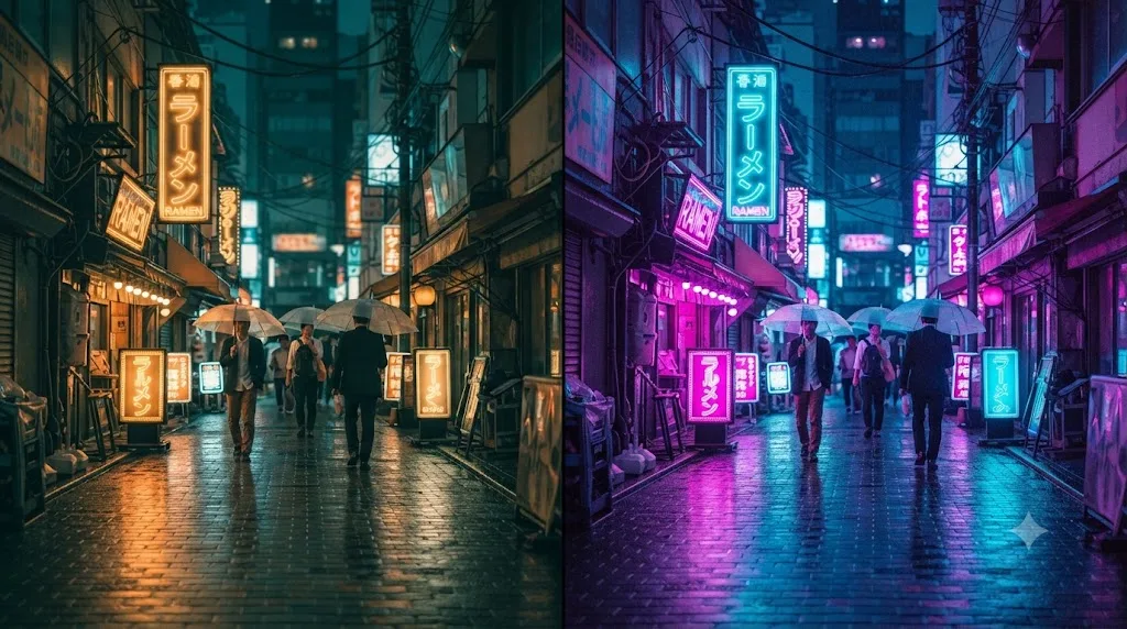
Teal-and-orange splits cool shadows against warm highlights, which keeps skin tones reading naturally against a cooled-down background. Cyberpunk splits shadows and highlights into two different cool colors, cyan and magenta, which deliberately pushes skin away from natural rather than protecting it. They're built on the same split-tone mechanic, but they're solving opposite problems.
| Teal-and-orange | Cyberpunk neon | |
|---|---|---|
| Shadow color | Teal, cool but neutral-leaning | Cyan-blue, saturated and electric |
| Highlight color | Orange, warm | Magenta-pink, cool-leaning and hot |
| Skin tones | Protected and enhanced by the contrast | Deliberately pushed artificial, then partially protected |
| Typical use | Naturalistic action, drama, most Hollywood tentpoles | Night exteriors, sci-fi, neon-lit urban settings |
| Accent color | Rarely needed, the two base colors carry the contrast | A single warm amber practical, used sparingly |
| Risk when overdone | Looks like a generic movie trailer | Looks like an Instagram filter |
The practical consequence for your node graph: a teal-and-orange grade usually needs less work protecting skin, since one of its two base colors is already warm and flattering. A cyberpunk grade needs the dedicated skin-protection node covered above almost every time there's a recognizable face in frame, because neither of its base colors does any favors for human skin on its own.
If you're not sure which one a shot actually calls for, look at the light sources already in the frame. Warm streetlights and a cool night sky push naturally toward teal-and-orange. Practical neon signage, LED strip lighting, and screens push naturally toward cyberpunk, since you're extending colors that are already physically present in the scene rather than inventing a mood from scratch.
What does a complete cyberpunk grade look like from start to finish?
Theory holds together better with a specific case attached to it, so here's one. Say you've shot a rain-soaked street exterior at night, mixed practical neon signage in pink and cyan, wet asphalt reflecting both, and a person walking through frame lit mostly by the signs around them.
- Normalize and balance first. New serial node, labeled "balance." If the footage is log, apply a Color Space Transform or your camera's conversion LUT on an earlier node, then set your black point and white point with Lift and Gain until the waveform uses a healthy range without crushing or clipping. Judge nothing about color style yet.
- Correct white balance to neutral. Find something in frame that should read close to neutral, wet pavement under a streetlight works well here, and use the parade scope to confirm red, green, and blue sit close together on it. You want a clean, honest starting point before you introduce any intentional color bias.
- Add the look node and split-tone. New serial node, labeled "look." Pull Lift toward cyan-blue and Gain toward magenta-pink, checking the vectorscope as you go. Start conservative. You'll likely push this further once the neon isolation and glow are in, and it's easier to add more than to walk back an overcommitted first pass.
- Isolate the pink sign. New node, labeled "pink-sign." Qualify its hue with the eyedropper, clean the matte, and push its saturation and hue independently so it reads as the brightest, most saturated object in the shot.
- Isolate the cyan sign the same way. New node, labeled "cyan-sign," same process, different hue target.
- Add glow to both isolated signs. Either as separate Glow nodes downstream of each qualifier, or by applying Glow directly inside each qualified node if your version's node order allows it cleanly. Keep Glow Threshold low and Intensity moderate on each, checking that the glow doesn't wash out the sign's actual shape.
- Protect the person's skin. New node, labeled "skin." Track a power window over the face, pull hue and saturation back toward natural by roughly half, and confirm against the vectorscope's skin line that the result reads as a person, not a green-tinted mannequin.
- Add chromatic aberration and grain at the Timeline level. A light Chromatic Aberration pass on the brightest highlights, and a subtle grain layer applied once across the whole project rather than per clip.
- Final vectorscope and waveform check. Confirm nothing is clipping at the gamut edge, confirm your black point and white point still hold, and play the result against your delivery target's actual player before committing to a full render.
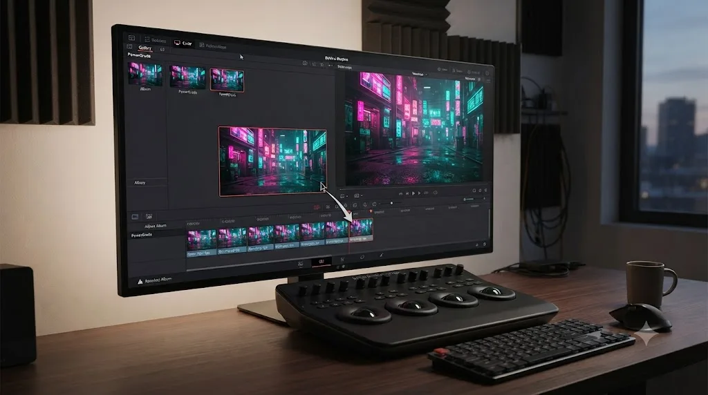
- Grab a still and save it as a PowerGrade. The exact node structure above, split-tone, dual neon isolation, glow, skin protect, becomes a reusable base for the next scene in the same location, rather than something you rebuild by hand every time the camera moves to a new angle.
Ten steps, nine or ten nodes depending on how you split the neon isolation, and every one of them undoable on its own if a client note or a second look at the scene changes your mind about a specific piece.
What mistakes make a cyberpunk grade look cheap instead of cinematic?
A handful of habits separate a grade that reads as a deliberate style from one that reads as a preset dragged onto a clip and left there.
| Mistake | Why it hurts | The fix |
|---|---|---|
| Saturating everything instead of two hues | Loses the narrow, intentional palette that makes the style read as designed | Restrict yourself to cyan, magenta, and one warm accent, nothing else |
| Skipping the balance pass before styling | Amplifies whatever exposure or white balance problems the raw shot already had | Normalize and balance first, style second, always |
| Uniform glow across every light source | Reads as a filter applied to the whole frame rather than light behaving physically | Isolate individual sources and vary glow intensity between them |
| Ignoring skin entirely | Faces read as sickly or alien instead of stylized | Protect skin on its own node, pulled back by roughly half, not fully neutral |
| No warm accent anywhere in the frame | Two cool colors with nothing to contrast against feels flat rather than dramatic | One amber or warm practical, used sparingly, does more than a third cool hue ever will |
| Pushing saturation past the vectorscope's gamut targets | Colors clip or shift unpredictably on delivery, and the client sees something different from your viewer | Watch the scope while you push, not after you're done |
| Grain or chromatic aberration applied too heavily | Draws attention to the effect instead of the scene | Both should be subtle enough that a viewer wouldn't consciously name them |
The best cyberpunk grades look like the world was actually lit that way, not like a filter was applied afterward. That distinction is the entire craft of the style. Real neon signage genuinely does bathe a street in cyan and magenta, genuinely does distort skin tone under it, and genuinely does bloom against wet pavement. Your job in the node graph is to extend what's already physically true about the scene, not to invent a mood the footage doesn't support.
Do you need DaVinci Resolve Studio for a cyberpunk neon grade?
No. Every tool this guide uses, the node system, HSL and RGB qualifiers, power windows, the Color Warper, and the Glow, Chromatic Aberration, and Vignette effects under ResolveFX, ships in the free version. Per CineD's comparison of the free and Studio tiers, the free version includes a full set of ResolveFX across the light, blur and sharpen, and color effect categories, which covers everything used to build the split-tone, isolation, and glow work in this guide.
What Studio adds is the DaVinci Neural Engine's AI-assisted tools, Magic Mask being the best known, plus newer additions like AI Cinematic Haze. None of those are required for the core cyberpunk look. Where Studio genuinely helps is a moving subject that a tracked power window struggles to follow cleanly, a job Magic Mask handles better than a hand-tuned window in some cases; our Magic Mask guide covers when that trade-off is worth the upgrade.
If you're still deciding between the two tiers for reasons beyond this specific look, our DaVinci Resolve 21 review breaks down the full free-versus-Studio decision.
Does hardware or OS change how this grade performs?
Yes, more than a standard primaries-only grade does. Every Glow node, every Chromatic Aberration pass, and especially Cinematic Haze render per frame on top of your primary color correction, and a cyberpunk timeline commonly stacks two or three of them across multiple secondary nodes. That adds up fast on a 4K timeline.
Per Puget Systems' hardware recommendations for DaVinci Resolve, 12 GB of VRAM is the baseline recommendation for smooth 4K grading, and a node stack heavy with light and blur effects, exactly the category this guide's glow and haze work falls into, pushes GPU memory demand toward the higher end of that range rather than the lower one. If you're grading on a machine near Blackmagic's stated 4 GB minimum, per its own tech specs page, expect playback stutter once you stack more than one or two glow-heavy nodes, and budget for proxy resolution or render caching more aggressively than you would on a straightforward correction pass.
On the OS side, the effects themselves behave identically on Windows, Mac, and Linux, since ResolveFX runs on Resolve's own GPU processing pipeline rather than anything platform-specific. The differences that matter are the same ones that affect any grade: Mac systems decode H.264, H.265, and ProRes in hardware on Apple silicon, which helps playback stay responsive under a heavy node stack, while Windows reserves hardware-accelerated H.264 and H.265 decode for Studio, which means free-version users on Windows grading compressed phone or drone footage lean harder on the CPU and often transcode to DNxHR or ProRes first for smooth playback.
If a node-heavy cyberpunk chain starts stuttering mid-grade regardless of platform, drop your Timeline Proxy Resolution to Half under Playback settings while you're drawing windows and adjusting qualifiers, switch back to Full to judge fine detail like glow falloff and grain, and cache the finished, effects-heavy nodes with Render Cache set to Smart so Resolve pre-renders the expensive parts in the background.
Does the camera you shot on change how you build this grade?
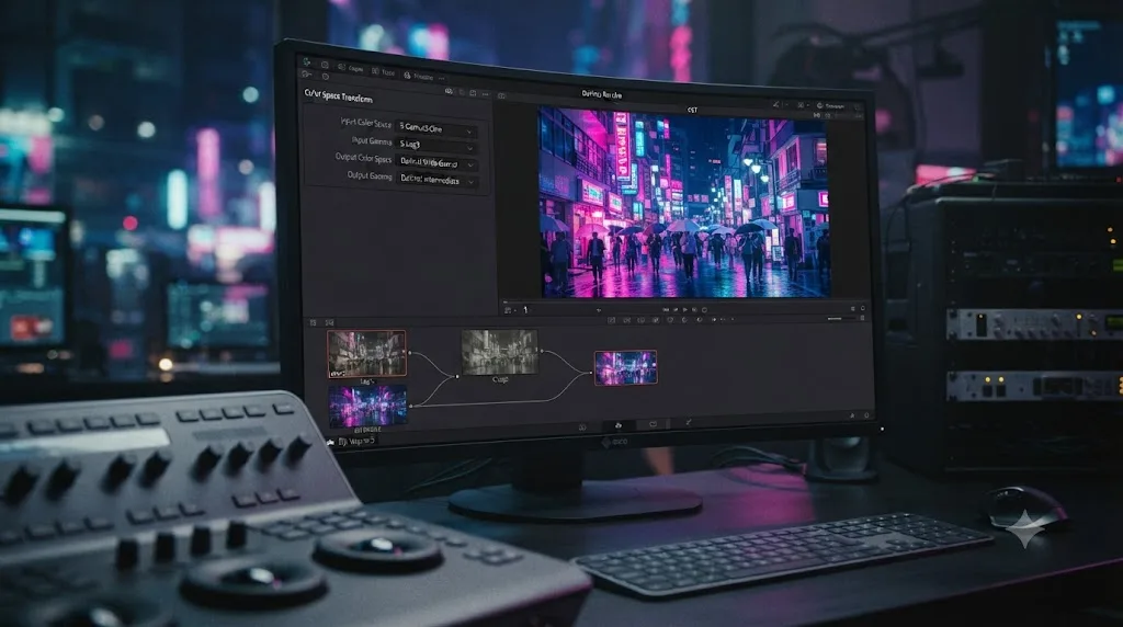
Yes, at the first node, and not at all after that. Everything in this guide sits on top of whatever balance node you build going in, and that node depends entirely on what log profile your camera recorded. Get the Color Space Transform wrong at the start and every color decision downstream inherits the error, since a look node pushed on top of a mis-transformed image just makes the mistake more saturated instead of fixing it.
Here's how the most common cameras behind neon-lit footage map onto Resolve's Color Space Transform node:
| Camera family | Log profile | Native gamut | CST input setting |
|---|---|---|---|
| Sony (A7 IV, A7S III, FX3) | S-Log3 | S-Gamut3.Cine | Input Color Space: S-Gamut3.Cine, Input Gamma: S-Log3 |
| Canon (R6 Mark II, R5, C70) | Canon Log 3 | Cinema Gamut | Input Color Space: Cinema Gamut, Input Gamma: Canon Log 3 |
| Panasonic (GH6, S5 II) | V-Log | V-Gamut | Input Color Space: V-Gamut, Input Gamma: V-Log |
| DJI (drones, Osmo Pocket) | D-Log | D-Gamut | Input Color Space: D-Gamut, Input Gamma: D-Log |
| GoPro (Hero 11/12) | GoPro Log / Protune flat | GoPro Color | Manual match against a reference frame, since CST presets are less consistent across firmware versions |
Set the output on all of these to DaVinci Wide Gamut and DaVinci Intermediate first, not straight to Rec.709, so you have room to add a second CST or a straightforward Rec.709 gamma step after your creative grade rather than baking the delivery space in at the very first node. Our camera-specific import guides for the Sony A7 IV's S-Log3 settings, the Canon R6 Mark II's C-Log3 import, and the Panasonic GH6's V-Log workflow walk through each camera's exact CST values and the gotchas specific to that body, including HDMI recordings that arrive tagged differently than the camera's internal codec.
A cyberpunk look built on a correct Color Space Transform behaves the same whether the shot came from a Sony, a Canon, or a drone. Once the CST has normalized the image into DaVinci Wide Gamut, the look node's Lift-toward-cyan and Gain-toward-magenta move reads identically regardless of source camera, because the node no longer cares what log curve the pixels used to sit on.
One caution specific to neon shoots: night exteriors push ISO higher than daylight work, and log footage underexposed even slightly in low light carries more chroma noise in the shadows than the same camera shooting a bright, well-lit scene. Pushing saturation on a look node amplifies that noise along with the color, since noise photographs as random color speckling and a saturation boost makes speckling more visible, not less. If a shadow-heavy shot looks gritty and colorful at the same time after the split-tone pass, check the raw plate at 100% before you blame the grade. Resolve Studio's Temporal Noise Reduction handles this cleanly if you have it; on the free version, a modest Blur Radius inside Matte Finesse on the noisiest qualified nodes, or simply pulling saturation back 5 to 10 points on the affected node, does most of the same job.
Can you build this look for daytime or interior scenes, not just night exteriors?
Yes, but the ceiling on how far you can push it drops. Everything in this guide assumes a night exterior because that's where cyberpunk grading shows up most often: the sun is down, practical neon is genuinely the brightest light source in frame, and there's nothing warm and dominant fighting the cyan-magenta split you're building. Daylight breaks that assumption.
Direct sun is a neutral-to-warm light source that's almost always brighter than any practical neon sign, so a full-strength split-tone pushed on top of a daylight exterior fights the actual lighting in the shot instead of extending it. The frame reads as a filter, not a world, because the eye can tell the sky doesn't actually look cyan and the sidewalk doesn't actually look magenta at noon. Save the aggressive version of this grade for shade, overcast light, dusk, or genuine interiors where you control what's competing with your split-tone.
Interiors are where daytime cyberpunk work usually happens instead: a bar with colored LED strips, an arcade, a server room lit by RGB hardware, an office with a single neon sign visible through a window. The technique doesn't change, but two adjustments help:
- Correct the ambient light to neutral first, separately from the neon accent. Interior scenes often mix tungsten or fluorescent ambient with a cooler LED or neon accent, and white-balancing the whole shot toward the accent color washes out the accent itself. Balance the room's dominant light to neutral in your balance node, then let the neon or LED source stand out as a genuine color contrast rather than something the whole frame is already tinted toward.
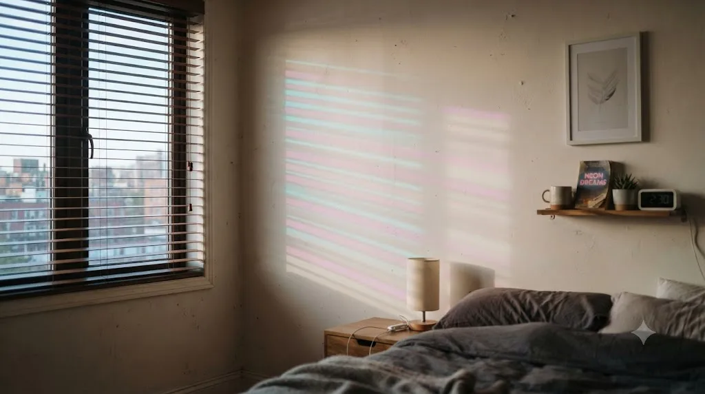
- Treat window light the same way you'd treat a practical sign. Neon bleeding through blinds or a window onto a wall or floor is one of the most common daytime-interior cyberpunk shots, and it qualifies and isolates exactly like a sign does, its own node, its own qualifier, its own glow if it needs one.
A lower-saturation version of the same split-tone, pushed maybe a third as hard as the night-exterior numbers in this guide, reads as "moody interior with colored practical lighting" rather than trying to fake a full cyberpunk night look in a room that's obviously lit by daylight streaming through a window. Match the intensity of the stylization to how much of the frame's actual light supports it.
Why does a saturated neon gradient band, and how do you stop it?
Because a gradient only has as many discrete steps between two colors as your bit depth allows, and stretching a gradient across a wider, more saturated range makes each of those steps easier to see. A smooth transition from deep cyan shadow to black, or from a magenta highlight into a desaturated midtone, has to divide itself into a finite number of visible levels. Push the saturation and contrast of that transition harder, the way a cyberpunk grade does by design, and the gaps between levels stop blending together and start reading as visible rings or stripes, usually first in the darkest part of the cyan shadow roll-off.
Delivery codec makes a real difference here, since 8-bit formats have far fewer available levels per channel than 10-bit ones:
| Codec | Bit depth | Banding risk on saturated gradients |
|---|---|---|
| ProRes 422 HQ | 10-bit | Low |
| DNxHR HQX | 10-bit | Low |
| H.265 (HEVC) Main10 | 10-bit | Low to moderate, depends on encoder bitrate |
| H.264 (AVC) | 8-bit | High, especially at web-streaming bitrates |
Three habits keep banding out of the finished grade:
- Master in a 10-bit intermediate codec like ProRes 422 HQ or DNxHR HQX even if the final web delivery has to be 8-bit H.264. The extra levels available during grading and any intermediate re-encodes matter more than the final compression step, which is usually viewed at a smaller size where banding is less visible anyway.
- Add grain at the Timeline node, covered earlier in this guide. Grain works as a dither: the random noise it adds breaks up the hard edges between visible steps in a gradient, scattering them into something the eye reads as texture instead of a stair-step pattern.
- Use the soft clip controls under Custom curves rather than a hard primary push when a specific channel is driving the banding. A hard-clipped edge concentrates all the missing detail into one abrupt line, which is exactly the shape banding is most visible in. A soft roll-off spreads that same compression across a wider range, which the eye reads as smooth even with the same underlying bit depth.
If banding shows up specifically in your cyan shadow shadows, it's frequently the Lift wheel pushed too far in a single, hard move rather than the overall look being too saturated. Try splitting one aggressive Lift push into two smaller ones on separate nodes; Resolve's internal processing carries more precision node to node than a single wheel can express at its extremes, and the softer, two-step version often reads as identically saturated without the visible stepping.
Is there a faster version of this workflow for a quick turnaround?
Yes, and it's worth knowing before a same-day deadline forces you to improvise one. The nine or ten node chain in the worked example above is the complete version, built for a hero shot on a project with room to iterate. A lot of real deadlines don't allow that: a same-day social cutdown, a client note that landed an hour before delivery, a run of B-roll that just needs to read as "on brand" rather than perfectly crafted.
The lean version cuts to two nodes:
- Balance, unchanged. Normalize and correct exposure and white balance exactly as you would for the full version. Skipping this step is still the fastest way to ruin the result, fast or not.
- One combined look node. Push Lift toward cyan and Gain toward magenta on the wheels, then add Glow directly to the same node at a low intensity and a wide radius, applied across the whole frame instead of isolated to individual signs. Raise overall saturation modestly on top. Skip the dedicated neon qualifiers and skip skin protection.
What you give up: precision. Signs don't get an individual boost, so the brightest practical in the shot won't stand out from the rest of the frame the way it does in the full version, and skin under this quick pass shifts color along with everything else, since nothing is protecting it. That's an acceptable trade for a background clip or a fast turnaround, and a bad one for a hero shot a client is going to scrutinize.
The two-node version is a starting point for volume, not a substitute for the full chain on anything that matters. Where it earns its keep is coverage: if you're grading twenty clips from the same neon-lit location under a deadline, build the lean version once, save it as a PowerGrade, and apply it across the whole scene with Append Node Graph rather than manually tuning nine nodes per clip when the schedule doesn't allow it. Go back and build out the full skin-protection and neon-isolation nodes only on the specific shots that end up as hero frames in the cut.
How do you match this grade across multiple cameras at the same location?
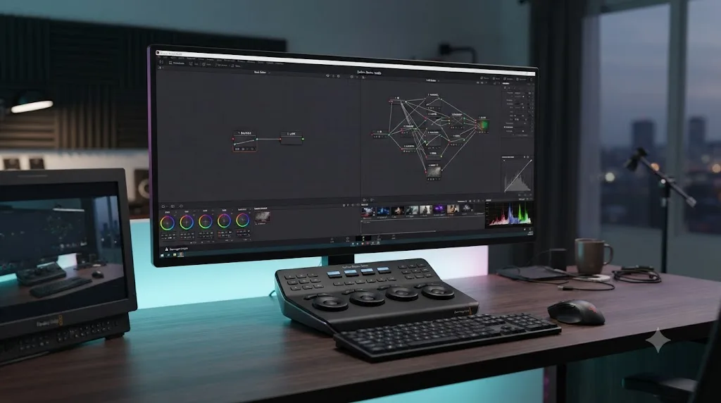
Balance and normalize each camera separately first, then apply the exact same look node, neon isolation, and glow structure to all of them with Append Node Graph. Multicam neon-lit coverage, a main camera and a second angle on a different body, is common in narrative and music video work, and every camera sensor and log profile renders color slightly differently even when they're pointed at the identical light source. Skip the per-camera correction step and the same cyan-magenta push lands differently on each angle, which reads as a color mismatch the moment you cut between them.
The order matters:
- Balance and Color Space Transform each camera's footage independently, using the correct CST settings from the table earlier in this guide for whatever camera shot that angle. This step brings every camera back to a neutral, matched starting point regardless of what log profile or gamut it originally recorded in.
- Confirm the match on the neutral shots before you style anything. Pull a still from each camera at the same moment in the scene, if your coverage overlaps, and check them side by side on the parade scope. They should sit close together once balanced. If they don't, that's a correction problem to solve now, not something the look node will hide later.
- Build the look, neon isolation, and glow nodes on one camera's footage first, then use Append Node Graph, not Apply Grade, to add that same structure onto the other camera's already-balanced clips. Append Node Graph adds the saved nodes on top of whatever correction is already there instead of replacing it, which is exactly what you want: each camera keeps its own accurate balance node, and both share the identical stylized look on top of it.
Our guide to color matching different cameras covers the underlying Color Space Transform and Shot Match workflow this depends on in more depth, including what to do when two cameras still don't agree after CST alone.
One wrinkle specific to neon: a lot of LED signage cycles through colors on a loop rather than holding one hue steady, and two cameras with different rolling shutter speeds or slightly offset frame timing can catch that same sign mid-different-color in each angle. A qualifier tuned to one camera's mid-cycle grab of the sign won't necessarily match the same sign's color in the other camera's footage, even after the look node is identical on both. Check the isolated neon qualifier's matte and hue on each camera separately after appending the shared look, and nudge the hue on whichever camera drifted rather than assuming Append Node Graph guarantees an exact match on a light source that wasn't holding still to begin with.
How do you save and reuse this look across a project?
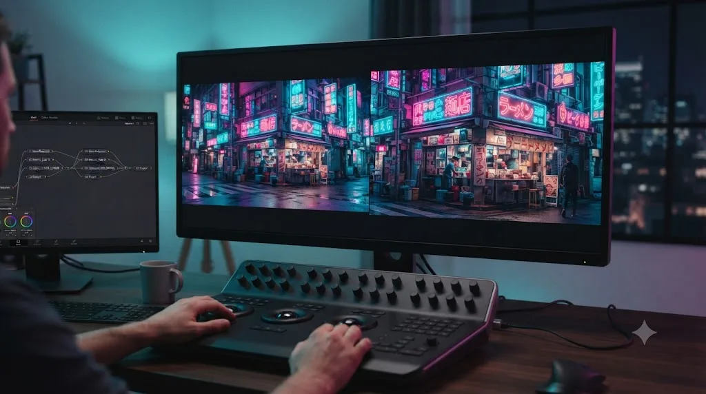
Grab a still of your finished node chain into the Gallery, then save it into a PowerGrade album so it's available on every clip in every project on your system, not just the one you built it on. A PowerGrade stores the entire node structure, split-tone wheels, both neon qualifiers, glow settings, and the skin-protect window, so applying it to a new shot from the same location gives you a working starting point instead of a blank node graph.
Our PowerGrades guide covers the full mechanics of building and organizing a PowerGrade library, including the difference between Apply Grade, which replaces a clip's existing node tree, and Append Node Graph, which adds the saved structure onto whatever's already there without erasing it. For a cyberpunk sequence with several different lighting setups across a night shoot, Append Node Graph is usually the better choice: apply your balance node fresh to each new shot's specific exposure, then append the look, isolation, and glow structure on top of it.
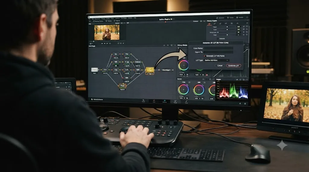
Once a look is genuinely locked and you want to hand it to a colorist who isn't working in Resolve, or bake it into a fixed transform for a downstream tool, our custom LUT guide walks through exporting a node chain as a .cube file. Keep in mind a baked LUT loses the qualifiers and power windows, so export it only once the shot-specific secondary work is finished and you just need the overall color transform to travel.
Where do you go from here?
Balance the shot honestly first. Split shadows toward cyan and highlights toward magenta in a node by itself. Isolate your practical neon and give it a controlled, deliberate glow. Protect any face in frame so it reads as a person under strange light rather than a color error. Check the vectorscope before you trust what you're seeing in the viewer.
That sequence, in that order, is the entire method. Everything else in this guide, the chromatic aberration, the grain, the camera-specific setup, the PowerGrade library, is refinement on top of it.
Pick one clip from your own footage, ideally something already lit with real neon or LED signage rather than flat daylight, and run it through the six-node structure above today. A cyberpunk grade that started from an honest balance always beats one built by stacking color effects on top of a shot nobody bothered to correct first. Once that clicks on one shot, the rest of a night sequence is the same six moves, repeated with a little judgment about which sign gets the accent and which face gets protected.
Frequently asked questions
- How do you get a cyberpunk color grade in DaVinci Resolve?
- Build a node chain that normalizes and balances the shot first, then add a dedicated split-tone node that pushes shadows toward cyan-blue and highlights toward magenta-pink. Isolate any practical neon signs with an HSL qualifier and boost their saturation and glow separately, then check the vectorscope to keep the most saturated colors from clipping when you deliver to Rec.709.
- What colors make a scene look cyberpunk?
- Cyan or electric blue in the shadows, magenta or hot pink in the highlights, and a deep blue-black base instead of a neutral gray one. Yellow and orange are used sparingly, usually as a single accent light, since a scene with warm and cool light competing everywhere reads as generic teal-and-orange instead of cyberpunk.
- How do you make neon signs glow in DaVinci Resolve?
- Add the Glow effect from ResolveFX Light to a node isolating the sign, and raise Glow Intensity while lowering Glow Threshold so only the brightest pixels bloom. DaVinci Resolve 20.2 and later add Secondary Glow and Atmosphere controls to the same effect for a second, softer glow layer without stacking two separate nodes.
- Why does my cyberpunk grade look muddy or gray instead of vibrant?
- The most common cause is pushing saturation before the shadows and highlights are actually split into two different hues. A single hue pushed harder just gets more intense, not more cyberpunk. Set the Lift wheel toward cyan and the Gain wheel toward magenta first, in a node by itself, then raise saturation on top of that split.
- Do you need DaVinci Resolve Studio for a cyberpunk neon grade?
- No. The node system, HSL qualifiers, power windows, Color Warper, and the Glow, Chromatic Aberration, and Vignette effects under ResolveFX are all included in the free version. Studio's DaVinci Neural Engine tools, including newer AI-driven effects like Cinematic Haze, aren't required to build the core look.
- Why do my neon colors clip or shift when I export the grade?
- Rec.709, the color space almost every delivery target uses, has a smaller gamut than the intense cyan and magenta values a neon-heavy grade can reach on the Resolve viewer. Colors that look right in the viewer get pulled back or shifted on export. Watch the vectorscope while you push saturation, and back off before a trace reaches the outer graticule targets.
- What's the difference between a cyberpunk grade and a teal-and-orange grade?
- Teal-and-orange splits shadows cool and highlights warm, which is how skin tones stay natural against a cooled background. A cyberpunk grade splits shadows cyan and highlights magenta or pink, both cool-leaning colors, which deliberately makes skin read artificial under the neon. That's the intended effect, not a mistake to fix.
- How do you keep skin tones natural in a neon-heavy grade?
- Isolate the face with a qualifier or a tracked power window on its own node, placed after the split-tone look, and pull the skin back toward its natural hue on the vectorscope's skin tone line while leaving the rest of the frame fully stylized. Total naturalism defeats the point of the look, so aim for readable, not neutral.
Sources
- DaVinci Resolve - Color (Blackmagic Design)
- DaVinci Resolve - What's New (Blackmagic Design)
- DaVinci Resolve - Tech Specs (Blackmagic Design)
- Cinematography of The Neon Demon, interview with Natasha Braier (Pushing Pixels)
- Learning To Work Quickly Using The 'Glow' Resolve FX, by Jason Bowdach (Mixing Light)
- Revisiting Glow Effects With New DaVinci Resolve 20 Updates, by Jason Bowdach (Mixing Light)
- Grading by Numbers: When to Use Color Scopes (and When Not To) (Frame.io Insider)
- Blackmagic Design releases DaVinci Resolve 20.2 (CG Channel)
- DaVinci Resolve 21.0.3 Update (Newsshooter)
- DaVinci Resolve: Why Pay for the Studio Version? (CineD)
- Hardware Recommendations for DaVinci Resolve (Puget Systems)
- DaVinci Resolve Reference Manual: HSL Qualification Controls
Keep reading

Guides · Jul 7, 2026 · 35 min
How to Color Grade in DaVinci Resolve: The Basics
Learn how to color grade in DaVinci Resolve: build a node chain, balance shadows and highlights with Lift, Gamma, and Gain, and read the scopes.
Guides · Jul 13, 2026 · 30 min
How to Create a Custom LUT in DaVinci Resolve (Full Guide)
Build a custom LUT in DaVinci Resolve from your own grade: Generate 3D LUT, pick a grid size, know what qualifiers and windows do to the export, test it right.
Guides · Jul 17, 2026 · 25 min
How to Use PowerGrades in DaVinci Resolve
Save, apply, and organize PowerGrades in DaVinci Resolve: grab a still, build an album, apply or append a full node tree, and share it as a .drx file.